Download
1 / 13
130 likes | 280 Vues
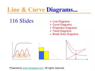
Line Graphs, Columns, Pie Charts and X-Y, Oh My!. An overview of graph types and when to use them. Line Graphs. When comparing changes over time When comparing changes amongst two or more variables over the same amount of time Examples include growth, rates, etc…. Line Graphs.

E N D
Line Graphs, Columns, Pie Charts and X-Y, Oh My! An overview of graph types and when to use them
Line Graphs • When comparing changes over time • When comparing changes amongst two or more variables over the same amount of time • Examples include growth, rates, etc…
Colums Graphs • Used in a comparison of data • Can show differences in such factors that are usually not time dependent • Should include pertinent comparisons (i.e., results of a survey, data totals, etc…
Pie Charts • Useful to breakdown a cluster of data that equals a total sum (into portions or percentages) • This graph is a good way to show proportions • Examples include percentages of a total population that comprise certain species, etc…
X-Y Scatter Plots • A direct comparison between two variables (how one variable may affect another) • These show a cause and effect relationship in a graphical format • The more independent variable is on the x axis (controlled variable) with the experimental variable on the y axis
Error Bars • Error bars are important to account for the range of error in a data set • In column graphs, they could be denoted as 5% error, or Standard Deviation, or Standard Error • We will cover this aspect more in depth, but I will show you how to use these on column graphs
Error Bars What is missing from this column graph? The error bars here represent a 5% error