Download
1 / 24
240 likes | 245 Vues
Learn about correlation and regression and how they help us understand the strength of association and predict changes between variables. Explore bivariate linear regression and discover how to interpret regression lines and coefficients.

E N D
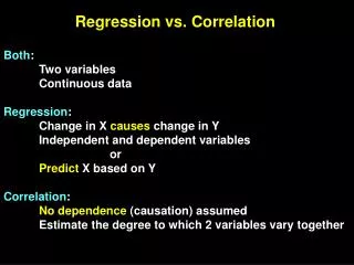
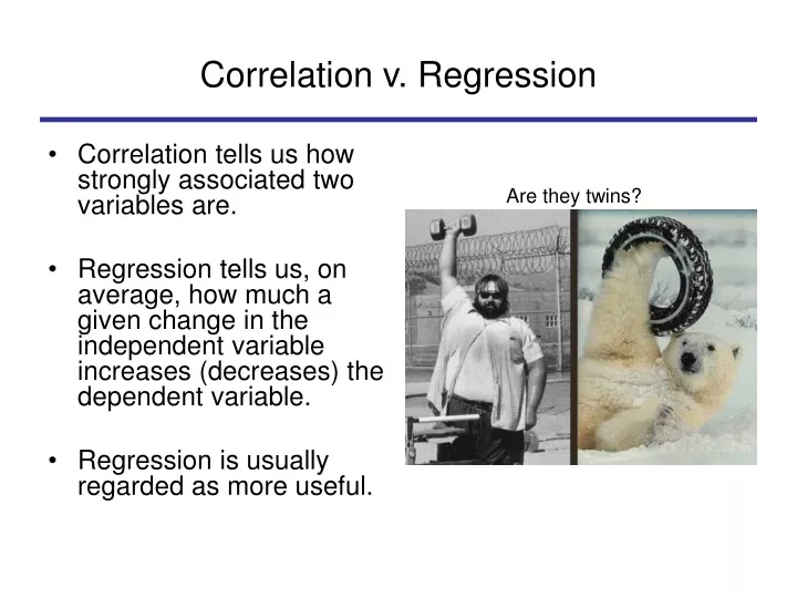
Correlation v. Regression • Correlation tells us how strongly associated two variables are. • Regression tells us, on average, how much a given change in the independent variable increases (decreases) the dependent variable. • Regression is usually regarded as more useful. Are they twins?
Bivariate Linear Regression • Let’s start out with what linear regression is. • Bivariate linear regression finds the best fitting straight line through a set of data involving two variables. • A particularly good description comes from a non-political setting—looking at the relationship between the age of trees and their size.
Regression (cont.) Here’s the data. DBH (diameter at breast height) is a measure of the size of trees. Just glancing at the data (and common sense) suggest that older trees are larger. Aging presumably causes trees to get bigger.
The relationship between age and size becomes clearer if we create what’s called a scatterplot, with the indepen-dent variable on the x-axis and the dependent variable on the y axis.
We could just “connect the dots,” but it seems clear that there is a general trend for the older trees to be bigger, and by connecting the dots, we may be missing the main point.
And, if we have a lot of data, connecting the dots makes little sense.
So, we might instead represent the relationship between age and the average tree size by a straight line—one that misses individual data points (some high and some low) but hits some sort of average between the points.
Reminder: it doesn’t always make sense to fit a straight line through a set of data. But often it is very useful.
How do draw that line? We typically create what is called the least squares line. We (or computers, that is) find the line that minimizes the sum of the squared deviations of the actual Y values from the line.
Some important asides: • This best-fitting line is often referred to as the regression line. (You need to remember this.) • There is a mathematical formula for finding the least squares line—we don’t just do it by trial and error. • Because we find the line that minimizes the squared deviations, simple regression is often referred to as “ordinary least squares,” or OLS.
Asides (cont.) • Why the “least squares” line? • For one thing, it puts more weight on large deviations; this is regarded as important. • Also, for this line, the sum of the positive and negative vertical distances is zero and the standard deviation of the points from the line is a minimum. This allows the useful interpretation of the correlation mentioned last time.
Before moving on, let’s glance at another scatterplot and regression line. Things are seldom as simple as above.
A little bit of mathematics • Mathematically, we express the linear relationship between the Y values and X values as… Y = a + b(X) • a is the “Y-intercept”, i.e. the Y-value of the line when X is zero. It is also referred to as the constant. • b is the slope--i.e., how much Y changes for every unit change in X.(Remember “rise over run”?) • b is also known as the regression coefficient.
A little bit of mathematics (example) • What is the Y-intercept (the constant)? • What is the slope? • Y = 1 + (.5)X • Given any value of X, we can find the value of Y Here, “dv value = 1 + (.5) * iv value.”
Sampling error: you can’t escape it. • As with our other estimates (e.g., of mean values), we typically estimate regression coefficients from a sample. • This means that there is sampling error, and we want to know whether our estimated coefficients are statistically significant.
Sampling error (cont.) • Mathematically, the slope in the population, beta, equals the slope in the sample within the bounds of a confidence interval. • You don’t have to remember this equation. • What you do need to remember is that regres- • sion coefficients can be significant or not. • SPSS will do the calculations for you; you have • to know how to interpret the results.
Regression in practice • Now, let’s see what can we do with all this. • To do that, let’s see how we do a regression with SPSS and how we interpret the output.
Regression in practice (cont.) • How do we get regression output from SPSS? • Analyze-Regression-Linear • We suggest you use the default options. • This procedure produces a fair amount of output. Here’s what’s most important (next slide).
Points to note on SPSS output: • The correlation and the correlation squared. (Note that R2 is capitalized when we do multiple regression—our next subject—and SPSS doesn’t change it for bivariate regression). R2 varies between 0 and 1 and is interpreted like r2, though it doesn’t show direction. • R2 will often be quite low, especially with individual data. Here, it’s moderate (.19).
Points to note (cont.) • The “coefficients” box shows: the variables included in the regression. the constant. the regression coefficient(s) (labeled “unstandardized coefficients”). the standard error, t value, and signifi- cance level (two-tailed) for a and b. the standardized coefficient (which we won’t deal with).
Interpreting the results • Remember that Y = a + b(X) • Here, a = 4.42 and b = -1.0. • One has to think about how the variables are measured. Here, the dependent variable is the mean value for each state on a seven-point scale (the question is about paying attention to state vs district needs). Professionalization runs from 0-1 (measuring how professionalized the legislature is).
Interpreting the results (cont.) • So, if prof1 = .1 (states like ID, VT, GA), we estimate that their legislators respond to the seven-point scale: 4.42 + (-1.0).1 = 4.32 • In contrast, if prof1 = .3 (states like WA, MN, OK), we find 4.42 + (-1.0).3 = 4.12. • Is this a meaningful difference? This is where interpretation comes in.
Application • There is a short homework assignment, due April 14, asking you to apply what you’ve learned (or what we hope you’ve learned anyway). • It should not take long, but it is important (for your last data analysis assignment) that you are able to do this simple homework.