Download
1 / 4
50 likes | 215 Vues
Double Page Spreads Research. – ‘Horror’ Film Review/Article Analysis. Double P age Spread Film Article – The Unborn.

E N D
Double Page Spreads Research – ‘Horror’ Film Review/Article Analysis
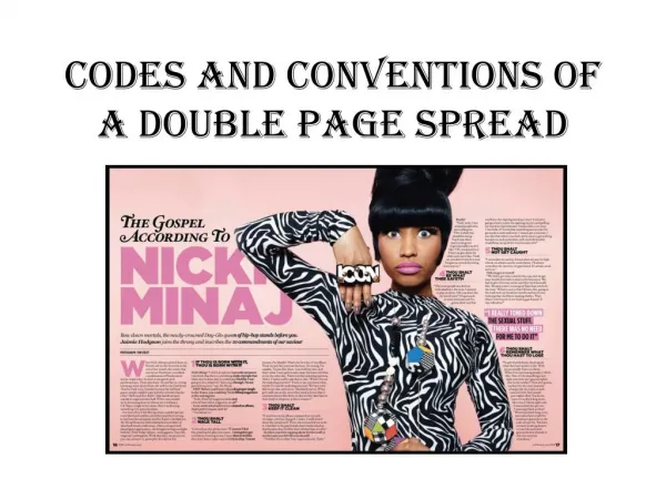
Double Page Spread Film Article – The Unborn The main image on the left is printed over the gutter line, as it is a dominant feature in the article. The image communicates a theme of fear and screaming, constructing the Horror genre representation of the film critiqued. Two secondary images positioned above columns of text. These images act as ‘teasers’ to entice the audience to watch the film as it reveals more content of the fim and what the audience can expect from it when they see it. They can also further define the genre of the film before the reader even starts to read, targeting the reader’s preferred genre, or in some cases not. Opening lines in capitals and a larger font than the remaining text, acts as a hook to readers as it states the film made “nearly a billion dollars”. A fact that will keep the audience interested as that huge figure tells the audience that the film is excellent and worth seeing. Large typeface for title of popular film ‘The Dark Night’ however in this case it acts as a hook rather than displaying a large film title. The film written about in this double page spread is ‘The Unborn’ directed by David. S. Goyer who also wrote ‘he Dark Night’ and this detail acts as a hook to the audience since ‘The Dark Night’ is a very popular film. Common convention to enlarge the font of the ‘initial capital’, a ‘drop capital’ to act as a visual cue, indicating the start of the article and therefore drawing attention to the text. Further explanation about the film director and his past work. This information acts as a hook to well-informed readers to entice them to follow the director’s most recent film and buy tickets to see it. Common convention to include a callout from the text in quotation marks. Breaks up the text nicely and an ambiguous, thought provoking callout can act as a hook for the reader to read on and find out the meaning behind it. Sometimes the quote is sourced by the speaker of it underneath in italics. Two columns of text for one page. Convention to have two or three columns per single page depending on the publication. These two columns allow for larger font and wider columns of text for an easy to read, neat layout. Font includes serifs, possibly standard Times New Roman, different for different magazines to include serif or sans-serif fonts, the style for this page is quite sophisticated and quite floral due to the artwork to the right of the page, therefore a serif font suits the style. Common convention that all magazines include - Page numbers, date of issue and magazine branding. All separated by difference in font, font size and use of bold. Helps navigate through the magazine so readers can easily find the articles and reviews they’re looking for from the contents.
Double Page Spread Film Article – District 9 Large header announcing to the audience the date of release for the film. Graphical “IN CINEMAS” sign followed by the release and screening date underneath indicates to the reader this double page spread is a film review, and creates a nice layout, separating the text and the image, the three creating a sense of three dominant features Main image positioned on the right of the double page spread and continues past the gutter line to take up as much of the spread as possible to communicate to the audience, boldly, the sci-fi genre and extra-terrestrial sub genre of the film – attracting some readers instantly. Another convention to include an extra in the film article, usually relates to the film review, however could reference information that is only loosely related to the film. For example, here, it stateswhere you can “look closer” into “aliens” therefore conforming to the genre of the film and targeting the audience well. Bold, sans-serif font for title of the film a way to indicate the subject of the film review clearly to the reader, acts as more of a hook to readers who know of the film as they will recognize the title and want to read on. Effective verticle layout created by the txt, ittle and large header above. Conventional page numbers, magazine branding and issue date as a footer to the double page spread. Preliminary details about the film, providing reader with interesting facts that may sell the film more to the audience, persuading them to go see it. Includes details such as the age certificate, the running time, the cast etc. Common convention in large film reviews, an Indication that the film review continues on the following page and instructs the reader to turn the page. Separates from the previous text with a fill-colour box and a large arrow. Conventional columns, usually two or three. Here they have used three. Using three columns restricts the width of each column and therefore requires smaller font to keep the reading easy and the layout neat. Font is sans-serif to fit the style of the article, helps construct the representation o the film genre. Serif fonts not suitable for the plain, ‘non-fancy’ style.
Double Page Spread Film Article – Alien Short paragraph explaining to the reader the content of the article, acts as a title for the article. Unusual to have a paragraph introducing the article rather than a large bold title. Challenges conventions of double page spreads. Conventional main image positioned on the right of the double page spread, filling an entire single page and only slightly running over the gutter, common form for double page spreads, clearly shows the main image as the dominant feature to the article. Image is quite an iconic scene from the film Alien and attracts attention from fans of the film and the genre. Iconic image of alien from the film, acts as another hook for fans of the film, establishing the content of the double page spread is related to Alien. Usually printed on each page of the article to make it flow and show a continuous relation to each page. Convention for some magazines to include a small icon. Conventional dropped Initial capital enlarged from the rest of the text in the opening paragraph. There is a different font and colour in the opening paragraph, an unusual style which again challenges the forms and conventions of double page spreads. Font is quite extra-terrestrial themed, contributing to the construction of the film genre representation. Conventional page numbers, magazine branding and issue date as a footer to the double page spread. Positioned bottom right of page. Large callout from the text, acts as a major hook for the reader as it is a personal statement which suggests it could be spoken by the director. Also includes the strong word “hardcore” which draws attention from the target audience. Another way this film review challenges the forms and conventions of double page spreads is the forms in which the text is placed; one column split in the middle by the large callout, so essentially two chunks of text left aligned with each other. This layout has separated the text of the article and makes it easy to read in a way,, as many columns can look daunting to read. Indication to turn the page and continue reading the article. Conforms to the green ‘alien’ style and colour scheme the article has tried to communicate.