Download
1 / 19
190 likes | 309 Vues
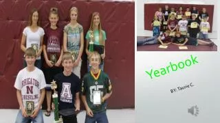
Creating Good Yearbook Pages. General Layout . Should be a mix of copy (text) and pictures The layout should look balanced No faces in the gutter (middle space between pages), but it is OK to have pictures cross the middle line Colors should look good together

E N D
General Layout Should be a mix of copy (text) and pictures The layout should look balanced No faces in the gutter (middle space between pages), but it is OK to have pictures cross the middle line Colors should look good together All copy should be correct (grammar, spelling, punctuation, capitalization, etc.) Pictures and text should be big enough to read. Text should be in a color that is readable against the background.
Choosing Photos for a Spread Pick a dominant photo that shows intense emotion or action that draws the reader into the page Avoid too many photos of people posed for the camera. Candid pictures do a better job of storytelling. Try to get a variety of pictures. For example, on a football spread, not all pictures should be of the quarterback. Get pictures of the crowd, cheerleaders, coaches, etc. Use a mix of horizontal and vertical pictures, close up and far away shots. Choose photos with the subjects facing toward the center of the spread. This draws the reader into the spread and towards other items on the page.
A Good Layout is Balanced • Consider your eyeline: this is a line of white space that goes all the way across the spread • The eyeline should not be in the direct middle of the spread • Do not cross the eyeline more than once • Dominant Photo • Select the best photo • Make it at least 2 times bigger than anything else on the page • Often the only thing that crosses the eyeline
Balanced Layout Cont. • Headline/ Title • Often will be an attention grabbing main title and then a fact filled subtitle • Usually positioned to the outside of the spread • Usually below or along the eyeline • Supporting Photos • Variety of sizes and shapes • Usually clustered towards the middle of the spread
Balanced Layout Cont. • Captions • Go to the outside corners of the photo cluster near the photos they describe • All captions should be a consistent size
Some Thoughts on Color When colors are not complimentary, the page can get hard to look at Use the Walsworth Color Guide to help you get started Use the dropper tool to help you get exact colors from the dominant photo onto the page. This is also a good PowerPoint with some suggestions on using color in yearbook spreads: http://www.slideshare.net/CuriousSJG/power-ofthepalette
Try blocks of copy many different ways playing around with font size, color, style, etc. Print them off to see which one you like best. Print many times as you work on a page to see how things REALLY look. Keep spacing between elements consistent. Make captions separate from body text by making it half a point smaller.