Download
1 / 5
50 likes | 62 Vues
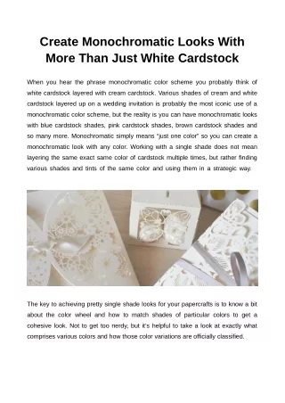
When you hear the phrase monochromatic color scheme you probably think of white cardstock layered with cream cardstock. Various shades of cream and white cardstock layered upon a wedding invitation is probably the most iconic use of a monochromatic color scheme, but the reality is you can have monochromatic looks with blue cardstock shades.

E N D
Create Monochromatic Looks With More Than Just White Cardstock When you hear the phrase monochromatic color scheme you probably think of white cardstock layered with cream cardstock. Various shades of cream and white cardstock layered up on a wedding invitation is probably the most iconic use of a monochromatic color scheme, but the reality is you can have monochromatic looks with blue cardstock shades, pink cardstock shades, brown cardstock shades and so many more. Monochromatic simply means “just one color” so you can create a monochromatic look with any color. Working with a single shade does not mean layering the same exact same color of cardstock multiple times, but rather finding various shades and tints of the same color and using them in a strategic way. The key to achieving pretty single shade looks for your papercrafts is to know a bit about the color wheel and how to match shades of particular colors to get a cohesive look. Not to get too nerdy, but it’s helpful to take a look at exactly what comprises various colors and how those color variations are officially classified.
There are three main components monochromatic color schemes: • HUE is a description of a base color, i.e. how much red, blue, yellow etc. is contained in a color. All colors are assigned a hue value based on how much of the parent color is present. For example a purplish-blue is a hue. • SHADEis a darker version of a particular color achieved by adding black + a color. • TINTis achieved by mixing a particular color with white to create a lighter version of the base color. Ok, science behind us, let’s get down to the practical matter of pairing up shades of various colors in a pleasing way to get monochromatic cards, scrapbook pages, paintings and more.
Single color designs look best when you choose a single base color and then choose variations of that color’s shade (darker versions) and tints (lighter versions). Start with a base color, choose one shade darker and one tint lighter and then add in any additional colors. For instance, when trying to create a monochromatic blue cardstock, you would not pair up a grayish-blue with a teal blue. That pairing would not look good. However, using a true blue along with a lighter and darker true blue will achieve a perfect harmony of monochromatic blues.
As another example, If you are starting with a khaki brown cardstock, which is kind of a grayish brown, you would not pair it with a warm chocolate brown cardstock, but rather you’d find other brown cardstock shades that have the same grayish hue. If you love cardstock, these single color looks can be so fun and allow you to use colors you might not have thought of before It’s hard to pair purple with much, but if you pair purple with itself, you have a winning combination. If you are serious about designing papercrafts with a monochromatic look, one of my top tips is to purchase a Bazzill Swatch Book. This allows you to play around with colors and find great combinations before you order your paper. There are several Bazzill Swatch Books to choose from over at 12x12 Cardstock Shop.
Here are a few fun monochromatic color combinations to get you started… Original Source : https://www.12x12cardstock.shop