Download
1 / 53
530 likes | 2.67k Vues
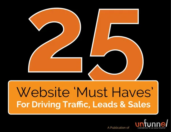
You know how important a website is to your online business strategy, hopefully everyone does at this point. <br><br>But what does it really take to have a great website design that drives traffic, generates leads and boosts revenue? <br><br>This 25-step swipe file is the ultimate startup resource to building a killer website, blog or campaign microsite. <br><br>What you'll learn: <br>1. How to get found online with search engine optimization (SEO), including link building, meta tags, and more <br>2. Important website, user experience (UX) and web usability tactics you need to know <br>3. Tips for creating content that attracts and keeps visitors engaging with, and sharing to social, the content on your website <br>4. Best practices for converting traffic into leads, including calls-to-action, landing pages, and forms <br>5. Grab your free copy over to the right, and start optimizing your website with these must-haves!.

E N D
Share This Ebook!25 1 Website ‘Must Haves’ For Driving Traffic, Leads & Sales A Publication of CONVERTING TO AN AGILE STARTUP
2 TABLE OF CONTENTS Introduction……………………. Part 3: Content………………..... Messaging………………………………....... Educate and Offer Value…………………… Importance of Quality………………………. Avoid Corporate Gobbledygook…………... Be Clear Not Clever………………………... Blogging……………………………………... Making Content Social and Shareable…… Other Forms of Content……………………. Customer Proof……………………………... 3 25 26 Part 1: Get Found Online…… Building Inbound Links………………….. On-page SEO……………………………. Title Tag & Meta Tags…………………… XML Sitemaps…………………………… 301 Redirects……………………………. 28 29 31 32 33 35 36 4 7 9 11 13 14 Part 2: Design & Usability…… The First Impression…………………...... Maintain Consistency…………............... Using the Right Images…………………. Navigation………………………………… Flash and Animation.....…………………. Accessibility………………………………. 15 16 19 20 21 23 24 37 Part 4: Conversion……………… Effective Call-to-Actions……………………. CTA Positioning……………………………... Landing Pages………………………………. Forms………………………………………… Newsletters………………………………...... 39 40 43 45 49 51 Conclusion……………………..... 52 Share This Ebook!
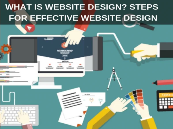
3 INTRODUCTION We all know how important a website is to a business’s online strategy. Almost every business, whether B2B, B2C, non-profit, local or global needs an online presence to reach buyers in the internet age. A company’s website is its virtual storefront. A recent survey by 1&1 Internet reported that up to 40% of small- to-medium sized businesses still don’t have a website. Shockingly, a recent survey by 1&1 Internet reported that up to 40% of small-to-medium sized businesses still don’t have a website. Even if you’re on social media, operating without a website is just silly. A website is an essential piece of your online marketing strategy. Whether you’re looking to build your first website, or if your existing site just isn’t getting the traffic or leads you were hoping for, you may wonder what it really takes to have a great website. Having a website alone isn’t the key to great results. Instead, it’s the ability turn your website into an inbound marketing machine. Your website has a hefty goal and it needs to wear many hats. A website needs to not just exist, it needs to perform. It needs to attract visitors, educate them and convince them to buy. But I know what you’re thinking - easier Share This Ebook!
4 Today, the web is social and interactive. It’s not static like most websites tend to be. As such, a website can no longer sustain as its own island. We now need to consider integrating search, social media, content, blogging, and more with our websites. Gone are the days where all it took was a URL, fancy Flash graphics, and an expensive advertising campaign to temporarily boost traffic. The reason for this shift is largely due to changing buyer behavior. Today’s buyer wishes to consume information when they want and how they want and often-times without the involvement of a sales person. And more importantly, they want to be educated and not sold to. As you can see from the following chart, websites and new forms of inbound marketing content (such as podcasts, blogging and social media) have become a considerable factor in the buying cycle. Share This Ebook!
5 You’ll also find in HubSpot’s 2011 State of Inbound Marketing Report that inbound marketing is more effective in reaching today’s buyer. Results show that inbound marketing has a 62% less cost per lead compared to outbound, or traditional, marketing. What might not be apparently visible here is the role your website plays. It’s actually a big one. In most cases, traffic from blogs, social media, organic and paid search end up converting into leads or sales on your main website. Without a website acting as an online basecamp, it would be difficult to attract new business to one source. This is why having an effective website is so crucial and that it contains key elements to driving more traffic, leads, and sales. So without further ado, I present to you 25 Website ‘Must Haves’ for Driving Traffic, Leads and Sales. To learn more about a particular must-have, you’ll find additional resources at the bottom of each topic. Definitely take advantage of these if you’re looking to master inbound marketing. Share This Ebook!
6 Part 1: Get Found Online A great website isn’t so great if no one visits it. This is why the first chapter is dedicated to getting found online, which covers the very top of the funnel of your inbound marketing strategy. Search Engine Optimization (SEO) is an absolute must-have to any website strategy, but it takes hard work and consistency when aiming for the top spot. These tips will help get you on your way to increasing your organic (non-paid) search engine rankings. Share This Ebook!
7 Building Inbound Links Every website on the internet has the goal of reaching the #1 position in search engines but because there is only one top spot per keyword phrase, not everyone can make it. So what gets a first place ranking? Off-page search engine optimization (SEO) is the most important factor to increasing your ranking results. Off-Page SEO is about building inbound links, essentially getting other quality websites to link back to you. Search engines call this authority or “link juice.” The more inbound links you have, the more important your site must be, thus the higher you’ll rank. Link building, when done right, isn’t easy since adding links to other websites is sometimes out of your control. Here are some tips to building inbound links: Share This Ebook!
8 • Create high-quality, educational or entertaining content. If people like your content, they will naturally want to link to it. • Submit your website to online directories. This is an easy way to start. • Write guest posts for other blogs. This is a win-win for both parties. People will want extra (quality) content from others and in exchange, it’s a great way to build inbound links. • Researching link building opportunities with other websites, but always check the authority of the websites that you are trying to get links from. There are many tools online that allow you to check domain or page authority, including HubSpot’s link grader tool. • And don’t borrow, beg, barter, bribe or buy links. Share This Ebook!
9 On-page Search Engine Optimization (SEO) While off-page SEO is hugely important, we can’t forget about on-page SEO. This consists of placing your most important keywords within the content elements of your actual pages. These on-page elements include Headlines, Sub-headlines, Body Content, Image Tags, and Links. Often times on-page SEO is referred to as “keyword density.” It’s very common that businesses will do too little on-page optimization or too much (keyword stuffing). While it’s important to include your keyword as many times as necessary within a page, you don’t want to go overboard with it either. For on-page SEO done right: • Pick a primary keyword for each page and focus on optimizing that page for that word. If you oversaturate a page with too many keywords on one page, the page will lose its importance and authority because search engines won’t have a clear idea of what the page is about. This is very common on homepages in particular, where too many keywords are used. Share This Ebook!
10 • Place your primary keywords in your headline and sub-headline. These areas of content have greater weight to search engines. • Include the keywords in the body content but don’t use them out of context. Make sure they are relevant with the rest of your content. • Include keywords in the file name of images (e.g. mykeyword.jpg) or use them in the ALT tag. • Include the keywords in the page URL and keep the URL clean. • And lastly, write for humans first, search engines second. Always prepare your content for your audience and then look to optimize it for search. Content written in the other order won’t read naturally and your visitors will recognize it. Share This Ebook!
11 Title Tag & Meta Tags While this may be the least sexiest component of SEO, it is a definite must-have. A Meta Tag is a line of code that is contained in the background of a web page. Search engines look at meta tags to learn more about what the page is about. Meta tags don’t quite have the level of SEO importance as they used to but are still very important. Back in the day, websites abused meta tags to increase their rankings by including far too many keywords. Now search engines are smarter and give more weight to inbound links and page content for ranking instead. However, they still play an important role to an SEO strategy. Make sure to use these on all of your pages. If you’re not a web guru, most website editors and content management systems enable you to easily edit meta tags without coding knowledge. If you don’t have an editor, you can simply open a web page file (ending in .htm, .html, .asp or .php) in Notepad or a plain text editor and the meta tags will be found near the top of the document. Share This Ebook!
12 Here is example of what meta tags look like in an HTML document: • Title: The title of the page seen at the top of a web browser, also the main headline displayed in search engine results. <title>HubSpot Inbound Marketing Software</title> • Description: A concise description of the page. <meta name=”Description” content=”Stop pushing. Start attracting. Stop interrupting. Start engaging. HubSpot’s Inbound Marketing Software...”> • Keywords: Words that identify what the page is about. Keep to less than 7 keywords per page. Keywords in meta Share This Ebook!
13 XML Sitemaps The general incentive behind an XML sitemap is to help search engine crawlers (or “spiders”) sift through your pages more efficiently. An XML sitemap is simply an .xml file containing a listing of all your pages and when they were updated. It’s a lot like a subway map. It shows the structure of your website and where are your pages reside. Creating a sitemap is easy. You can find sitemap generators online that will create the .xml file for you. Once you get the .xml file, simply upload it to the root directory of your website (e.g. www. website.com/sitemap.xml). If your website is updated regularly, make it a good practice to update your xml file at least once a month so search engines have the freshest data. Adding an XML sitemap is a component that is commonly overlooked, while it may not be the deciding factor in improving your Search Engine Share This Ebook!
14 301 Redirects We’ve all experienced a time when we clicked on a website link that ended up being broken. Typically you’ll see a “404 message” or “Page Not Found.” A lot of times this is caused when a page is moved to a new URL and the old link hasn’t been directed to the new page. Think about the lost opportunity when your customers or potential buyers want information that they can’t locate. If you choose to move a page on your website, make certain that you use a permanent 301 Redirect, a method used to change an old URL to a new one. In addition to keeping visitors happy when navigating your website, permanent 301 redirects are also important for SEO. When a user can’t find a new page, nor can a search engine, and you’ll lose any SEO status the old page once had. To keep the SEO juice following to new pages, set up a 301 redirect for pages that have been moved so search engines know where to find it. Share This Ebook!
15 Part 2: Design & Usability Now that you’re generating some good traffic by getting found online, your next focus is getting that traffic to stay on your website. It depends on the industry, but most websites have a 30-60% bounce rate on average. This means a large majority of web traffic entering your website leaves without navigating to any other pages. And many times they may never come back. Yikes! Here are some tips you need to consider to improve user experience and decrease your bounce rate. Share This Ebook!
16 The First Impression Your website represents who you are and what you offer. When people see it for the first time they’re thinking: • Is this site credible? • Is it trustworthy? • Is this a professional company? • Is this company stable? • Does this site make me feel welcome? • Am I in the right place? You need to ask yourself all of these questions when designing your website. Now, design may not be the most important factor in a website overall and often-times folks put too much emphasis on how a site looks instead of it works, but it does play an important role in making a good first impression. For example, an in-depth study from the Stanford University and Consumer Web Watch, “How Do People Evaluate A Website’s Credibility? Results from a Large Study,” found that a website’s design was more important than credibility indicators such having a privacy policy, awards or certifications. P-44 Technologies does a great job at summarizing this study (continue to next page…) . Share This Ebook!
17 “Visitors first evaluate a site’s overall design, including its use of multimedia. Beau Brendler, director of Consumer Web Watch noted: “While consumers say they judge on substance, these studies demonstrate that consumers judge on aesthetics, and get distracted by bells and whistles.” So, after spending all this time developing great, valuable content that visitors can’t find anywhere else on the Web, does this mean nothing matters but a cool color scheme and fancy flash animation? Fortunately, it doesn’t. The Stanford study noted specifically that while a site’s design is the first indicator of quality, it isn’t the only one: “…the visual design may be the first test of a site’s credibility. If it fails on this criterion, Web users are likely to abandon the site and seek other sources of information and services.” Tips for a great website design: • Proper use of colors: Use the right colors for your audience and to draw attention to select elements. Don’t try to make everything jump out. The result will be just the opposite – nothing will stand out. Avoid a chaotic mix of colors on your website and instead pick two to four colors for your template and marketing materials. • Animations, gadgets and media: Avoid anything unnecessary. Using Flash animations because they look cool is the wrong strategy. In most cases it’s best not to use animated background or background music. Only use media and animations to help support content and information. . Share This Ebook!
18 • Layout: Create a clear navigation structure (refer to Navigation on page 21) and organize page elements in a grid fashion (as opposed to randomly scattered). Also, don’t be afraid of white space and avoid clutter! • Typography: Make sure your website is legible. Use fonts, font sizes and font colors that are easy to read. For easier page scanning, use bullet lists, section headers, and short paragraphs. If your site is English language- based, make sure information flows from left to right and top to bottom. While design is important, don’t forget that offering great content is what your visitors are ultimately after. A well- designed website might convince visitors to take a closer look but they won’t look twice if the content isn’t useful and well organized. After all, you never get a second chance to make a first impression. Share This Ebook!
19 Maintain Consistency It’s best to keep elements on your site fairly consistent from page-to-page. Elements include colors, sizes, layout and placement of those elements. Your site needs to have a good flow from page to page. This means colors are primarily the same as well as fonts and layout structure. Navigation should remain in the same location of your layout throughout your website. Consistent design elements such as Logo, Naviga- tion, Links & Colors Homepage Subpage For layout structure, typically three page layouts exist for most websites: one for the homepage, one for content pages and one for form pages. For example, your homepage will have a different layout than a landing page for a PPC campaign. Keep the elements in these layouts constant. This will help keep your visitors from feeling lost. . Share This Ebook!
20 Using the Right Images Images can be a powerful element to any website but you need to use them wisely. For example, consider stock photography. Stock images are seen everywhere because they are easily accessible and inexpensive. But are they good to use? Marketing Experiments performed a test comparing the use of stock photography verses real imagery on a website and each of their effects on lead generation. What they found was that photos of real people out-performed the stock photos by 95%. Why? Because stock images tend to be irrelevant. Resist the temptation to use photos of fake smiling business people! As a result, take care to place meaningful images on your site. Every image is transmitting a subconscious message to your audience and sometimes the result is different from what might expect. I’d recommend looking into another study by Marketing Experiments “Images vs. Copy: How getting the right balance increased conversion by 29%.” Share This Ebook!
21 Navigation Perhaps one of the biggest factors to keep visitors on your website is having a good, solid navigation system that supports all search preferences. In fact, more than three-quarters of survey respondents from a recent HubSpot study say that the most important element in website design is ease in finding information. Share This Ebook!
22 If people can’t find what they are looking for, they will give up and leave. Important factors in a site’s navigation include: • Keep the structure of your primary navigation simple (and near the top of your page). • Include navigation in the footer of your site. • Use breadcrumbs on every page (except for the homepage) so people are aware of their navigation trail. • Include a Search box near the top of your site so visitors can search by keywords. • Don’t offer too many navigation options on a page. • Don’t dig too deep – in most cases it’s best to keep your navigation to no more than three levels deep. • Include links within your page copy and make it clear where those links go to. This is also great for SEO! • Avoid use of complicated JavaScript and especially Flash for your navigation. Many mobile phones can’t see Flash (yet), thus they won’t be able to navigate your website. Same applies to web browsers that don’t have an updated version of Flash installed. The overall rule with a proper navigation structure is simple: don’t require visitors to have to think about where they need to go and how to get there. Make it easy for them. Share This Ebook!
23 Flash and Animation Flash animation can grab someone’s attention, yes, but it can also distract people from staying on your site. Not only are mobile applications lacking the capability to view flash animation but many people simply don’t want to be bothered with unexpected noises and animations. Keep the animation to a minimum and only use when necessary. If you’re in love with Flash or require animations, consider moving to HTML5 instead, if applicable. It’s a great browser- compliant alternative to Flash. Share This Ebook!
24 Accessibility Make sure that anyone visiting your website can view it no matter what browser or application they are using. In order to gain significant traffic, your site needs to be compatible with multiple browsers and devices. With growth in mobile phones and tablet devices, people are surfing the internet more than ever before. Make sure to get some of those views by allowing everyone to view your site, no matter what kind of system they run or which browser they use. Share This Ebook!
25 Part 3: Content Content is one of the most important aspects of any website. With the rise of inbound marketing, content has become front and center in the minds of marketers. It is what search engines and people are looking for. It’s what drives visitors to your site and turns prospects into leads. Take a look at these next must-haves for creating killer website content. Share This Ebook!
26 Messaging There are four basic questions you need to ask yourself regarding the content of your website. • Will people know what I do within seconds? • Will they understand what page they’re on and what it’s about? • Will they know what to do next? • Why should they buy/subscribe/download from this site instead of from someone else? Ideally, you want your visitors to know the answers to these questions. It should be readily apparent what your site is about, what they can do there and why they should take action. On your homepage and most important pages, consider these helpful tips in delivering the right message: • Create a few headlines and sub-headline ideas for your most important pages. To combat question #4 (why should I buy from you?) use a powerful value proposition and steer clear from generic cliches, gobbledygook terms and corporate speak. Share This Ebook!
27 What Basecamp is Clear next steps Who is it for • Make sure to include clear call-to-actions and next steps. Include links in your body copy, next step links at the end of the copy and calls-to-action wherever appropriate. Include a little direction and you’ll be glad you did. • Test your copy. For the most accurate indication of a winning headline, use A/B testing to determine which variation drives the most conversions. You can use tools like HubSpot’s A/B Testing Tools, Google’s Website Optimizer or services like 5 Second Test. Share This Ebook!
28 Educate and Offer Value Even though the purpose of a corporate website is to provide information about your products and services, not everyone is ready to buy when they first hit your site. Second, remember it’s not all about you. What’s in it for them? • Offer more than just product content. Provide eBooks, whitepapers, videos, and other forms of content that is educational. This will nurture prospects through your marketing and sales funnel until they are ready to buy, plus, they will feel as if they are receiving valuable information along the way and not just a sales pitch. • In product-specific content, write as if you are speaking directly to your audience. Use words like “you,” and “we.” Be transparent. Make yourself sound human. Speak their language. • Write your product content as if you are helping them solve their problems. Avoid “we are the best” speak and instead use “this is how we help you….” Share This Ebook!
29 Importance of Quality Everyone knows having a lot of content is a good thing, but in the days where search engines are getting smarter and buyers are becoming more selective, quality content is truly king. Quality content is a definite must-have for any website. This includes: • Offer unique content. People love this and so do search engines. • Write for humans, not search engines. People don’t read like robots. • Provide value and educational content that helps others. • Do your research when paying for content that is written by third-party services. Some work well, others do not. • Keep content fresh. Having news that’s two years old still sitting on your homepage will probably give your visitors a bad feeling. Share This Ebook!
30 • Know your audience. Providing content that is specific to your buyers makes it more relevant for them, and in turn, higher quality. • Include evidence when needed. If stating facts, numbers, awards, testimonials and etc., try to back it up with a source and give credit when credit is due. • Know your subject well. You probably don’t want an auto mechanic writing about brain surgery. Accurate content equals quality. Share This Ebook!
31 Avoid Gobbledygook A professional image is necessary but you still want to avoid the dreaded corporate gobbledygook. What is gobbledygook you ask? Great question. These are jargon terms and phrases that have been over-used and abused rendering them meaningless (you’ll find them mostly in the high-tech and B2B industry). These words are meant to add more emphasis of a particular subject but instead they make your eyes roll. Avoid these words on your website and in other materials whenever possible: • Next Generation • Cutting edge • Flexible • Ground breaking • Robust • Best of breed • Scalable • Mission critical • Easy to use • And so on… I think I’ve put you through enough torture Share This Ebook!
32 Be Clear and Not Clever For years, advertising has tricked us into thinking that catchy and creative headlines and phrases work well at capturing our attention. They might have for a while but not so much anymore. As consumers we are tired of advertising trickery, marketing cliques, and surreptitious methods of persuasion. We don’t want to be lied to, gimmicked, or fooled. We just want the truth! Wouldn’t it be easier to get the point in our content instead of trying to persuade others? If you focus your content on being clear, not clever, you will find that more people will place their trust in you. Be careful not to make things more complicated than they need to be. Use simple words that are easy to understand. Your goal is to be understood. Just be clear with what you want people to do on your site. You will gain more fans and followers in the long-run. Share This Ebook!
33 Blogging Blogging is without a doubt one of the most important assets to any inbound marketing strategy and it’s a perfect complement to your website. Here are some reasons why you really need a blog: • It creates fresh content and more pages of content, which is great for SEO. • It helps establish you as an industry authority and thought leader. • It helps drive more traffic and leads back to your website. • It’s a great channel to converse and engage with your audience and customers. • It’s a great way to get valuable inbound links! Blogging isn’t as difficult as you think. There are plenty of blogging tools you can use to get started. If the ability to create content regularly is your main concern, there are inexpensive blog writing services (called Content Marketplaces) like Zerys and WriterAccess that will help you get started. If you still need proof blogging works, HubSpot has lots of research on the subject, specifically: Share This Ebook!
34 How do you like them apples? Yes, blogging gets results! I recommend checking out 100 Marketing, Charts and Graphs for more awesome blogging stats. Share This Ebook!
35 Make Content Shareable and Social Social media websites have seen and exponential growth in the past decade and continue to grow larger every day. Oftentimes people will “Like” a post, product, or blog entry, causing all of their friends to see what they like and even provide them with a link to find it themselves. Consider this type of network effect for your own website. Make it just as easy for people to share and socialize about your content and resources. It’s almost blindingly obvious why you should take advantage of this opportunity. Providing people with excellent content that can be shared with their peers will surely increase your flow of traffic. • Add a sharing widget or plugin to every page on your site. This will enable visitors to share your pages via all the major social networks. Tools like AddThis or ShareThis are easy to install and provide you with analytic tracking as well. • If you’re on a blogging platform like HubSpot or Wordpress, there are plug-ins available that enable people to share your articles plus auto-publish content to your social networks like Twitter, LinkedIn and Facebook. Share This Ebook!
36 Use Multiple Forms of Content Content is more than just the written word. Media and utilities are excellent forms of content that can turn a text- heavy site into something that pleases the viewing preferences of multiple audiences. • Content takes place in the form of: • Imagery (including infographics) • Video • Audio • Online utility tools (e.g. Website Grader) • Games • You name it! Try using many different forms of content. It will help create a content-rich experience. Share This Ebook!
37 Customer Proof No matter what you’re selling, potential buyers like to see confirmation that you’ve made other customers happy. Testimonials, customer reviews and case studies are powerful sources of content for moving prospects even closer to the final buying stages. • Provide authentic customer stories and don’t hide these behind a form! • Place real, short and powerful testimonials on your site. Tips to maximize testimonials: - Try to include real names and titles and use pictures of the person along with their testimonial if possible (if they already have a picture on LinkedIn, ask to use that!). This adds authenticity. Not including a name makes a testimonial seem phony even if it’s real. - Instead of randomly placing testimonials on any page, consider placing testimonials on certain topics on the pages relevant to them. For example, if you have a quote about your awesome customer service, place that on a service or support page. If you have one for your convenient return policy, place that somewhere in a shopping cart or pricing page. Share This Ebook!
38 • The more proof you have the better. Make it part of your strategy to collect case studies and testimonials when possible. • Leverage other online sites that provide reviews, such as Yelp (for local businesses), or industry specific directories like Capterra (for software providers). Share This Ebook!
39 Part 4: Conversion Now that you know what it takes to drive traffic and engage visitors with great content, the next step is to get your visitors to convert from a prospect into a lead. You don’t want them leaving without providing some information or else you will lose the opportunity to nurture them until they are ready to buy. Here are some must-haves for increasing your website conversions. Share This Ebook!
40 Effective Calls-to-Action The effect of a successful Call to Action (CTA) is to drive a visitor to take a desired action. CTAs are typically kept above the fold or in clear sight on a page so visitors know where to take the next step. CTAs are the key to lead generation but they need to be done right to convert traffic into leads. • Make them bigger and bolder than most other elements on the page, but don’t overdo it. • Consider colors of the CTA, whether it is a link, button or image. Make them look so good people will want to click on them. • Offer CTAs that provide value, like guides, whitepapers, estimates, etc. “Contact Us” is the worst form of a CTA. Don’t rely on that as your only option for conversion. • Make the CTA look clickable. You can do this by making a button or adding a hover effect to an element. • Less is more. Keep it simple and clear what is being offered. • Test when possible. Try testing different colors (e.g. red verses green buttons), language, and placement to see which CTAs get more clicks and drive more leads (refer to the “Messaging” section above for A/B testing tools). Share This Ebook!
41 Here are some good examples of calls-to-action: Clear CTAs Example 1: Freshbooks Share This Ebook!
42 Good CTAs Example 2: HubSpot Share This Ebook!
43 CTA Positioning So you have Call-to-Actions, but how will people find them? You want to think about where you will be placing your CTAs. You don’t want to dump CTAs everywhere. That will give people too many options or not the right options at the right time. Consider this: • Segment your top-of-the-funnel and middle-of-the-funnel offers. Place top-of-funnel type offers (whitepapers, downloads) on top-level pages. Add middle-of-funnel offers (request a quote, trial, pricing) as the prospect is digging deeper and learning more about your offering. • Place CTAs both above and below the fold. Placing CTAs above the fold is important because that area of a page gets the most views. However, there are still other areas of a page to promote your CTAs. Add some at the bottom of pages and within body content as well. • Some studies suggest placing CTAs to the right of the page work better but testing this will ultimately determine what’s best for your website. Share This Ebook!
44 The placement of your CTAs can impact conversion. The only way to know which options work best is to test! • Use thank-you pages for additional CTAs. A thank-you page or message is what is seen right after someone completes a web form. Many times there is plenty of real estate to offer more downloads and CTAs. Once a prospect completes a form, don’t stop there. Offer them additional downloads, however if possible, do so without requiring them to complete another form. • Test, test, test! As indicated in the example above, it’s unclear which version will drive the most conversions. Test different placements to know which one works best for your website. Share This Ebook!
45 Landing Pages Now that you have some awesome CTAs you need to drive those links to landing pages. Landing pages, sometimes called a “Lead Capture Page,” are used to convert visitors into leads by completing a transaction or by collecting contact information from them. Landing pages consist of: • A headline and (optional) sub-headline • A brief description of the offer/CTA • At least one supporting image • (Optional) supporting elements such as testimonials or security badges • And most importantly, a form to capture information Landing pages are necessary to implement. Landing pages direct your visitors to one particular offer without the distractions of everything else on your website. Visitors are on a landing page for one and only purpose: to complete the lead capture form! Share This Ebook!
46 What makes an effective landing page? • Include the elements on the previous page and only what is needed. Keep your pages simple and minimize distractions. • Never ever use your homepage as a landing page. • Remove main site navigation from the landing page so visitors can focus on completing the form and not continuing to search your site. • Make it very clear what the offer is and make it irresistible. • Absolutely make sure that the content on your landing page matches your call-to-action. If there is a disconnect in your messaging visitors will hit the Back button. • Reduce friction – don’t make visitors think too much or do too much work (i.e. reading). • Use the right form and only collect the information you absolutely need (see must-have Forms for more details). Effective landing pages are what will turn your website into a lead generating machine. Share This Ebook!
47 Example of a bad landing page: 1. Not sure what this page is offering. 2. Not clear what I’d be signing up for? “Free 2 Week Trial” is hidden. 3. Way too much text. No one will ever read all that! 4. Screen shots of the product are very confusing. 5. No forms directly on this page to capture prospect information. 6. Length of the page might be too long. 7. Selling too much on features and not value. 8. No customer proof: testimonials or case studies. Share This Ebook!
48 Example of a good landing page: 1. Main navigation has been removed 2. HubSpot logo remains in the top left corner. 3. Clear headline describing the offer. 4. Clear image of the offer. 5. Brief description of the offer including bullet points for scanning. 6. Lead form directly on the page with sub- headline re-emphasizing the offer. 7. Content focuses on value. 8. Not too long. Share This Ebook!
49 Forms Forms are the key to a landing page. Without them, there is nothing for the visitor to do on that page. Forms come in handy when it’s time for people to sign-up, subscribe to your site or download an offer. You might be wondering how much or how little information you should require with a form. There is no magic answer when it comes to how many fields your form should contain but the best balance would be to collect only the information you really need. The fewer fields you have in a form, the more likely you will receive more conversions. This is because with each new field you add to a form, it creates friction (more work for the visitor) and fewer conversions. A longer form looks like more work and sometimes it will be avoided all together. But on the other hand, the more fields you require, the better quality those leads might be. The best way to determine what works best is to test it. Share This Ebook!
50 Recommendations for landing page forms: • Only ask for the information you need for you or your sales team. Also avoid asking for sensitive information that companies or consumers may not want to disclose. • Consider the value of the offer. The more valuable an offer may be perceived, the more information you may be able to ask for in return. If it’s a newsletter subscription, only ask for email address (and maybe first name, at most). • Reduce anxiety - People are more resistant to give up their information these days, especially because of the increase in spam. Add a privacy message (or link to your privacy policy) that indicates their email will not be shared or sold. • Don’t use the word “SUBMIT” on your form buttons! No one wants to submit anything. Instead, try “download whitepaper,” “Get your free eBook,” or “Join our newsletter.” • If advertising a downloadable offer as your CTA, fulfill the request instantly. For example, if your form is for a whitepaper download, include a link to download that whitepaper on the very next page (typically called a “thank you” page). Another option is to send an auto-responder email containing a link to the offer but it’s recommended it’s given right away upon form submission so people don’t have to dig in their email for your content. Share This Ebook!