Download
1 / 3
0 likes | 15 Vues
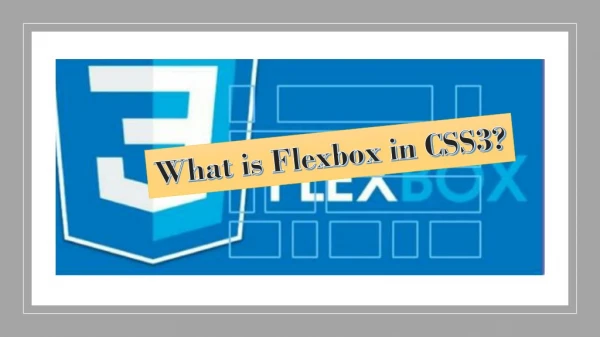
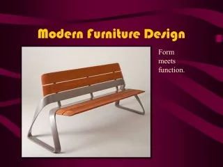
The Power of Flexbox<br>Flexbox is a one-dimensional layout model that allows you to arrange elements along a row or column, handling both distribution and alignment of space between items. Here are some key features and benefits of using Flexbox:

E N D
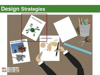
CSSFlexboxandGridLayouts:ModernDesignStrategies Intherealmofmodernwebdesign,CSSFlexboxandGridlayoutshaverevolutionizedhowdeveloperscreateresponsiveandvisuallyappealinginterfaces.Theselayoutsystemsprovidepowerfultoolstostructurecontent,alignelements,andadaptdesignsacrossdifferentscreensizes.Whetheryou'reaseasoneddeveloperorjuststartingwithwebdesign,understandingFlexboxandGridisessentialforcraftingwebsitesthatnotonlylookgreatbutalsoperformwellacrossdevices. ThePowerofFlexbox Flexboxisaone-dimensionallayoutmodelthatallowsyoutoarrangeelementsalongaroworcolumn,handlingbothdistributionandalignmentofspacebetweenitems.HerearesomekeyfeaturesandbenefitsofusingFlexbox: FlexibleContainer:Theparentelement(container)becomesaflexcontainerbysetting display:flex;,enablingyoutocontrolitschildelements(items)efficiently. Alignment:Flexboxprovidesstraightforwardalignmentoptions(justify-content,align-items,align-self)topositionitemswithinthecontainer,verticallyorhorizontally. ResponsiveDesign:Itsimplifiescreatingresponsivedesignsbyautomaticallyadjustingthelayoutbasedonavailablespaceandviewportsize. Ordering:Youcanrearrangetheorderofelementsvisuallywithoutchangingthesource order,usingtheorderproperty. Spacing:Easilymanagespacingbetweenitemsusingpropertieslikeflex-grow,flex-shrink,andflex-basis. Flexboxexcelsinlayingoutcomponentswithinasingledimension(eitherroworcolumn),makingitidealfornavigationmenus,cardlayouts,andcomponentsthatrequireflexiblesizing. HarnessingtheVersatilityofCSSGrid CSSGridtakeslayoutcontroltothenextlevelbyprovidingatwo-dimensionalgridsystem,offeringprecisecontroloverbothrowsandcolumns.Here’swhyCSSGridisagame-changer: GridContainer:Bysettingdisplay:grid;ontheparentelement,youestablishagridcontainerwhereyoudefinerows(grid-template-rows)andcolumns(grid-template-columns). AlignmentandSpanning:Gridallowsitemstospanmultiplerowsorcolumns(grid-columnandgrid-rowproperties)andoffersrobustalignmentcapabilities(justify-items,align-items,justify-self,align-self).
ResponsiveLayouts:SimilartoFlexbox,CSSGridfacilitatesresponsivedesignbyusingauto-fill,auto-fit,andminmax()functionstoadapttodifferentscreensizes.ResponsiveLayouts:SimilartoFlexbox,CSSGridfacilitatesresponsivedesignbyusingauto-fill,auto-fit,andminmax()functionstoadapttodifferentscreensizes. ComplexLayoutsMadeSimple:It’sperfectforcomplexlayoutslikemagazine-style grids,imagegalleries,andmulti-columnformswhereprecisecontroloveritemplacementiscrucial. NestedGrids:Gridscanbenestedwithineachother,allowingforintricatedesignsandhierarchicalstructures. CombiningFlexboxandGridforOptimalLayouts WhileFlexboxandGridarepowerfulontheirown,theyshinebrightestwhenusedtogether.Considerthesestrategies: FlexibilitywithFlexbox:UseFlexboxforsmaller-scalelayoutswithingriditems,suchasaligningcontentwithincardsorlistitems. GridforOverallStructure:EmployCSSGridforoverarchingpagestructure,likedefiningheader,maincontent,andfootersections. ResponsiveDesignHarmony:Combinebothlayoutstoachieveresponsiveharmony— FlexboxforitemswithinaflexiblegridstructureprovidedbyCSSGrid. ProgressiveEnhancement:StartwithGridformajorsectionsandenhancewithFlexboxwherefinercontrolorflexibilityisneeded. EmbracingModernDesignPractices Aswebdesigntrendsevolvetowardsmoredynamicandadaptivelayouts,masteringCSSFlexboxandGridlayoutsiscrucial.Thesetoolsnotonlysimplifythecreationofresponsivedesignsbutalsoempowerdeveloperstocraftvisuallycompellinganduser-friendlyinterfaces. Whetheryou’rebuildingaportfoliosite,ane-commerceplatform,oracorporatewebapplication,leveragingFlexboxandGridwillstreamlineyourdevelopmentprocessandelevatethequalityofyourdesigns.Embracethesemoderndesignstrategiestostayaheadintheever-changinglandscapeofwebdevelopment. ByharnessingthepowerofCSSFlexboxandGridlayouts,you’llnotonlyenhanceuserexperiencebutalsofuture-proofyourprojectsagainstthediversearrayofdevicesandscreensizesintoday’sdigitalworld.Happycoding! Inthisblogpost,we’vecoveredtheessentialsofCSSFlexboxandGridlayouts,highlightingtheirfeatures,benefits,andstrategiesforcombiningthemeffectively.Whetheryou'renewtowebdesignorlookingtoenhanceyourskills,understandingtheselayoutsystemswillempoweryoutocreatemodern,responsive,andvisuallyappealingwebsites.