APPLICATIONS FOR STRATEGIC ASSESSMENT, POLICY AND DECISION SUPPORT, MONITORING AND EVALUATION
310 likes | 688 Vues
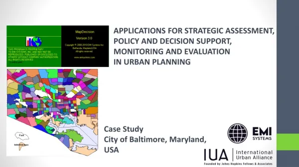
APPLICATIONS FOR STRATEGIC ASSESSMENT, POLICY AND DECISION SUPPORT, MONITORING AND EVALUATION IN URBAN PLANNING. Case Study City of Baltimore, Maryland, USA. STANDARDS. The purposes of assessing performance are:

APPLICATIONS FOR STRATEGIC ASSESSMENT, POLICY AND DECISION SUPPORT, MONITORING AND EVALUATION
E N D
Presentation Transcript
APPLICATIONS FOR STRATEGIC ASSESSMENT, POLICY AND DECISION SUPPORT, MONITORING AND EVALUATION IN URBAN PLANNING Case Study City of Baltimore, Maryland, USA
STANDARDS The purposes of assessing performance are: a) to identify, problems, directions and policies to increase the general performance over time, and b) to increase equity and/or equality, by bringing lower performers to the level of better performers. The user can: - set benchmarks and standards of performance according to sector policies; - change them dynamically on the screen to respond to immediate priorities; - compare performance against standards for several time periods.
Standards Indicator: population over 75 years of age (Census 2010) Indicator: population density per square kilometer (Census 2010)
Standards Indicator: percentage of population below poverty level (ACS 2014) Indicator: percentage of households with more than 5 members (ACS 2014)
RANKING COMPOSITE INDICES The system allows the user to describe an entire aspect or problem by developing indices or composites, as weighted sums of standardized values of selected indicators.
RANKING COMPOSITE INDICES By ranking, grouping and plotting the municipalities, neighborhoods, statistical areas, census tractson the map, MapDecision allows the user to identify problems. Individual report cards produced for each case show the specific sector problems of the cases in point. Units (municipalities, neighborhoods, statistical areas, census tracts) are ranked and grouped according to the values of the composite index. The groups are color coded like traffic lights: green is good, red is bad, and yellow is an intermediary situation.
Population education level index – ranking and mapping Index composition: ACS 2014 Legend: Green and light green – census tracts with higher values of the index (population with higer education level) Yellow – census tracts with average values of the index (population with average education level) Brown and red – census tracts with lower values of the index (population with lower education level)
Ranking the spatial units - report cards Report cards are generated for each census tract. They allow the user to compare the territorial units (in this case census tracts) in a SWOT (strength, weaknesses, opportunities and threats) strategic assessment approach.
Population education index – Report card Legend: The values displayed in green or red on each card are standardized, so the card shows for each variable selected whether the case has a value above or under the mean for all cases. Green shows a relative strength of a case in comparison with the other cases for the respective variable. Red shows a relative weakness of a case in comparison with all the other cases.
Population education index Comparing report cards – Baltimore census tracts Comparing 3 neighboring census tracts in Baltimore: the first ranking 7 in the index hierarchy (green on the map), the second ranking 87(yellow on the map) and the last one ranking 183 (brown on the map). The length and the color of the bars in the report cards bars suggests explanations for the position in the hierarchy, highlighting the strengths and weaknesses of each territorial unit.
Dwellings and housing index – ranking and mapping Index composition: ACS 2014 Legend: Green and light green– census tracts with higher values of the index (better housing conditions) Yellow – census tracts with average values of the index (average housing conditions) Brown and red – census tracts with lower values of the index (poor housing conditions)
Dwellings and housing index Comparing report cards – Baltimore census tracts Comparing 3 neighboring census tracts in Baltimore: the first ranking 33 in the index hierarchy (green on the map), the second ranking 109 (yellow on the map) and the last one ranking 191 (brown on the map). The length and the color of the report cards bars suggests explanations for the position in the hierarchy, highlighting the strengths and weaknesses of each territorial unit.
Income /earnings index – ranking and mapping ACS 2014 Index composition: Legend: Green and light green – census tracts with higher values of the index (higher earnings) Yellow - census tracts with average values of the index (average earnings) Brown and red - census tracts with lower values of the index (lower earnings)
Buildings situation index Comparing report cards – Baltimore census tracts Comparing 3 neighboring census tracts in Baltimore: the first ranking 27 in the index hierarchy (green on the map), the second ranking 81 (yellow on the map) and the last one ranking 197 (brown on the map). The length and the color of the report cards bars suggests explanations for the position in the hierarchy, highlighting the strengths and weaknesses of each territorial unit.
Vulnerability index – ranking and mapping Index composition: Census 2010 & ACS 2014 Legend: Green and light green – census tracts with higher values of the index (areas with the lowest level of vulnerability) Yellow – census tracts with average values of the index (areas with average level of vulnerability) Brown and red – census tracts with lower values of the index (areas with the higher level of vulnerability)
Vulnerability index Comparing report cards – Baltimore census tracts Comparing 3 neighboring census tracts in Baltimore: the first ranking 6 in the index hierarchy (green on the map), the second ranking 41 (yellow on the map) and the last one ranking 193 (brown on the map). The length and the color of the report cards bars suggests explanations for the position in the hierarchy, highlighting the strengths and weaknesses of each territorial unit.
ANALYZING RELATIONSHIPS MapDecision helps the user understand the relationships between inputs and outcomes. The RELATE procedure computes and displays the simple correlation between selected variables.
CORRELATION PLOT Clicking on one cell in the correlation matrix displays the Correlation Plot of percentage of population with bachelor's degrees or above and per capita income (dollars).
EVALUATING PERFORMANCE MapDecision allows the user to evaluate performance against inputs (human and financial resources) in the specific socioeconomic and demographic environment. The concept is that of a “black box” where inputs and outputs shed light on the process. The system identifies over-performers and under-performers. If a census tract ranks low in social environment (education) or housing, yet it ranks high in achievement (lower percentages of population below poverty level), it is an over-performer.
EVALUATING PERFORMANCE Example of over-performer census tract: high ranking according to poverty rate (low percentage of population under the poverty level) and lower ranks in education, housing and age dependency ratio
INDICATORS RELATIONSHIPS ANALYSIS A multiple regression model provides insight into the relationships between various indicators. Explained variable: Percentage of population below poverty level • Explaining variables: child dependency ratio, percentage of population with bachelor’s degree or above, percentage of unemployed population, percentage of inactive population and per capita income.
PLAYING WHAT-IF SCENARIOS MapDecision supports the development of action plans for improving system performance by developing “what-if” scenarios based on the multiple regression model. For example, changing various inputs of the model can indicate the impact on lowering the value of percentage of population below poverty level.
TARGETING The analytical framework supports targeting of scarce resources at the units where the needs are greatest in the respective municipality. Quadrant analysis is used for targeting based on two criteria, and a more general query procedure allows targeting based on any number of criteria. Quadrant analysis can also be used in identifying the under-performing and over-performing territorial units (e.g. territorial units with “local conditions” below average but results above average)
Targeting interventions - Baltimore • According to percentage of population below the poverty level and child dependancy ratio Targeting the most disadvantaged areas Highlighted on the map in magenta are the census tracts with both indicators, percentage of population below the poverty level and child dependency ratio, above the average
INDEX-BASED RESOURCE ALLOCATION MapDecision helps address equity issues by supporting index-based resource allocation to direct resources to the territorial units where the needs are highest. The procedure allows an initial “proportional allocation” (e.g. per capita) to be adjusted in accordance to an index of need developed in consensus by the stakeholders. For example, in the next scenario census tracts receive between 200 USD and 421.79 USD per inhabitant. The resulting allocations are shown in the next slide.
Procedure RESOURCE ALLOCATION
If a different range of per inhabitant allocations is agreed on, a new allocation scenario develops automatically.
The resource allocation procedure in MapDecision allows playing realistic allocation scenarios, including set-aside amounts for discretionary allocations, and manually changing the computed amounts for census tracts where other resources have been made available, etc.
EXPLORING LOCAL TRADE-OFFS Several procedures allow the user to identify possible local trade-offs of strengths between neighboring census tracts. The purpose of this function is to promote local dialogue and transparency, to empower local units, tap local resources and decrease their dependency on the center.
EXPLORING LOCAL TRADE-OFFS Green – census tracts that can be potential donors of resources Red – census tracts that can be potential receivers of resources Legend: