
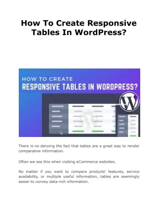
How to Create a Responsive Website
Building a responsive website entails planning and constructing a website that adapts to multiple screen sizes and devices to provide the best user experience possible. This necessitates the use of adaptable layouts, pictures, and media queries, as well as the optimization of the website's speed for quicker loading times. Website owners may improve their website's accessibility, usability, and search engine rankings by prioritizing responsiveness.


How to Create a Responsive Website
E N D
Presentation Transcript
HOW TO CREATE A RESPONSIVE WEBSITE http://cacms.in +91 82880 40281
1. PLAN YOUR DESIGN Before you begin designing your website, create a wireframe or preliminary layout. Determine the important elements, such as the header, footer, navigation menu, and content sections. http://cacms.in +91 82880 40281
2.USE A RESPONSIVE DESIGN FRAMEWORK A responsive design framework is a collection of pre-designed templates, styles, and scripts that can assist you in swiftly creating a responsive website. Bootstrap, Foundation, and Materialize are some popular responsive design frameworks. http://cacms.in +91 82880 40281
3.MAKE USE OF A RESPONSIVE DESIGN TEMPLATE A responsive design template is a pre-designed website that you can personalise with your own content and branding. Many website builders have responsive design templates, making it easy to construct a responsive website without knowing how to code. http://cacms.in +91 82880 40281
4.UTILIZE CSS MEDIA QUERIES CSS media queries allow you to create distinct styles for different screen sizes. For example, you can configure the font size and layout for a desktop screen and then adapt it for a smaller mobile screen. http://cacms.in +91 82880 40281
5.OPTIMIZE PHOTOS AND VIDEOS BIG IMAGES AND VIDEOS CAN SLOW DOWN THE LOADING PERFORMANCE OF YOUR WEBSITE, MAKING IT LESS RESPONSIVE. COMPRESS AND REDUCE THE FILE SIZE OF PHOTOS AND VIDEOS TO OPTIMISE THEM. http://cacms.in +91 82880 40281
6.TEST YOUR WEBSITE MAKE SURE YOUR WEBSITE APPEARS AND PERFORMS PROPERLY ON MULTIPLE DEVICES AND SCREEN SIZES. YOU CAN ALSO USE ONLINE TOOLS LIKE GOOGLE'S MOBILE- FRIENDLY TEST AND PAGESPEED INSIGHTS TO TEST THE RESPONSIVENESS AND LOADING SPEED OF YOUR WEBSITE. http://cacms.in +91 82880 40281
By following these steps, you can create a responsive website that looks great and functions well on different devices. THANK YOU http://cacms.in +91 82880 40281


