Responsive Web Design OR Mobile Web Apps
Ready to make your website happen? But stuck between Responsive web design & mobile web application solutions? Just be worry free, read this whitepaper and determine the best solution. https://biztechconsultancy.com/blog/whitepaper/responsive-web-design-mobile-web-apps/

Responsive Web Design OR Mobile Web Apps
E N D
Presentation Transcript
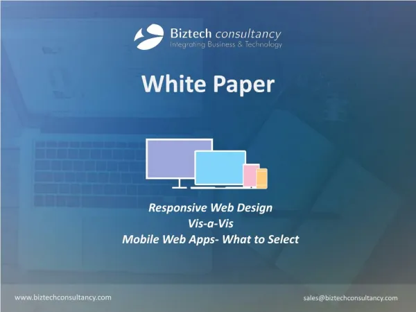
White Paper Responsive Web Design Vis-a-Vis Mobile Web Apps- What to Select www.biztechconsultancy.com sales@biztechconsultancy.com
Dramatic Facts 80% About 80% of internets users have Smartphones! (Source: gartner) 59% Mobile data traffic constitutes 59% in 2015! (Source: gartner) 60% Video streaming accounts for over 60% of mobile data traffic in 2018 (Source: gartner) White Paper by www.biztechconsultancy.com 2
Executive Summary This whitepaper intend to deliver solution for enterprises that are uncertain about what to select – responsive web design or mobile web apps for their business! This paper offers a comparative analysis of these two approaches and also illustrates the pros and cons of both the business models. It will help enterprise to reach a conclusion, which theory to embrace based on several factors defined in this paper, and of course given the business vertical needs! White Paper by www.biztechconsultancy.com 3
Responsive Web Design or Mobile Web Apps “With unrelenting evolution of smart phones, frequent introduction of updated mobile OS versions, easy access to diverse mobile web apps and high speed broadband connectivity has immensely transformed the way consumers use their handheld device today.” Mobile devices and its usabilities have impacted every segment of personal as well as professional space. It is going to become the inseparable part of every life and business. Its ubiquitousness had encouraged businesses consider it as a revolution and they have started shifting from traditional business strategies to mobile strategies for their businesses. Here comes the real challenge for businesses – Responsive Web Design or Mobile Web Apps? What these approaches are and how it works? White Paper by www.biztechconsultancy.com 4
Device Driven Strategy - Mobile Web Apps “Till a few years back, when developers craft a website, it was largely designed considering bigger screen – laptops, desktops etc. in mind. But with the evolving trend of handheld devices, such development processes become difficult for the users to comply with. When any such website is opened in handheld device, view, navigation and browsing becomes tough as it requires adjustment, resizing and zooming in and out. This is when many businesses started thinking of creating something as cool as mobile web apps that requires no adjustment and meant dedicatedly to browse websites through mobile devices.” Having a mobile version of your business can be a great idea! This is what most businesses are looking for considering the consumers’ availability online widely through mobile devices. It is a versions of your website that can be accessed via mobile or tablet. The major benefits that mobile version of website offers is, it gives a completely optimized view of your website in any of the handheld devices. As mobile web app is the fusion of versatility of web and features of touch-enabled devices, it offers the most rewarding benefits of a regular mobile, which runs well in diverse browsers and devices. At the same time it’s compatible with nearly all smart phones thus reaching our wider spectrum of audience. White Paper by www.biztechconsultancy.com 5
All in One – Responsive Web Design “Responsive web design has already reached the heart of every business! It is a methodology that supports such a design and configuration of website that can easily adjusts with any screen size, orientation or OSs, be it big screen or handheld devices. It adjusts with the different screen sizes and operating systems and still provides a clear and optimized view of the website.” With the switching of devices, i.e. from PC to iPhone, the website will automatically adjust with the resolution and image sizes. There will not be any need to resize, zoom in or out by the users. White Paper by www.biztechconsultancy.com 6
Comparative Analysis of Mobile Web App Vs Responsive Web Design Principles Mobile App (MA) Responsive Web Design (RWD) Access Speed Very fast Fast App Store Available Not necessary Approval Process Some are mandatory None Content Versions Multiple URLs/versions for each page, i.e., content forking Same content regardless of device or platform Development Cost Expensive to very expensive Moderate to reasonable Features Phone features, location services, camera, etc... Limited phone features Functionality Some functions may be omitted from the mobile application All functions of original site remain Internet Connection Available offline Required Monetization Easily monetized Not as easy to monetize Optimized to mobile device Best Good User Access After installation and some user configuration/interaction Through browser with little to no user configuration/interaction Implementation Time Less Time Longer Development Cycle Versions Two Separate Versions – for mobile and website Single Version- website that can optimized across mobile devices Design Approach Requires specialized knowledge Straightforward if you know your needs User Experience Better user experience as build for mobile device Not as great user experience as mobile app as designed for website that can optimize across mobile devices White Paper by www.biztechconsultancy.com 7
Responsive Web Design – Most Suitable Scenarios Usually, responsive web design is ideal for business having informational website, wherein the information, which is in the right side of the desktop app is shifted to bottom of the page when browsed through mobile devices. News/Media Websites: Such websites require scrolling from top to bottom. These are text heavy sites, which require frequent updates and may become expensive if separate mobile technology is used for design. Responsive web design works well for quick access and easy update. Blogs/Corporate Website: Brand consistency is important for such sites and the website that works well on desktop and mobile devices maintaining the consistency of brand becomes easy. Location Driven Solutions: Direction finder solutions are mostly image heavy. In such websites viewing routes and locations closely by zooming and adjusting the screen using fingers is necessary, which is easily possible by responsive web design. If you fall within above business types, responsive web design is the solution! White Paper by www.biztechconsultancy.com 8
Limitations of Responsive Web Design Like any other technology, responsive web design also has its own limitations that often push businesses to mobile web apps! User Experience is Mediocre Compare to Mobile Web Apps: Responsive web design can optimize the user experience but as it has to account for several devices it cannot offer the quality of experience that mobile device can offer. Responsive design would require more time and effort to provide the improved user-experience. Comprehensive Development Cycle: Designing a responsive website design takes longer time and effort than building simple web pages. Redesigning any website to make it responsive adds to the complexity. Building responsive web pages require lot of factors to consider like prioritizing content and images to avoid missing any vital text. All these complexities make responsive website less compelling! If the above factors - rich user experience, horizontal navigation and faster development time are your priority, you need to embrace Mobile Web App approach. White Paper by www.biztechconsultancy.com 9
Mobile Web Apps – The Right Scenario High quality user experience is the priority for consumers, at which a mobile web app is the bests. Easy to navigate, seamless transaction are the core to any mobile web app. Following are the priorities that can push any business to embrace mobile web apps: Accurate Layout, Content and User Preference: The mobile web experience is different from big screen experience. For businesses where quality user experience is most crucial, an individual layout can make the entire difference. It mostly involve left to right scrolls to view the catalogue with right content in place. It is easily possible in a mobile web application. Iterative Deployment of Mobile Service: Mobile services must be built on user experience and preferences to offer optimal user experience. The design and deployment should be in an iterative manner to reach perfection and frequent changes. This type of deployment is preferably done in mobile service. Considering above facts, Mobile Web Apps are the right approach! White Paper by www.biztechconsultancy.com 10
Selecting the Right Solution Responsive web design is the buzz word with a vision to offer optimal view across multiple devices but can it meet the emerging challenges of mobile world? It depends what you want to achieve from your website and online business! Single code base, easy maintenance and single website with improved SEO are the offerings that responsive web design brings in whereas improved user experience, low performance risk and faster implementation are the qualities mobile web apps ushers in. Thorough planning and best understanding of the users’ preferences is the key that can help you decide the desired approach to embrace, when it comes to selecting the right design model to build your website. If you want to give your customers greater user experience, better performance, faster deployment and flawless transaction mobile web app is the answer. If you’re happy with the solutions that is easy to maintain, features within your control than responsive web design is the solution for you. White Paper by www.biztechconsultancy.com 11
302, Shridhar Complex, Near Sardar Patel Statue, Naranpura, Ahmedabad - 380013. Gujarat, India. www.biztechconsultancy.com sales@biztechconsultancy.com +91-987-962-2024