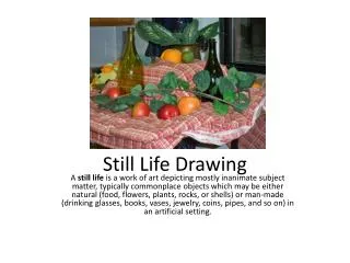
STILL LIFE
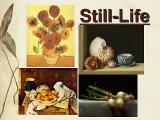
STILL LIFE Examples of Impressionist Still Life Painting Still Life with Apples and Oranges by Paul Cezanne Sunflowers by Van Gogh PAUL CEZANNE

STILL LIFE
E N D
Presentation Transcript
Examples of Impressionist Still Life Painting Still Life with Apples and Oranges by Paul Cezanne Sunflowers by Van Gogh
PAUL CEZANNE Paul Cezanne exhibited with the Impressionists as a young man but went on to develop his own style. As he said himself, he wished “to turn Impressionism into something more solid and enduring, like the art of museums”.
Still Life 1878 by Paul Cezanne In this painting Cezanne has used everyday objects: fruit, napkin, wine glass, knife, bowl. He has composed the arrangement with care to create a balanced piece of work (the same objects can be seen in many of his other paintings) Throughout the painting Cezanne has chosen to stress certain points to create balance. As you study the painting, parts advance and retreat optically. This is due to stressing some outlines and using the effects of hot and cold colours (hot colours advance, cold recede, thus creating depth) Oil Paint on Canvas (46cm x 55cm)
The objects have gravity and weight. Cezanne was interested in the relationship of colour to modelling. He used the contrasting effect of hot and cold colours. The apples are done in OPPOSITE colours of red and green. The background and wooden table are done in opposites of orange and blue but are duller and darker The knife is placed to keep your attention towards the centre. It acts a bit like an arrow. It also tells you that there is a solid shape underneath. Take it away and the white cloth would look like a slope. The white bowl is stretched to the left to fill a space. It has an ellipse that is not drawn to the correct perspective which would have been too delicate and thin for the rest of the forms. The wine glass is treated in the same way. At these points there are areas of extremely dark tones. Cezanne uses them to balance the composition, weighing them against the whites. The tabletop is tilted forwards so that all the objects come into view. It also slopes down slightly from left to right.
BRUSHSTROKES: the objects are painted with visible short slanting brushstrokes, all going in the same direction. They are not curving expect to show the roundness of the fruit as you might expect. The brushstrokes unify different areas of the painting and give solidity and weight to the objects. TONES: range from white through to black. The white cloth and bowl have greys applied using the wet into wet method of using paint. White shows off the coloured fruit wonderfully. The contour down the left hand side of the bowl is strengthened with a black line to emphasise the shape, making it one of the important elements in the painting. The bowl and stand are placed on the golden section, vertically and horizontally, so that the composition is visually pleasing. Golden Section (ratio 3:5)
CUBISM Cubism was a movement in painting developed by PICASSO and BRAQUE from about 1907 and recognised as one of the great turning points in Western art. Cubism made a radical break from the idea of art as the imitation of nature that had dominated European painting since the 16th Century. Picasso and Braque aimed to depict objects as they are known, rather than as they appear at a particular moment and place. To this end, they broke down the subjects they represented into a multiplicity of facets, rather than showing them from a single, fixed viewpoint, so many different aspects of the same object could be seen simultaneously.
The two most important influences of Cubism were African sculpture and the later paintings of Cezanne. Picasso and Braque’s work up until 1912 is generally known as ANALYTICAL CUBISM. In this phase of the movement forms were analysed into predominantly geometrical structures and colour was extremely subdued. In a second phase, known as SYNTHETIC CUBISM, colours became much stronger and shapes more decorative with elements such as stencilled lettering and pieces of newspaper which were introduced into paintings. Cubism was the principle source of ABSTRACT ART.
Still Life before an Open Window by Juan Gris Violin and Palette by Georges Braque
Still Life with Chair Caning 1912by Pablo Picasso
“Still Life with Chair Caning” was one of several oval Still Lives that Picasso painted in 1912. He liked to work on several paintings at the same time. He framed two of them with rope. The rope also draws attention to the collage within the work. It could also suggest the raised edge of a café table. The rope frame is quite yellow in colour. It helps to emphasise the touches of yellow found here and there throughout the painting. Picasso described Cubism as “an art dealing primarily with forms”. Cubism tried to dislocate space and the forms of objects to create an overall pattern where perspective is done away with. In this painting the Still Life objects are not easily made out, they are depicted from several viewpoints, not one. This painting is famous for being the first to incorporate collage*. Picasso has stuck down a piece of oil cloth patterned with a wickerwork design. This creates the illusion of a chair. It is also the first time lettering is a key element. (*The French verb “coller” means “to glue”) Oil Paint and Oil Cloth on Canvas (27cm x 35cm)
The colour scheme is extremely limited. Picasso uses a range of ochres (yellow-brown) and siennas (reddish-brown). Black and white are also used so there is a wide tonal range from light to dark. A small amount of lemon yellow has been used to represent a sliced lemon. The shape of a wine glass is shown in a fragmented way, as if seen through broken glass. Newspaper letters seem to be painted free hand without stencils. They are the darkest tones. Lines of different thicknesses appear throughout the composition to show the contours of the objects. The lines are grey, black and blue-grey. The collaged oil cloth is merged with the rest of the painting by exaggerated horizontal brushstrokes which seem to show the edge of a café table. The vase and shadow of a wine glass are also placed across it using diagonals. (Oil cloth is like the plastic covered cloth used today instead of fabric tablecloths. It is easily cleaned) A scallop shell is done using an IMPASTO technique (thick, non-transparent paint). The paint is built up in layers with a thick layer of white paint on top of ochre. A black line of paint is drawn with a brush to convey the scallop.
Examples of Colourist Still Life Paintings Still Life with Tulips and Oranges by Samuel Peploe Roses in a Chinese Vase with Lustre Teacup by F. C. Cadell
Still Life 1913by Samuel John Peploe
This is a highly structured and geometric composition. Balance is achieved by creating a triangle of objects from a small cup and saucer to a tall wine bottle. The triangle formation is mirrored and emphasised in the angular cushion behind the wine bottle, along with a series of triangular shapes which form the background pattern. Geometric shapes enhance a sense of organisation and give a manufactured look to the composition. The strong emphasis on line and shape make this painting piece together like a jigsaw and is likely to have been influenced by Cubism, a movement that distorts traditional compositions into flat, disjointed areas. Hard outlines are used to emphasis the structure of the objects. This results in the objects appearing more 2 dimensional and creates a unified painting that explores shape, pattern and colour. The lines help to simplify the form of the objects making them bold and angular. The depth of this painting is fairly shallow since the background is highly patterned and a steady black line surrounds many of the objects. The scale and positioning of the objects, combined with the artist’s use of colour provide the depth in this painting.
The fruit bowl is a main focal point since the colour of the fruit allows it to stand out against the blue and white bowl. However, the jug and bottle, because of their central positioning, draw your eye towards them. The eye moves from the small teacup, upwards over the bowl and jug,towards the top of the painting via the wine bottle. The painting stops before we see the top of the bottle which acts as a full stop or dead end. This could be seen as an awkward area of the painting, however it serves to push our gaze to the opposite side of the painting where we see a flower and flowing patterned drape. To the left of this we meet up with the teacup and saucer. A variety of blues and greens, with the inclusion of reds and yellows, are used in this painting. The warm colours of the fruit stand out against the cool background colours. Red and green are used next to each other and create a striking area of interest at the bottom of the painting. The use of complimentary colours helps the overall impact and vibrancy. Planes of flat colour, with hardly any variation of surface texture, create a unified surface across the painting. For example, the bottle appears to be a similar texture to the fruit. Dark, bold outlines create the form of the objects which add to a sense of flatness that is hardly interrupted by the appearance of brushstrokes.