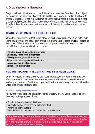
Drop Shadow
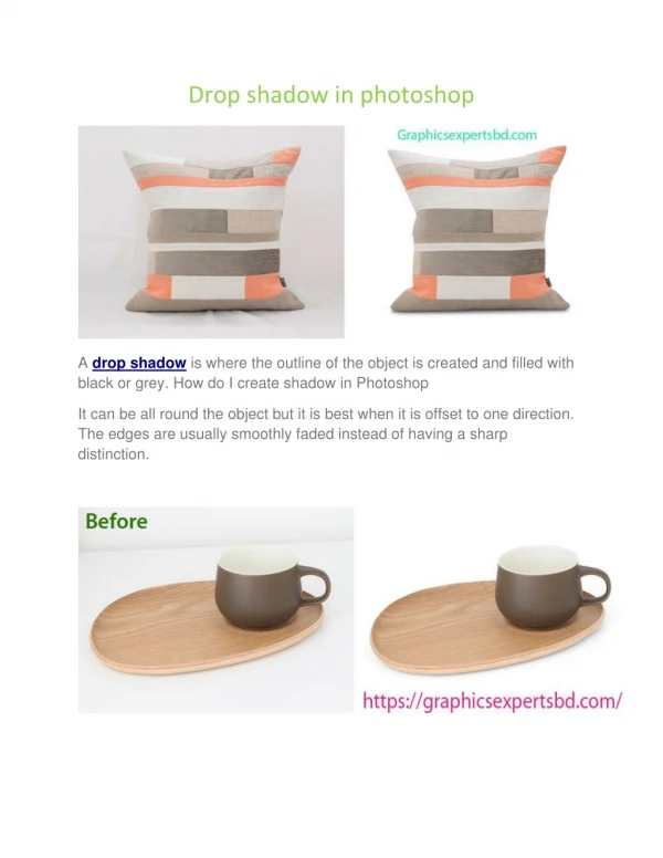
Drop shadow is a graphical effect that creates a sense of depth by adding a darkened or colored shadow below an object. It's often used to make text or images appear to be raised off the background. The intensity, color, and angle of the drop shadow can be adjusted to achieve different effects.

Drop Shadow
E N D
Presentation Transcript
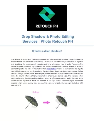
Drop Shadow & Photo Editing Services | Photo Retouch PH What is a drop shadow? Drop Shadow: A Visual Depth Effect A drop shadow is a visual effect used in graphic design to create the illusion of depth and dimension. It's essentially a darkened or colored outline placed behind an object or text, simulating the appearance of a shadow cast by a light source. How it works: Placement: The shadow is usually positioned slightly behind and below the main object, creating a sense of distance. Color and Opacity: The color of the shadow often Drop Shadow matches or complements the object's color, while its opacity can vary depending on the desired level of depth. A darker, more opaque shadow creates a stronger sense of depth, while a lighter, more transparent shadow can be more subtle. Blur: To mimic the natural diffusion of light, drop shadows often have a blurred edge. This creates a softer transition between the object and its shadow, making the effect more realistic. Angle: The angle of the shadow can be adjusted to match the direction of the light source. A shadow angled downwards suggests a light source coming from above, while a shadow angled sideways might indicate a light source from the side.
How does drop shadow work? Drop Shadow: A Visual Illusion A drop shadow is a visual effect that creates the illusion of depth by casting a shadow below an object. It's a common technique used in graphic design, photography, and even real-world applications like stage lighting. How Does It Work? Light Source Identification: The first step is to determine the position of the primary light source. This affects the direction and intensity of the shadow. Shadow Creation: A shadow is created by blocking light. The object itself acts as a barrier, preventing light from reaching the surface below. Shadow Shape and Intensity: The shape of the shadow is determined by the shape of the object and the Drop Shadow angle of the light source. A larger object will cast a larger shadow, while a smaller object will cast a smaller one. The intensity of the shadow depends on the brightness of the light source and the distance between the object and the surface. Offset and Blur: To create a realistic drop shadow, the shadow is typically offset slightly below and to the side of the object. This simulates the natural behavior of shadows in the real world. Additionally, blurring the edges of the shadow can help to soften the transition between the object and its shadow, making it appear more natural. Key Factors Influencing Drop Shadows Light Source Direction: The direction of the light source determines the angle and position of the shadow. Shadow Color: The color of the shadow can be adjusted to match the color of the object or to create a specific effect. Shadow Opacity: The opacity of the shadow controls its visibility. A more opaque shadow will appear darker and more defined, while a less opaque shadow will be more subtle. Shadow Blur: Blurring the edges of the shadow can create a softer, more realistic effect. Shadow Distance: The distance between the object and the shadow can affect the perceived depth and realism of the image.
Does drop shadow work on all backgrounds? Drop shadows and Background Compatibility Drop shadows are a popular design element used to create depth and dimension in digital designs. They are essentially a darker, blurred outline of an element that appears to be cast onto a surface. While drop shadows can significantly enhance the visual appeal of a design, their effectiveness can vary depending on the background they are placed against. Ideal Backgrounds for Drop Shadows: Solid Colors: Solid backgrounds provide the Drop Shadow cleanest and most consistent canvas for drop shadows. The contrast between the dark shadow and the plain background creates a strong sense of depth. Gradients: Gradients, especially those with a subtle transition between colors, can also be a good backdrop for drop shadows. The shadow can blend seamlessly with the gradient, creating a more organic and integrated look. Textures with Low Contrast: Textures with low contrast, such as subtle patterns or noise, can provide a suitable base for drop shadows. The shadow can be easily distinguished from the background without overwhelming the texture. Challenging Backgrounds for Drop Shadows: Busy Patterns: Highly detailed or complex patterns can make it difficult for drop shadows to stand out. The shadow might blend in with the pattern or create visual clutter. High-Contrast Images: Images with strong contrast between light and dark areas can interfere with the visibility of drop shadows. The shadow might be obscured by the brighter parts of the image. Transparent Backgrounds: Drop shadows might not appear as intended on transparent backgrounds. The shadow could bleed through the transparent areas, creating an unwanted effect. Tips for Using Drop Shadows Effectively: Consider the Overall Design: The effectiveness of a drop shadow depends on the overall context of the design.
What other effects can be combined with drop shadow? Combining Drop Shadows with Other Effects Drop shadows are a versatile design element that can enhance the appearance of text, images, and other elements. However, when combined with other effects, they can create even more visually striking and impactful results. Here are a few examples: 1. Bevel and Emboss: Bevel and emboss effects create a sense of depth and dimension by simulating raised or sunken surfaces. When combined with a drop shadow, the effect is amplified, making the element appear even more three-dimensional. For instance, applying a bevel and emboss effect to a button with a drop shadow can make it look like it's physically protruding from the page. 2. Inner Shadow: Inner shadows are created within the Drop Shadow boundaries of an element, giving it a hollow or recessed appearance. When combined with a drop shadow, you can achieve a layered or multi-dimensional look. For example, applying an inner shadow to a text box with a drop shadow can make it appear as if it's embedded in the background. 3. Gradient: Gradients are smooth transitions between multiple colors, creating a sense of depth and variation. Combining a gradient with a drop shadow can add a subtle or dramatic effect to an element. For instance, applying a gradient to a button with a drop shadow can make it appear to be illuminated from a specific angle. 4. Stroke: A stroke is a line drawn around the edges of an element. When combined with a drop shadow, it can create a more defined and outlined appearance. For example, applying a stroke to a text box with a drop shadow can make it stand out more clearly from the background. 5. Outer Glow: Outer glows create a soft, luminous effect around an element. When combined with a drop shadow, you can achieve a more ethereal or magical look. For instance, applying an outer glow to a text element with a drop shadow can make it appear to be glowing or emitting light. 6. Reflection: Reflections simulate the appearance of an element reflected in a surface.
How can drop shadow enhance typography? Enhancing Typography with Drop Shadows Drop shadows are a powerful tool in typography that can significantly enhance the appearance and readability of text. By creating a sense of depth and dimension, they can make text stand out from its background and attract attention. Here are some ways drop shadows can enhance typography: 1. Improving Readability: Contrast: Drop shadows can increase the contrast between the text and its background, making it easier to read, especially in low-light conditions or on complex backgrounds. Depth: The illusion of depth created by a drop shadow can help to separate the text Drop Shadow from its surroundings, reducing visual clutter and improving legibility. 2. Adding Visual Interest: Dimensionality: Drop shadows give text a three-dimensional appearance, making it more engaging and visually interesting. Emphasis: By strategically placing a drop shadow, you can emphasize specific words or phrases within a piece of text. Style: The choice of drop shadow color, opacity, and offset can significantly impact the overall style and tone of the typography. 3. Creating Hierarchy: Importance: Using drop shadows on headings or titles can visually differentiate them from body text, creating a clear hierarchy within a document. Emphasis: By applying drop shadows to key elements, you can draw attention to important information and guide the reader's eye. 4. Enhancing Branding: Consistency: Consistent use of drop shadows can contribute to a strong and recognizable brand identity. Recognition: A unique drop shadow style can help your typography stand out from competitors and be easily remembered. 5. Considerations for Effective Use: Context: The effectiveness of a drop shadow depends on the overall design context, including the background, font choice, and intended audience. Balance: Avoid overuse of drop shadows, as too many can create a cluttered and distracting effect.
How can drop shadow be used in logo design? Drop Shadows: Adding Depth and Dimension to Logos Drop shadows is a powerful tool in logo design, capable of adding depth, dimension, and visual interest to otherwise flat designs. By simulating the effect of light casting a shadow on an object, drop shadows can enhance the perception of a logo's three-dimensionality and make it stand out from its background. Here are some ways drop shadows can be used effectively in logo design: Creating Depth: By placing a drop shadow beneath an object, you can give it a sense of depth and make it appear as if it's raised above the surface. This technique is particularly effective for logos with intricate Drop Shadow designs or complex shapes. By casting a shadow on a particular shape or text, you can draw attention to it and make it the focal point of the design. Adding Dimension: Drop shadows can help to add dimension to flat logos. By creating a subtle shadow beneath the design, you can give it a more realistic appearance and make it seem less two- dimensional. Improving Readability: In some cases, drop shadows can help to improve the readability of text-based logos. By casting a shadow beneath the text, you can make it easier to read, especially on busy backgrounds offsetting the shadow slightly from the object, you can give it the appearance of being in motion. When using drop shadows, it's important to consider the following factors: Shadow Direction: The direction of the shadow should be consistent with the overall design and lighting of the logo. Shadow Color: The color of the shadow should complement the colors of the logo and create a harmonious overall appearance. Shadow Opacity: The opacity of the shadow should be adjusted to achieve the desired level of depth and dimension. Shadow Blur: The blur radius of the shadow can be used to control its softness and create a more natural-looking effect.
Can drop shadow be used in print design? Drop Shadows in Print Design: A Delicate Balance Yes, drop shadows can be used in print design, but with caution. While they can add depth and dimension to elements, they can also appear dated or distracting if not used judiciously. Here are some key points to consider: Print Quality: The effectiveness of a drop shadow heavily depends on the print resolution and quality. High-resolution printing can better capture subtle details and avoid pixilation. Paper Texture: The paper's texture can impact how the drop shadow appears. For example, a smooth paper may show the shadow more clearly than a textured one. Color Contrast: The Drop Shadow contrast between the element and its shadow should be sufficient to be visible without overwhelming the design. Design Style: Drop shadows can be a great fit for classic or vintage styles, but they may not be as effective in minimalist or modern designs. Purpose: Ensure the drop shadow serves a purpose, such as improving readability or adding visual interest. Avoid using them solely for decorative effects. When to Use Drop Shadows: To enhance readability: A subtle drop shadow can make text easier to read, especially on busy backgrounds. To create depth: Drop shadows can give elements out. To highlight key elements: Using a drop shadow on a specific element can draw attention to it. When to Avoid Drop Shadows: In minimalist designs: Drop shadows can clash with the simplicity of minimalist aesthetics. When they appear dated: Overuse of drop shadows can make a design look outdated. If they interfere with other elements: A poorly placed drop shadow can distract from the overall composition. In conclusion, drop shadows can be a valuable tool in print design when used thoughtfully. By considering factors like print quality, paper texture, color contrast, and design style, you can effectively incorporate them into your projects.
Website: https://retouchph.com/ Email: info@retouchph.com Price List: https://retouchph.com/pricing Phone: +8801723283638 Company Address: Majhira, Shajahanpur, Bogura-5801, Bangladesh.