Make Beautiful Tailwind Cards That Inspire Your Users - Blogs
0 likes | 19 Vues
Learn how to create cards with Tailwind CSS, add images and responsive designs, and showcase practical examples to inspire your next project.

Make Beautiful Tailwind Cards That Inspire Your Users - Blogs
E N D
Presentation Transcript
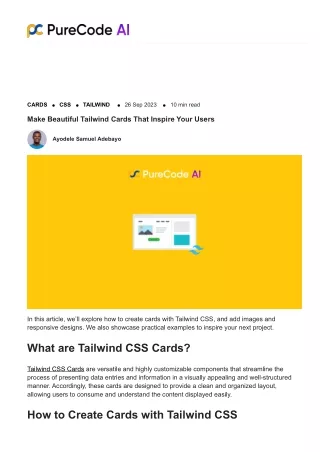
CARDS CSS TAILWIND 26 Sep 2023 10 min read Make Beautiful Tailwind Cards That Inspire Your Users Ayodele Samuel Adebayo In this article, we’ll explore how to create cards with Tailwind CSS, and add images and responsive designs. We also showcase practical examples to inspire your next project. What are Tailwind CSS Cards? Tailwind CSS Cards are versatile and highly customizable components that streamline the process of presenting data entries and information in a visually appealing and well-structured manner. Accordingly, these cards are designed to provide a clean and organized layout, allowing users to consume and understand the content displayed easily. How to Create Cards with Tailwind CSS
We can create a Tailwind Card by bringing multiple Tailwind CSS components together. So, we’re going to discuss some of the elements that make up a card in Tailwind CSS. The basic elements of a card include the following: Card container Card title Card description Card button Image Cover Create a Card Container The card container will be the wrapper of our card, and it’ll look something like the following: <div class="max-w-sm rounded-lg border border-gray-200 shadow"> ... </div> This ensures that our card won’t be bigger than the sm width and applies a border-radius of 8px, a gray border, a white background, and a shadow. Card Title Next, we’ll add a card title. A card title can be the product name, a user’s full name, or any title about the card’s content. However, there are some cards with optional header titles. <h2 class="mb-2 text-2xl font-bold tracking-tight text-gray-900"> Card Title </h2> Card Description The card description contains more context about the card item, such as a category, group, etc. This also allows the user to know more about the title of the card. <p class="mb-3 text-gray-700"> Card description </p> Card Button The card button allows us to create a CTA (call to action) within a card. Thus, this allows us to perform actions like add to cart or redirect the user to a product full page. <button class="rounded-lg bg-blue-700 px-3 py-2 text-center text-sm font-medium text-
white hover:bg-blue-800 focus:outline-none focus:ring-4 focus:ring-blue-300"> Card button </button> Card Outcome Now that we know how to create a button, by putting everything together, our final card code will look something like below: <div class="max-w-sm rounded-lg border border-gray-200 p-5 shadow"> <h2 class="mb-2 text-2xl font-bold tracking-tight text-gray-900">Card Title</h2> <div class="flex flex-col items-start"> <p class="mb-3 text-gray-700">Card description</p> <button class="rounded-lg bg-blue-700 px-3 py-2 text-center text-sm font-medium text-white hover:bg-blue-800 focus:outline-none focus:ring-4 focus:ring-blue-300">Card button</button> </div> </div> Our output will be as shown here: Tailwind Cards with Image Cover Cover images are an essential component of a blog post or profile card. We can use the following code snippet to add a cover image to a Tailwind card.
<div class="max-w-sm rounded-lg border border-gray-200 p-5 shadow"> <img src="https://via.placeholder.com/640x360" class="mb-2 rounded-lg" /> <h2 class="mb-2 text-2xl font-bold tracking-tight text-gray-900">Card Title</h2> <div class="flex flex-col items-start"> <p class="mb-3 text-gray-700">Card description</p> <button class="rounded-lg bg-blue-700 px-3 py-2 text-center text-sm font-medium text-white hover:bg-blue-800 focus:outline-none focus:ring-4 focus:ring-blue-300">Card button</button> </div> </div> Here, we’re only adding the img ta above the card title, this update will give us the following result. Tailwind Card Directions Tailwind cards can be designed as either vertical or horizontal, depending on your design requirements and breakpoints. In this section, we’re going to showcase the vertical and horizontal card directions. Horizontal Tailwind Cards Horizontal Tailwind cards are particularly well-suited for displaying content in a compact (child elements aligned horizontally) side-by-side layout. As a result, this makes them ideal for scenarios where you need to present multiple pieces of information or images in a concise and organized manner.
By arranging the card elements horizontally, you can optimize the use of available screen space. This ensures that your design remains visually appealing and user-friendly across a wide range of devices. To achieve this vertical arrangement, you can utilize the powerful Tailwind CSS utility classes such as flex, flex-row, or grid, which allow you to effortlessly control the direction and alignment of the card components. Vertical Tailwind Cards In contrast to the horizontal Tailwind cards, the vertical Tailwind cards are designed to flow from top to bottom, with child elements being aligned vertically. This layout is particularly useful for displaying content in a stacked manner, making it easier to read and comprehend.
To achieve this vertical arrangement, you can utilize the powerful Tailwind CSS utility classes such as flex, flex-col, or grid, which allow you to effortlessly control the direction and alignment of the card components. By Tailwind utility classes, you can create visually appealing and highly functional horizontal and vertical Tailwind cards that cater to your specific design requirements and breakpoints. How to make a responsive card in Tailwind CSS? To make a responsive card in Tailwind CSS, we can combine the knowledge of card direction with the device breakpoint classes i.e. The card will be vertical on smaller screens while the card will be horizontal on medium and large screens as demonstrated below.
The major breakpoint we’re using here is the md: utility class: medium screen size. You can learn more about the Tailwind breakpoints from here. <div class="flex h-screen items-center justify-center px-5"> <a href="#" class="flex flex-col items-center rounded-lg overflow-hidden border border-gray-200 bg-white shadow hover:bg-gray-100 md:max-w-xl md:flex-row"> <img class="w-full object-cover md:h-auto md:w-48 md:rounded-none" src="https://via.placeholder.com/640x360" alt="" /> <div class="flex flex-col justify-between p-4 leading-normal"> <h5 class="mb-2 text-2xl font-bold tracking-tight text-gray-900"> Introduction to React </h5> <p class="mb-3 font-normal text-gray-700"> React is a popular frontend library used for creating UI components. </p> </div> </a> </div> You can learn about the basics of Tailwind Flexbox from the tutorial video below.
Tailwind Card Group Hover Effects We can add a group hover effect on the card by using the Tailwind group utility classes, as demonstrated below. To achieve this, we’ll add the group class name to the card container and specify the changes we want to the card body. <div class="flex h-screen items-center justify-center px-5"> <a href="#" class="group flex flex-col items-center overflow-hidden rounded-lg border border-gray-200 bg-white shadow hover:bg-blue-50 md:max-w-xl md:flex-row"> <img class="w-full object-cover md:h-auto md:w-48 md:rounded-none" src="https://via.placeholder.com/640x500" alt="" /> <div class="flex flex-col justify-between p-4 leading-normal"> <h5 class="mb-2 text-2xl font-bold tracking-tight text-gray-900 group-hover:text- blue-400">Introduction to React</h5> <p class="mb-3 font-normal text-gray-700 group-hover:text-red-400">React is a popular frontend library used for creating UI components.</p> </div> </a> </div> Examples of Tailwind Cards?
Below, you will find a diverse range of Tailwind CSS card examples that indeed demonstrate the versatility and effectiveness of Tailwind Cards and their various applications. In any case, these examples showcase how developers can leverage the robust utility classes provided by Tailwind CSS to create visually appealing, responsive, and mobile-friendly cards that cater to a wide array of design needs and use cases. Some of these instances include but are not limited to: Displaying product information Presenting user profiles, and Featuring articles or blog posts. Product Detail Card With the utility classes offered by Tailwind CSS, you can effortlessly design and develop an eye- catching, responsive, and mobile-optimized Product Detail Card that caters to a diverse range of product design requirements and use cases. This advanced card solution is perfect for showcasing essential product information, such as product images, descriptions, pricing, and customer reviews or ratings, in an easily accessible and visually engaging manner as shown below. Source code: <div class="max-w-sm rounded-lg border border-gray-200 bg-white shadow"> <a href="#">
<img class="rounded-t-lg" src="https://via.placeholder.com/640x360" alt="sport foot wears" /> </a> <div class="p-5"> <a href="#" class="flex items-center justify-between"> <h5 class="mb-2 text-2xl font-bold tracking-tight text-gray-900">Sport foot wears</h5> <p class="font-semibold">$<span class="text-xl font-semibold">50</span></p> </a> <p class="mb-3 font-normal text-gray-700">Order sports wears in different colors and sizes from anywhere in the world.</p> <div class="flex items-center justify-between"> <a href="#" class="inline-flex items-center rounded-lg bg-blue-700 px-3 py-2 text-center text-sm font-medium text-white hover:bg-blue-800 focus:outline-none focus:ring-4 focus:ring-blue-300"> Add to cart <svg xmlns="http://www.w3.org/2000/svg" fill="none" viewBox="0 0 24 24" strokeWidth="{1.5}" stroke="currentColor" class="ml-2 h-5 w-5"> <path strokeLinecap="round" strokeLinejoin="round" d="M2.25 3h1.386c.51 0 .955.343 1.087.835l.383 1.437M7.5 14.25a3 3 0 00-3 3h15.75m-12.75-3h11.218c1.121-2.3 2.1-4.684 2.924-7.138a60.114 60.114 0 00-16.536-1.84M7.5 14.25L5.106 5.272M6 20.25a.75.75 0 11-1.5 0 .75.75 0 011.5 0zm12.75 0a.75.75 0 11-1.5 0 .75.75 0 011.5 0z" /> </svg> </a> <div class="flex items-center space-x-1"> <svg class="h-4 w-4 text-yellow-300" aria-hidden="true" xmlns="http://www.w3.org/2000/svg" fill="currentColor" viewBox="0 0 22 20"> <path d="M20.924 7.625a1.523 1.523 0 0 0-1.238-1.044l-5.051-.734-2.259- 4.577a1.534 1.534 0 0 0-2.752 0L7.365 5.847l-5.051.734A1.535 1.535 0 0 0 1.463 9.2l3.656 3.563-.863 5.031a1.532 1.532 0 0 0 2.226 1.616L11 17.033l4.518 2.375a1.534 1.534 0 0 0 2.226-1.617l-.863-5.03L20.537 9.2a1.523 1.523 0 0 0 .387-1.575Z" /> </svg> <svg class="h-4 w-4 text-yellow-300" aria-hidden="true" xmlns="http://www.w3.org/2000/svg" fill="currentColor" viewBox="0 0 22 20"> <path d="M20.924 7.625a1.523 1.523 0 0 0-1.238-1.044l-5.051-.734-2.259- 4.577a1.534 1.534 0 0 0-2.752 0L7.365 5.847l-5.051.734A1.535 1.535 0 0 0 1.463 9.2l3.656 3.563-.863 5.031a1.532 1.532 0 0 0 2.226 1.616L11 17.033l4.518 2.375a1.534 1.534 0 0 0 2.226-1.617l-.863-5.03L20.537 9.2a1.523 1.523 0 0 0 .387-1.575Z" /> </svg> <svg class="h-4 w-4 text-yellow-300" aria-hidden="true" xmlns="http://www.w3.org/2000/svg" fill="currentColor" viewBox="0 0 22 20"> <path d="M20.924 7.625a1.523 1.523 0 0 0-1.238-1.044l-5.051-.734-2.259- 4.577a1.534 1.534 0 0 0-2.752 0L7.365 5.847l-5.051.734A1.535 1.535 0 0 0 1.463 9.2l3.656 3.563-.863 5.031a1.532 1.532 0 0 0 2.226 1.616L11 17.033l4.518 2.375a1.534 1.534 0 0 0 2.226-1.617l-.863-5.03L20.537 9.2a1.523 1.523 0 0 0 .387-1.575Z" />
</svg> <svg class="h-4 w-4 text-yellow-300" aria-hidden="true" xmlns="http://www.w3.org/2000/svg" fill="currentColor" viewBox="0 0 22 20"> <path d="M20.924 7.625a1.523 1.523 0 0 0-1.238-1.044l-5.051-.734-2.259- 4.577a1.534 1.534 0 0 0-2.752 0L7.365 5.847l-5.051.734A1.535 1.535 0 0 0 1.463 9.2l3.656 3.563-.863 5.031a1.532 1.532 0 0 0 2.226 1.616L11 17.033l4.518 2.375a1.534 1.534 0 0 0 2.226-1.617l-.863-5.03L20.537 9.2a1.523 1.523 0 0 0 .387-1.575Z" /> </svg> <svg class="h-4 w-4 text-gray-300 dark:text-gray-500" aria-hidden="true" xmlns="http://www.w3.org/2000/svg" fill="currentColor" viewBox="0 0 22 20"> <path d="M20.924 7.625a1.523 1.523 0 0 0-1.238-1.044l-5.051-.734-2.259- 4.577a1.534 1.534 0 0 0-2.752 0L7.365 5.847l-5.051.734A1.535 1.535 0 0 0 1.463 9.2l3.656 3.563-.863 5.031a1.532 1.532 0 0 0 2.226 1.616L11 17.033l4.518 2.375a1.534 1.534 0 0 0 2.226-1.617l-.863-5.03L20.537 9.2a1.523 1.523 0 0 0 .387-1.575Z" /> </svg> </div> </div> </div> </div> Profile Detail Card Tailwind CSS provides utility classes that make it easy to construct a stylish profile detail card. You can showcase the image, name, role, and contact information of a user as shown below.
Source code: <div class="w-full max-w-md rounded-lg border border-gray-200 bg-white p-5 shadow"> <a href="#"> <img class="mx-auto rounded-t-lg" src="https://via.placeholder.com/640x360" alt="profile picture" /> </a> <div class="p-5 text-center"> <a href="#"> <h5 class="mb-2 text-2xl font-bold tracking-tight text-gray-900">Durojaye Felix Toba</h5> </a> <p class="mb-3 font-normal text-gray-700">Computer Scientist</p> <a href="#" class="inline-flex items-center rounded-lg bg-blue-700 px-3 py-2 text- center text-sm font-medium text-white hover:bg-blue-800 focus:outline-none focus:ring-4 focus:ring-blue-300"> Contact <svg xmlns="http://www.w3.org/2000/svg" fill="none" viewBox="0 0 24 24" stroke- width="1.5" stroke="currentColor" class="ml-2 h-5 w-5"> <path stroke-linecap="round" stroke-linejoin="round" d="M2.25 6.75c0 8.284 6.716 15 15 15h2.25a2.25 2.25 0 002.25-2.25v-1.372c0-.516-.351-.966-.852-1.091l-4.423- 1.106c-.44-.11-.902.055-1.173.417l-.97 1.293c-.282.376-.769.542-1.21.38a12.035 12.035 0 01-7.143-7.143c-.162-.441.004-.928.38-1.21l1.293-.97c.363-.271.527-.734.417-1.173L6.963 3.102a1.125 1.125 0 00-1.091-.852H4.5A2.25 2.25 0 002.25 4.5v2.25z" /> </svg> </a> </div> </div> Pricing Card A pricing card is a common component on websites offering premium services, we can easily build a pricing card using Tailwind CSS as shown below.
Source code: <div class="flex h-screen items-center justify-center px-5"> <div class="relative flex w-full max-w-[320px] flex-col rounded-xl bg-gradient-to-tr from-blue-600 to-blue-400 bg-clip-border p-8 text-white shadow-md shadow-blue-500/40"> <div class="relative mb-8 overflow-hidden rounded-none border-b border-white/10 bg- transparent bg-clip-border pb-8 text-center text-gray-700 shadow-none"> <p class="block text-sm uppercase leading-normal text-white antialiased">enterprise</p> <h1 class="mt-6 flex justify-center gap-1 font-sans text-7xl font-normal tracking- normal text-white antialiased"> <span class="mt-2 text-4xl">$</span>105 <span class="self-end text-4xl">/year</span> </h1> </div> <div class="p-0"> <ul class="flex flex-col gap-4"> <li class="flex items-center gap-4"> <span class="rounded-full border border-white/20 bg-white/20 p-1"> <svg xmlns="http://www.w3.org/2000/svg" fill="none" viewBox="0 0 24 24" stroke-width="2" stroke="currentColor" aria-hidden="true" class="h-3 w-3"> <path stroke-linecap="round" stroke-linejoin="round" d="M4.5 12.75l6 6 9- 13.5"></path> </svg> </span> <p class="block font-sans text-base font-normal leading-relaxed text-inherit antialiased">24hrs support</p> </li> <li class="flex items-center gap-4"> <span class="rounded-full border border-white/20 bg-white/20 p-1"> <svg xmlns="http://www.w3.org/2000/svg" fill="none" viewBox="0 0 24 24" stroke-width="2" stroke="currentColor" aria-hidden="true" class="h-3 w-3"> <path stroke-linecap="round" stroke-linejoin="round" d="M4.5 12.75l6 6 9- 13.5"></path> </svg> </span> <p class="block font-sans text-base font-normal leading-relaxed text-inherit antialiased">Streaming</p>
</li> <li class="flex items-center gap-4"> <span class="rounded-full border border-white/20 bg-white/20 p-1"> <svg xmlns="http://www.w3.org/2000/svg" fill="none" viewBox="0 0 24 24" stroke-width="2" stroke="currentColor" aria-hidden="true" class="h-3 w-3"> <path stroke-linecap="round" stroke-linejoin="round" d="M4.5 12.75l6 6 9- 13.5"></path> </svg> </span> <p class="block font-sans text-base font-normal leading-relaxed text-inherit antialiased">Access to beta features</p> </li> </ul> </div> <div class="mt-12 p-0"> <button class="block w-full rounded-lg bg-white px-7 py-3.5 text-center text-sm font-bold uppercase text-blue-500 shadow-md transition-all hover:scale-[1.02]" type="button">Continue</button> </div> </div> </div> Blog Post Card with Background Image In certain situations, it may be desirable for our blog postcard to feature a visually appealing background image, as demonstrated in the example provided below.
Source code: <div class="flex h-screen items-center justify-center px-5"> <a href="#" class="relative flex flex-col items-center overflow-hidden rounded-lg border border-gray-200 bg-white shadow hover:bg-blue-50 md:max-w-xl md:flex-row"> <div class="absolute inset-0 m-0 h-full w-full overflow-hidden rounded-none bg- transparent bg-[url('https://via.placeholder.com/640x400')] bg-cover bg-clip-border bg- center text-gray-700 shadow-none"> <div class="to-bg-black-10 absolute inset-0 h-full w-full bg-gradient-to-t from- black/80 via-black/50"></div> </div> <div class="relative z-10 flex flex-col justify-between p-4 leading-normal"> <h5 class="mb-2 text-2xl font-bold tracking-tight text-white">Introduction to React</h5> <p class="mb-3 font-normal text-slate-200">React is a popular frontend library used for creating UI components.</p> </div> </a> </div> Frequently Asked Questions About Tailwind Cards How do you use cards in Tailwind? Ans: Tailwind cards can be adapted to present user profiles, feature articles, or highlight blog posts, making it a highly versatile component for any modern web application. Is it worth using Tailwind? Ans: Yes, Tailwind CSS is worth using as it provides utility-first classes that you can combine with custom CSS. This makes building UI components very fast which is good for prototyping, and it is highly customizable to suit your needs. What is the grid card in Tailwind? Ans: Grid cards in Tailwind are cards built using the Tailwind Grid system. You can learn more about the Tailwind Grid system from here or watch a video tutorial below.
What are the cons of Tailwind? Ans: There is an initial learning curve to pick up all the utility classes, and the class names can become long and repetitive in the HTML, but overall the pros of Tailwind generally outweigh the cons for most use cases. Wrapping Up By utilizing the powerful utility classes offered by Tailwind CSS, developers can effortlessly create responsive, mobile-friendly, and aesthetically pleasing cards that cater to various design requirements and use cases, such as showcasing products, displaying user profiles, or featuring articles and blog posts. In this article, we took a look at what cards are and how they can be built using Tailwind CSS utility classes. Furthermore, are you looking for more Tailwind articles? Learn how to make great navbars to improve your users’ experiences, or how to change the background color for easy customization. We’re launching soon! Sign up to be notified when Purecode launches in October 2023. Generate thousands of responsive custom-styled HTML, CSS, Tailwind, and JS components with our AI assistant and customize them to match your brand. Share this: Ayodele Samuel Adebayo
More blogs CSS Why You Need to Use CSS Minification for Web Performance 01 Mar 2024 12 min read CSS Top CSS Shape Generator Tools That Will Make Your Life Easier 26 Feb 2024 12 min read CSS
Best CSS Background Generator Tools for Stunning Websites 26 Feb 2024 9 min read Tailwind Blogs Tailwind Dropdown Tailwind Cards Tailwind Config Tailwind Buttons Tailwind Breakpoints Tailwind Grid MUI Blogs MUI Typgraphy MUI Tooltip MUI Appbar MUI Stack MUI Slider MUI Select Bootstrap Blogs Bootstrap vs MUI