Responsive Web Design
What is the purpose of creating a responsive web design? The first and foremost reason is that the number of mobile users is growing abundantly by the minute. Smaller devices are more preferred as opposed to laptops and PCs. More than 80% of all the web traffic is from mobile devices. Hence, it is imperative that the website contents are scaled to match the screen size. This gives viewers an enhanced experience to read and use the contents.

Responsive Web Design
E N D
Presentation Transcript
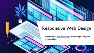
Responsive Web Design Prepared by - The AS Groups, Web Design Company in Hyderabad
Purpose of Responsive Web Design Website and its contents automatically scales to match the screen size on which it is viewed. Easy reading of contents by viewers. Enables Website Designer to create once and publish the same content everywhere, for all devices.
Components of Responsive Web Design Allow designers to specify different styles for specific browser and device circumstances. Media Query Changing the size of the media as the size of the viewport changes. Flexible grid to create the website layout that will dynamically resize to any width. Flexible Layouts Flexible Media
Changes Made With Flexible Images CSS3 Media Queries Layout and Text based on display size range Make everything fit in screen size Resize Images Design Style sheet Show or Hide Contents Custom Layout
Flexible Images Deliver Images at maximum utilised size Relative size values are set instead of fixed attributes Image Resolution and download Times are primary points considered
Custom Layout Structure For size changes, Layout is changed with: (OR) Separate Style sheet Through CSS Media Query
CSS3 Media Queries Min-Width and Max width properties handed Place all the queries in one CSS style sheet, with the rest of the styles for the website. Use Javascript as a back-up to devices that don’t support CSS3 media query options.
Show or Hide contents It is possible to shrink things proportionally and rearrange elements as necessary to make everything fit as a screen gets smaller.
Conclusion With Responsive Web design: We can create custom solutions for a wider range of users, on a wider range of devices. It gives better user experience. The entire design is a lovely mix of fluid grids, fluid images and smart mark-up where needed.
Thank You Website - https://www.theasgroups.com/ Contact Us: Address: H.. -4-117/2/, P.No.5, Kothapet, Rd Number 1, Ratna Nagar, New Maruthi Nagar Hyderabad, Telangana 500035, India Email: info@theasgroups.com, theasgroups@gmail.com Mobile Number: +91 9912266885

