Mastering Presentation Success: The Ultimate Checklist
This comprehensive guide covers essential steps for creating engaging and impactful presentations, from content to delivery, with valuable tips and resources.

Mastering Presentation Success: The Ultimate Checklist
E N D
Presentation Transcript
The Presentation Checklist Ben Watkins Winter 2003
The Presentation Checklist Ben Watkins Winter 2003
The Presentation Checklist Ben Watkins Winter 2003
The Presentation Checklist Ben Watkins Winter 2003
The Presentation Checklist Ben Watkins Winter 2003
The Presentation Checklist Ben Watkins Winter 2003
Objective and Agenda • Objective–presentations: what works, what doesn’t. More resources in backup... • Why? – more presentations are coming… • Agenda: • 5 steps to building a presentation • Presentation Checklist • Feedback • Additional resources Title Agenda Background Content Visuals Delivery Final Prep Checklist Backup
Background • Who will be attending? • How does your topic relate to the attendees? • Audience knowledge level? • How long do you need to speak? • What is the preferred presentation style? Electronic or paper? • Will there be Q&A session? Title Agenda Background Content Visuals Delivery Final Prep Checklist Backup
Content • “Getcha” at the beginning… • Tell them why they care – Relate. • Research. Research. • Have backup foils. • Identify appropriate visuals. Title Agenda Background Content Visuals Delivery Final Prep Checklist Backup
Visuals • Visual are important (prove it…) • Don’t over clutter – simplicity. • Choose good color scheme. • Cool over warm… • Be creative and original in your design • Avoid cliché visuals… • Limit sound. Title Agenda Background Content Visuals Delivery Final Prep Checklist Backup
Delivery • Composure & confidence • Voice • Volume, inflections, varied pitch • Passionate delivery • Animation • Humor • Eye contact to entire audience • Don’t read • The “Ums” Title Agenda Background Content Visuals Delivery Final Prep Checklist Backup
Final Preparation • Practice… a lot. • Technical considerations • Projector vs. overhead • Backup your file • Bring alternate formats • Bring notes And finally… • Go over Ben’s checklist… Title Agenda Background Content Visuals Delivery Final Prep Checklist Backup
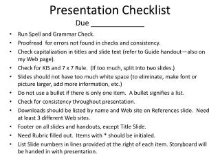
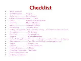
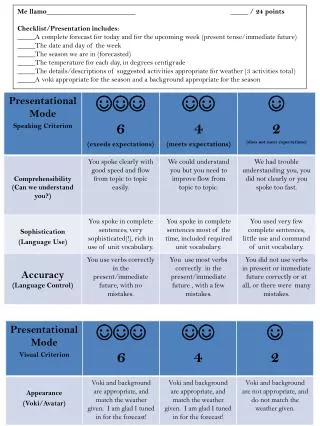
Background Analyze audience What is speech time allowed Layout of room Tools needed… Backup file on disc Battery charged on laptop Backup transparencies Q&A prep Content Clear objective Getcha at beginning Why they care - relate Good closure Sharp visuals Backup foils Proof read Print out Ben’s Presentation Checklist Visuals • Good color scheme • Minimum sounds • Limited animation • Simplicity • Avoid visual clichés Delivery • Confidence & composure • Eye contact • Animated, passionate. • Time fit • Clear voice – vary pitch, inflections • Don’t read • Appropriate vocabulary • Don’t look all the way back Title Agenda Background Content Visuals Delivery Final Prep Checklist Backup
Feedback Backup and additional resources… Title Agenda Background Content Visuals Delivery Final Prep Checklist Backup
Links… • Presenting Help • http://www.presentersonline.com • Powerpoint Tutorials & Tips • http://www.microsoft.com/office/powerpoint/default.asp • http://support.microsoft.com/default.aspx?scid=fh;en-us;ppt2002 • http://www.actden.com/pp/ • http://www.brainybetty.com/ADVPPT2003/Advanced%20PowerPoint%20Masters%20and%20Graphics.htm • http://www.brainybetty.com/tips_and_tricks.htm • http://www.brainybetty.com/ppthelp.htm • http://thorup.com/MTSU/powerpoint.html Title Agenda Background Content Visuals Delivery Final Prep Checklist Backup
More Links… • Brief Color Theory • http://www.colormatters.com/colortheory.html • http://hort.ifas.ufl.edu/TEACH/floral/color.htm • Wordsmith… • http://www.rhymezone.com/ • http://www.infoplease.com/ • Famous Quotes • http://www.quotationspage.com/ • Free photos • http://www.freefoto.com/ Title Agenda Background Content Visuals Delivery Final Prep Checklist Backup
Even More Links… • Image editing tips • http://www.colorcentral.com/tips-links/tips_links.html • Free image editing software • http://graphicssoft.about.com/cs/imageediting/tp/freephotoedw.htm Title Agenda Background Content Visuals Delivery Final Prep Checklist Backup
Using Color in Multimedia Presentations Does it really matter what background color to use in a presentation? Is there a certain color that communicates authority? What about a color that evokes loyalty? The answers are yes, yes, and yes. According to the Board Report of Graphic Artists, the right color selection can promote attention, evoke moods, create desire, and even generate a favorable response. So, the next time you want to convey confidence or create that certain mood, check out the color chart below to learn more about the meanings we commonly associate with different colors. Title Agenda Background Content Visuals Delivery Final Prep Checklist Backup
Top Ten Mistakes Made By Presenters! • No Presentation ObjectivesIf you don't know what your audience should do at the end of your presentation, there is no need for you to present. Knowing your objectives is the key to developing an effective presentation. • Poor Visual AidsVisual aids are designed to reinforce the main points of your presentation. Without effective visuals, you are missing a key opportunity to communicate with your audience. • Ineffective CloseClosing your presentation is extremely important. It is when you tie up your presentation and spell out what you want your audience "to do". A weak close can kill a presentation. • Mediocre First ImpressionAudiences evaluate a presenter within the first 120 seconds of your presentation. Presenters who make a bad first impression can lose credibility with their audience and as a result diminish their ability to effectively communicate the information in the presentation. • No PreparationThe best presenters prepare for every presentation. Those who prepare and practice are more successful in presenting their information and anticipating audience reaction. Practice does make perfect! • Lack of EnthusiasmIf you aren't excited about the presentation, why should your audience be? Enthusiastic presenters are the most effective ones around! • Weak Eye ContactAs a presenter, you are trying to effectively communicate with your audience to get your message across. If you don't make eye contact with the members in your audience, they will not take you or your message seriously. • No Audience InvolvementThe easiest way to turn off your audience is by not getting them involved in your presentation. Use audience involvement to gain their "buy-in". • Lack of Facial ExpressionsDon't be a zombie. Effective speakers use facial expressions to help reinforce their messages. • Sticky Floor SyndromeThere is nothing worse than a speaker who is glued to the floor. Title Agenda Background Content Visuals Delivery Final Prep Checklist Backup
Quick Powerpoint shortcuts *These tips are used when in full screen mode Title Agenda Background Content Visuals Delivery Final Prep Checklist Backup
go back Visuals are important Visuals are the best way to teach your audience. According to a recent University of California at Los Angeles study, 55% percent of what an audience learns comes directly from the visual messages seen during a presentation- compared to 38% from audio messages. By combining audio and visual presentation messages, presenters can ensure their objectives are met. Visuals increase the retention of messages. A Wharton Research Center study has shown that the retention rate of verbal only presentations is approximately 10%. However, when you combine visual messages with verbal communication, you increase the retention rate to nearly 50%. A 400% increase! Why not use visual aids to help you audience remember your message? Title Agenda Background Content Visuals Delivery Final Prep Checklist Backup
go back This is boring • I am now bored • I will no longer listen

