ITSC 2013 A/V Guide for a Podium Presentation
140 likes | 296 Vues
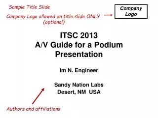
Sample Title Slide. Company Logo. Company Logo allowed on title slide ONLY (optional). ITSC 2013 A/V Guide for a Podium Presentation. Im N. Engineer Sandy Nation Labs Desert, NM USA. Authors and affiliations. Purpose. Sample Purpose Slide (required).

ITSC 2013 A/V Guide for a Podium Presentation
E N D
Presentation Transcript
Sample Title Slide Company Logo Company Logo allowed on title slide ONLY (optional) ITSC 2013A/V Guide for a PodiumPresentation Im N. Engineer Sandy Nation Labs Desert, NM USA Authors and affiliations
Purpose Sample Purpose Slide (required) • Review the standards for preparing presentation visuals for ITSC • Demonstrate the standards in a sample PowerPoint file • Provide the sample PowerPoint file as a model for creating your presentation Use Bold text on white (clear) background. Minimum font size is 20pt. Arial, Helvetica and Symbol US default fonts ONLY. Page numbers in lower right corner Starting on page 2
Outline Sample Outline Slide (required) • Introduction • Page Layout • Slide/Text Formatting • Good example • Bad example • Preparing Figures • Animation/Video • Exceptions/Revisions • Summary
Introduction: Electronic Presentation at ITSC • Software to use: • Microsoft PowerPoint • Motion effects or transitions can be effectively used to clearly state data • Do not use transitions gratuitously • Can be distracting to the audience • The AV committee determines if motion effects and transitions are excessive Minimum font size is 20pt.
Page Layout • File Page Setup: • Slides sized for On-screen Show • Landscape mode • Maximum of 20 slides • Unless authorized by session chair • Page number at lower right • Four required slides: • Title, Purpose (#2), Outline (#3), Summary • No slide transitions or “custom animation" (motion effects) • Unless clearly beneficial to technical communication, e.g. figure overlays Page numbers in lower right corner
Slide/Text Formatting • Arial, Helvetica or Symbol fonts are easy to read • Math and Greek symbols are found in the Symbol font • Bold font, minimum of 20pt • Applies to text imported from other applications such as figure captions, legends, axis labels, etc. • Minimum size of 18pt acceptable for axis labels • Black or high-contrast color text on white (clear) background, or white/high-contrast text on dark background • Use color text carefully (View next 2 slides in viewer mode for examples)
Example – Good Slide Formatting (high contrast text & background combination) • Text is written in Arial, Helvetica or Symbol fonts Q = 90o l = 1064 nm • Bold font, minimum of 20pt • Applies to text imported from other applications such as figure captions, legends, axis labels, etc. • Minimum size of 18pt acceptable for axis labels. • Black or high-contrast color text on white/light background or white/light text on dark background • Use color text carefully (Good imported graph, line width and font size are visible) 7
Example – Bad Slide Formatting (low contrast text & background combination) • Small font size is hard to read across a crowded room • No bold makes lines thin and difficult to read (not everyone in the audience wears glasses) • Note • Bullet • Transitions • Can • Be • Distracting (Poor imported schematic, line width and font size not visible, text is to small) • This slide has too much information and too many colors on it making it difficult to read causing the audience to focus on what you have written on your slide versus what you are communicating. The audience would like to hear what you have to say instead of struggling to read it on your slide. A slide with this much information and/or bullets on it should be broken into 2 slides and made easier to read and convey data for the audience. The above schematic would be better broken into 2 pieces to demonstrate the key points of the layout. Bullet transitions if technically relevant should not be distracting. Color blind people can not distinguish between red & green.
Preparing Figures Imported curves must be thick and clear Imported text must conform to text guidelines
Temp. Sense Preparing Figures Imported images must be clearly labeled 2 INV. to Stress 4 AC 1 Current Controlled Oscillator (ICO) 2 NMOS Stress 3 3 1 4 Heater
Preparing Figures • Figures must be large and easy to read • Figures must take up at least 25% of the slide • Labeling within a figure must comply with presentation font guidelines (20 pt minimum) An example of a properly sized figure
Preparing Figures • Text in figures must be considered carefully • The example at the right is illegible • The figure itself is too small and of little value to audience members An example of a poorly sized figure
Animation/Video • Animation/Video can be used to clearly convey technical information • Animation and Video will be approved by the A/V chair when important for conveying technical content • Animation/Video used must be compatible with PowerPoint • Can not exit presentation to play animation/video • Files can be embedded into a presentation • Video files must be included with power point presentation for easy linking • .mpg or .avi format only
Conclusions Sample Conclusions Slide (required) • When preparing your ITSC PowerPoint presentation, follow the A/V Standards from the start • Ask questions early in the process to avoid complications. Contact your session chairs for questions • We are here to help you make a great presentation. Thank you for your participation and see you at ITSC 2013
