UNESCO Knowledge Portal Graphic Solutions
700 likes | 1.05k Vues
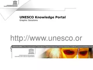
UNESCO Knowledge Portal Graphic Solutions http://www.unesco.org UNESCO.ORG UNESCO presence in the Internet facilitates consultation and access to information from all over the world. UNESCO.ORG In many cases it is the only possible link between the user and the Organization. UNESCO.ORG

UNESCO Knowledge Portal Graphic Solutions
E N D
Presentation Transcript
UNESCO Knowledge Portal Graphic Solutions http://www.unesco.org
UNESCO.ORG • UNESCO presence in the Internet facilitates consultation and access to information from all over the world.
UNESCO.ORG • In many cases it is the only possible link between the user and the Organization.
UNESCO.ORG • The visual identity of UNESCO in the web is crucial for users of many different backgrounds, ages, origins, cultures, education levels and structures: Institutions, organizations, corporations, professionals, individuals, as well as UNESCO staff and team collaborators.
UNESCO.ORG • The UNESCO Portal is not only a vital working toolbut the immediate support of the visual identity of UNESCO.
UNESCO.ORG • The UNESCO Portal should reflect the philosophy and the work of the Organization, as well as its structure and the linkages between the various sectors and departments.
UNESCO.ORG • Most importantly, it should at all times respect the graphic codes regarding colour, shape, typography, layout, as well as show and promote creativity, diversity and the identity of its sectors, departments and services.
Analysis and evaluation of the graphic solutions of the five Knowledge Subportals • The analysis of the knowledge subportals reveals a distinct intention of respecting common codes regarding visual identity, navigation structure and ergonomic solutions.
Analysis and evaluation of the graphic solutions of the five Knowledge Subportals • Each supbportal has an individual graphic identity but similar structure regarding typography, access to information and links and positioning with regard to other subportals and services.
Analysis and evaluation of the graphic solutions of the five Knowledge Subportals • Some of them omit aspects of UNESCO visual identity or use it in very different ways as far as shape, size or colour are concerned.
Analysis and evaluation of the graphic solutions of the five Knowledge Subportals • Basically, this reflects an extremely rapid growth in a new medium such as Internet, as well as the lack of standards requiring graphic consistency.
Analysis and evaluation of the graphic solutions of the five Knowledge Subportals • In many instances there is a lack of relationship and links between departments, which leads to duplication of information, creates confusion and hampers user´s access to information.
Analysis and evaluation of the graphic solutions of the five Knowledge Subportals • In many instances as well, documents are not tailored to the web, which means an excess of information in some cases and insufficient information in others.
Analysis and evaluation of the graphic solutions of the five Knowledge Subportals • The use of the delta in its different versions as an identification banner of the site, the position of icons and common elements give us hints to the development of a common portal which identifies a compact organization working in different fields as Education, Natural Sciences, Social Sciences, Culture, Communication & Information, each keeping its own identity but with common elements within the Organization.
Education http://www.unesco.org/education/index.shtml • The banner is dominated by black and white portraits with a subtle coloration which is an elegant allusion to diversity.
Education http://www.unesco.org/education/index.shtml • The overall page is dominated by a white background, common to the thematic menu on the left, the central or contents portion and the menu on the right, as well as the top portion, containing the UNESCO logo, the banner, the title and the language options. This gives good consistency to all site areas and an overall cleanliness to the window to diversity.
Education http://www.unesco.org/education/index.shtml • Nevertheless, the absence of differentiating elements to isolate each area, e.g. by colour bands or blocks, or by horizontal or vertical lines gives the same priority at the same time to all areas of information.
Education http://www.unesco.org/education/index.shtml • The right menu shows a relative richness of colour and illustrations which could divert the user´s attention from the other areas.
Education http://www.unesco.org/education/index.shtml • The left menu shows a nice graphic detail in different colours but a suggested pale grey background is covered by the white background of each title.
Natural Sciences http://www.unesco.org/science • The top area contains several thematic images, one of them highlighted. This is a good way to focus attention on particular issues.
Natural Sciences http://www.unesco.org/science • The blue and yellow of the delta strokes are repeated as the colour code in the rest of the window. Blue is used in the thematic areas on the left side and yellow for resources and events on the right side.
Natural Sciences http://www.unesco.org/science • These menus are delimitated by blue vertical lines which separate them visually from the central contents area. The icon menu and the central headings are separated by blue horizontal lines.
Natural Sciences http://www.unesco.org/science • This set of lines gives structure to the different areas of the page in the traditional layout used in newspapers to differentiate columns and articles.
Natural Sciences http://www.unesco.org/science • The abundance of information contained in the central area makes it an excessively long page.
Natural Sciences http://www.unesco.org/science • The amount of images, logos and photographs is adequate for easy downloading and gives a clean look and ease of navigation.
Social Sciences http://www.unesco.org/general/eng/programmes/social/ • This subportal has a different visual structure. There is a fixed resources menu on the right and the central section is actually divided in two, so there are four vertical columns.
Social Sciences http://www.unesco.org/general/eng/programmes/social/ • The excellent graphic solution of the banner which extends downwards and to the left, beyond the delta, contains close-up portraits of a girl, a man and a woman in which the most important features are the eyes.
Social Sciences http://www.unesco.org/general/eng/programmes/social/ • The titles use a strong, narrow typography over colour bands which reinforce the structure and the different sections.
Social Sciences http://www.unesco.org/general/eng/programmes/social/ • The adequate amount of information, condensed in single sentences, is a good introduction for the related links. The colour blocks, in subtle shades of grey and ivory, separate well the different areas (resources, features, themes, news…).
Social Sciences http://www.unesco.org/general/eng/programmes/social/ • The subportal has a strong design and a marked “journalistic style”. As far as the visual identity is concerned, it is the only subportal in which the UNESCO logo is used in black on an ochre background.
Culture http://www.unesco.org/culture • This is the only subportal not using an image for the banner but the logo of the sector, the word “culture”, in a large size.
Culture http://www.unesco.org/culture • The layout of the portal focuses on the left-hand menu, consisting of bright coloured bands and titles in negative on the bands.
Culture http://www.unesco.org/culture • Blue dominates the page; it is used for the typography of the titles and for the UNESCO logo
Culture http://www.unesco.org/culture • This subportal also carries an excess of information in the news section, in the center area.
Culture http://www.unesco.org/culture • An avantgarde typography has been chosen for headings, slogans and logo.
Culture http://www.unesco.org/culture • The right-hand menu, features and resources, appears in a blue margin box on a white background.
Culture http://www.unesco.org/culture • The use of square shaped images, all in the same small size, unifies the whole layout; the images serve as icons which can be used to access information.
Communication & Information http://www.unesco.org/webworld/index/shtml • The banner consists of a single image which fades into the white background in a geometrical pattern.
Communication & Information http://www.unesco.org/webworld/index/shtml • With a red dominant, this subportal has a structure in which once again the different areas of the window are defined by subtle shades of grey and red.
Communication & Information http://www.unesco.org/webworld/index/shtml • The menus appear on the left hand side and the news content on the right.
Communication & Information http://www.unesco.org/webworld/index/shtml • Just as in the Culture subportal, here the equal size of the images unifies the look. News items are separated with dotted lines and each one carries a square image and a small “more” icon which leads to complete information.
Communication & Information http://www.unesco.org/webworld/index/shtml • Emphasizing the red dominant, the UNESCO logo is used in white against a red background.
Communication & Information http://www.unesco.org/webworld/index/shtml • The typographical and cromatic sharpness and the graphical simplicity gives great fluidity and ease of navigation and makes information very readable.
Looking for consistencyGraphic and ergonomical solutions • The study of the subportals shows that all have a similar structure and organization of information, with similar navigation hierarchy and ergonomy, but without graphical consistency.
Looking for consistencyGraphic and ergonomical solutions • Building on the experience and the positive features of each one of the subportals and respecting their design, elements and chromatic diversity, we propose their unification through graphical codes which take into account the original features of each subportal and respect the graphical identity of UNESCO.
Looking for consistencyGraphic and ergonomical solutions • With the constant position of their elements, a single structure, typographical consistency, geometrical construction and hierarchy of headings, we propose making navigation easier and establishing a single portal.
Looking for consistencyGraphic and ergonomical solutions • The main concept is that UNESCO.ORG should be the only portal which opens the different doors of knowledge to its users, and the common link between the different knowledge sectors.
Principlesfor the design of the single Portal • Top strip • Rapid access menu to Organization, the five Knowledge Subportals and Sitemap and Services. On a dark grey background, a small band (23 pixels high) with text in negative.
Principlesfor the design of the single Portal Delta • Consists of an oblique stroke (arc of a circle) and a pale grey horizontal strip (23 pixels high) which defines four areas: • Main image of the page • UNESCO logo • Language choice area • Page contents
