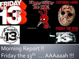
Friday the 13th Website: Visual Analysis
60 likes | 131 Vues
Conducting a visual analysis of the Friday the 13th website, focusing on design elements such as the enter page, video content, text placement, and color schemes. Explore how these elements contribute to the overall horror genre experience for the audience.

Friday the 13th Website: Visual Analysis
E N D
Presentation Transcript
The Enter Page As we have established through previous textual analysis carried out, a conventional feature of the website is the inclusion of an enter page. The enter page presented on the Friday the 13th official website, is advertising the extended version of the film’s DVD. Located in the centre alongside a large image of both the DVD on the left and the inclusion of the character ‘Jason’ on the right, is a video of the new features consisted within the extended cut. The large image is of a broad male conveyed in a metal amour covering his face in a medium long shot. The representation of this icon may suggest to the audience that this character is strong and invincible. It is important to acknowledge that that the character face is hidden through a mask, and therefore may suggest that the character has something to hide, developing enigma throughout the page. The use of a low key lighting is consistently established within the poster connoting a mysterious and gloomy perspective of what type of film genre Friday the 13th is, in this case a ‘Horror’. The use of these large image and video clips, are useful interactive and engaging features for the audience to interact with. Within this video sequence, we can establish a low key lighting within the mise en scene, which enables the idea of mystery and enigma to be produced. Moreover, other distinguished features such as the page navigation bars such as ‘Buy it now’, ‘Enter the site’, and ‘on demand’ have also been presented in a white, bold, serif typeface. This typeface has been portrayed on a red stain, in order for the feature to stand out against the black background. The choice of these colour combinations follow the horror genre, with the use of black and white contrasting allowing specific features to stand out, and attract the audience, as well as the use of the blood stain red to connoted with the idea of blood. Additionally, another feature established on the website homepage, is the inclusion of the title of the film which conveys a consistent look throughout all products marketed. The title ‘Friday the 13th’ is located at the top of the page just above the billing block. The text is the biggest text on the page and it is conveyed in the colour red, which therefore makes the text stand out and grabs the audience’s attention. The font is simple and serious looking, establishing a connection to the horror genre. Finally, also included on the enter page of the, is the use of other texts presented underneath the film title portrayed in a large bold serif typeface. The use of colours such as the white and golden font, also contrast against the black background allowing it to stand out as an attractive feature to the target audience.
Page Loading The page loading page as shown on the left hand side is presented in between the transaction between the enter page and homepage. As we are able to see, the page presented on the Friday the 13th official website is very plain and simple. The use of a consistent colour contrasting combination of a black background and white font is also applied. It is evident that this specific colour combination is a typical colour scheme used within the horror genre. Moreover, the loading has been identified through the use of percentage numbers. The specific font chosen to convey this is a bold serif typeface. It is also important to acknowledge, that this particular feature located within the centre, is of a extremely small size scale in comparison to the layout of the page.
The Home Page It is first acknowledged that the consistent film title ‘Friday the 13th’ has been presented in the left hand corner of the homepage. It is also evident that same title has also been conveyed through other marketing products such as the film poster. The title ‘Friday the 13th’ is one of the biggest text on the page and it is conveyed in the colour red, which therefore makes the text stand out and grabs the audience’s attention. The font is simple and serious looking, establishing a connection to the horror genre. The first and most interactive feature of which puts together the website is the menu consisted with the options of various navigations bars relevant to the film ‘Friday the 13th’. This has been located underneath the large title, and therefore consumes a recognisable location. Here, through the use of swiping across the option ‘Menu’ with the cursor, the wooden looking bar shown, as presented within the image on the right. As this specific transition is carried out, the use of diegetic sound effects of the wooden bars falling. This is an interesting and interactive feature which engages the audience to further interact through the choice of navigation bars. The presentation of the wooden navigation bars, is relevant to the current film, as it consists of connotations with the campsite, and therefore foreshadows the narrative. More importantly, the choice of typography used to present this information is a simple sans serif typeface presented in a musky white. The fact that the colour of the font is white also makes its easily noticed by the viewers as it has been placed on dark contrasting background. Another feature established underneath the large film title, is the feature ‘Killer Cut’. The use of this feature has been presented in a bold sans serif font. The use of a graphical image of a sharp object cutting through metal has also been presented. The use of this text image cohesion is an effective way to present this feature. The inclusion of blood dripping from the metal has also been included, which represents the horror genre.
The Home Page As an established conventional feature, it is important for a large image representing the narrative of the film, as well as the genre to be included. As we are able to see located just left of the centre is an image of a female. The use of interactivity has been incorporated within this feature on the page, as the image shakes as if it were a hand held camera as the cursor swipes over the feature. More importantly, the female is seen to be wearing bright coloured clothing this therefore connotes the character as a protagonist. Through the medium long shot, the character is seen walking around, attempting to find signal on her phone. This therefore, represents the character as vulnerable through the stance, actions being carried out, as well as the emotions consumed on the characters face. Moreover, the inclusion of the female represented through these vulnerable connotations supports the theory suggested by Vladimir Propp. Propp suggested several specific character, whom are established within the a narrative. One of character of which was recognised as the ‘Princess’. As we are able to see, this is evident through the representations created through the female character. The application of a low key lighting is also established within the mise en scene. This consistent feature, sets a dark mood as well as creates a tense and mysterious atmosphere.
The Home Page The majority of the Friday the 13th homepage as established within the image conveyed on the right hand side consists of information about the DVD. The information has been presented on a gloomy realistic background setting of the woods. The use of the low key lighting, and bare trees within the mise en scene creates a tense atmosphere as well as develops the sense of enigma. A large image of the DVD has been located on the right hand side of the home page, where alongside this the inclusion of specific information has been presented in a simple san serif typeface. The use of the black , white and red colour scheme has consistently been applied throughout all marketing products of Friday the 13th. More important information such as ‘on blue-ray DVD on June 16’ as well as subheadings such as ‘About the DVD’ has been conveyed in a much larger text. The importance of this allows a structure understanding of information, as well as emphases more relevant information. Located at the bottom of the page is the films billing block, presented in the conventional typeface and colour. Additional options, such as ‘Pre Order Now’ and ‘On Demand’ have also been presented in boxes, of which are also clickable options. This strategy develops the amount of DVDs sold. Lastly, the option of ‘share’ in the top right hand corner is also a visible feature. This option allows the potential target audience fan base to increase, through below the line advertising. This option has been conveyed within a box, which evidently suits the genre and colour scheme rand throughout the website.