Download
1 / 7
70 likes | 193 Vues
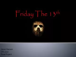
Friday the 13 th. An Overview of the film. Friday the 13 th is a horror film, about a boy named Jason, who had drowned at Camp Crystal Lake as councillors hadn’t been paying attention. Many years after, the camp is re-opened, murders begin

E N D
An Overview of the film Friday the 13th is a horror film, about a boy named Jason, who had drowned at Camp Crystal Lake as councillors hadn’t been paying attention. Many years after, the camp is re-opened, murders begin to occur again. Is someone looking for revenge? On the night of Jason’s birthday in the 13th cabin on Friday 13th he returns and attempts to kill the councillors.
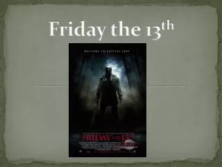
The Main Feature The main attraction of the overall film poster is the large image located in the centre of the page. The large image is of a broad male conveyed in a metal amour covering his face in a medium long shot. The representation of this icon may suggest to the audience that this character is strong and invincible. It is important to acknowledge that the image is the only image on the page and other than the title it is the only feature presented with some colour. The use of a low key lighting is consistently established within the poster connoting a mysterious and gloomy perspective of what type of film genre Friday the 13th is, in this case a ‘Horror’. The use of the low key lighting and black colours used may also represent an antagonist. The light also covers half of the characters face as well as the amour mask he is wearing, the representation of this may convey that the character has something to hide. Moreover, the character is presented in dark coloured clothing, which could insinuate that this character may be an antagonist. Through the iconography of the male holding a sword could also foreshadows that this film is a horror/ slasher genre.
The Text The text presented on the film poster has been presented in many different font, colours and sizes in order to establish different purposes to each text. Firstly, located at the top of the page is ‘Welcome to Crystal Lake’. This font has been in a simple font and a small size. The purpose of this may have been because it is located at the top on its own, it can be easily recognised and therefore there is no need to portray this text in a large font. Moreover, the fact that the colour of the font is white also makes its easily noticed by the viewers as it has been placed on a contrasting background. Just above the billing block is in a small simple font is ‘From the producers of Texas Chainsaw Massacre’ in the colour white, which allows the text to be easily readable as it has been placed on a contrasting background. By adding this type of information on the film poster it persuades the audience to see the film, as it can be insinuated that this film will be better as there has been previous experience. Also the potential fan base may already be there from previous viewers of ‘Texas Chainsaw Massacre’. The title ‘Friday the 13th’ is located at the bottom of the page just above the billing block. The text is the biggest text on the page and it is conveyed in the colour red, which therefore makes the text stand out and grabs the audience’s attention. The font is simple and serious looking, establishing a connection to the horror genre. The billing block has been conventionally placed at the centre bottom of the page. This has been shown through a darker white, and in a readable sized text. Specific words, for example the production company name, or the producers name have been written in larger sized fonts in uppercase. This may have been done in order to make the audience aware of the production of film so that it can gain recognition for future films produced. Furthermore, the fact that the production and distribution had been carried out by Paramount Pictures and New line Cinema shows that they had a high budget to produce this film. Finally, at the very bottom centre of the page is the date it is being released ‘February 13th’. This has been portrayed in a large red font, so that this important information gets across to the audience. In a much smaller and white colour font is the website. This has been established, as it allows the audience to explore more about the film.
Other Features Also incorporated on the film poster is a range of logos. These logos are representing logos of the films distribution and production companies. As we have also been informed within the billing block that Paramount Pictures as well as New Line Cinema carried out the production and distribution of the film. The logos of these companies have been incorporated to support this idea. Moreover, on the right hand side is a logo which looks as if it has been stamped on the poster. This logo clearly shows ‘Bloody’. The use of this informs future viewers and fans about what type of Horror genre the film specifically is. New line Cinema is a subsidiary of Warner Bros. However, is known to be an independent company. Furthermore, Paramount Pictures is a large American film distribution and production company, who is owned by the conglomerate Viacom. From this critical information we are able to insinuate that Friday the 13th had a high budget to produce and distribute the film due to its successful companies which produced the film.
The Background The background of the film poster allows the overall gloomy and haunted look to be created. The background is of a river or stream within the woods. The majority of this image has been conveyed in a black/grey colour. Moreover, where the white light comes through gives off this effect as if the sun light is entering its way through trees, making the location feel very misty and gloomy. Some of this light has been shown in the river, where the ripples are more visible. The background has created an atmosphere for the audience.
The Unique Selling Point The Film poster consists of many conventional features, which the audience may find familiar. However, features which make this film poster unique are features such as ‘Welcome to Crystal Lake’. This allows the audience to gain a small understanding of the plot. Moreover, features such as ‘From the producers of Texas Chainsaw Massacre’ produces a sense of reliability for the audience, as they can feel that they are able to watch this film as the producers have had previous experience. Overall, the film poster is unique and follows the genre of horror, by using dark colours and props which can produce a sense of fear for the audience. The film poster doesn’t reveal the main character presented on the film poster, unlike conventional films. This may also become another feature which may interest the audience as they are left waiting in anticipation.