Download
1 / 18
180 likes | 317 Vues
Elements of Page Architecture. By Marcia M. Feisal, MA Assistant Professor Speech and Mass Communication- Journalism. It is a process, not an event. Includes the appearance as well as the content of the message. It means asking questions about the audience and implementing answers.

E N D
Elements of Page Architecture By Marcia M. Feisal, MA Assistant Professor Speech and Mass Communication- Journalism
It is a process, not an event. Includes the appearance as well as the content of the message. It means asking questions about the audience and implementing answers. Placement & proportion Shadow and light Contrast and unity Subtlety and surprise 4 Aspects of Planning Audience Message Environment Competition What is Design?
Establish goals and organize material. Choose format and layout. Choose typeface (font) size space Add and manipulate visuals. Words alone cannot tell the whole story. In many places or in current publications, words are replaced by visuals. Build momentum into pages. Chunking-break up large amounts of type into bite-sized chunks with the addition of subheads, pull quotes, and sidebars. Layering-present information to readers on an as-needed basis or as wanted Refine and fine tune design. Six Steps to Success
1. Headers and Footers HEADERS- title of publication, but is not the nameplate. Includes name of publication, date of issue, location, firm/school name and logo (if appropriate) Can contain rule lines Typeface is compatible with others on pages FOOTERS- page number, volume number or date. Also called a folio. Some design connection to the nameplate Usually omitted on page one 10 Elements of Print Page Architecture
2. Logos and Titles also called standing heads different typeface includes the nameplate all have a common design element Nameplate Essentials Size: No larger than 1 1/2” to 2” in height Name of publication Volume number, Issue number Complete Address Date Logo or slogan of paper 10 Elements of Print Page Architecture
3. Headlines Some standard rules: Use active voice Use only well-known abbreviations, w/o periods between letters Don’t split prep phrases, numbers, names,acronyms, infinitives, Or gerund or verb phrases between decks (lines) Use single quote marks Use a comma in place of and Spell out zero to ten. Use numerals over ten. Write horizontally, not vertically No ALL CAP heads 10 Elements of Print Page Architecture
No underlines Avoid centered headlines Use same typeface for all heads in paper, but vary emphasis: bold, bold italic, italic Never! use outline or shadow option. Vary set width of letters Vary size of heads according to story length, placement or importance “Above-the-fold” stories get a larger headline Vary tracking or kerning (space b/w letters) Use 18 pt and above Avoid tombstone placements 10 Elements of Print Page Architecture
4. Subheads-used to break up long sections of type Contrast typeface with body text, but use same face as headlines Use same type emphasis (ex. italic) on all subheads Add extra space above, below and to sides of subhead Add graphic accents like lines, box or dot lines Set type in bold if the type is small and it is reversed out of a dark background. Don’t always center subheads; set them flush left for variety. Be consistent. Subheads need to look alike. 10 Elements of Print Page Architecture
5. Text Size is usually 10 or 12 pt for body text Size 8 or 10 pt for captions, bylines and jump lines Typeface-use same for all capitals, text and other Typeface contrasts with head and subhead text Alignment-flush left or justified. Avoid crazy rivers of white space created by gaps between words or letters Line length is a column, usually 1 1/2” to 2” wide Use bullets and number lists to break up long sections of type 10 Elements of Print Page Architecture
6. Endmarks-signal theend of story. Use typefaces like: Wingdings, Webdings, Zapf Dingbats, Symbol or Woodcut ornaments 7.Initial Caps- oversize letters used start a story Raised caps Drop cap Adjacent caps Can use the default option which is usually a larger size of the text typeface and you can specify the number of lines you want the cap to fill (usually 3 lines) 10 Elements of Print Page Architecture
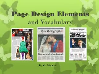
8. Visuals and Captions VISUALS- infographics pie charts - graphs - flow charts - illustrations- photos- artwork Replace text with visuals when possible Don’t repeat pulled info in the story CAPTIONS- set type the same width as a column, not the width of the photo Placement is above, below, or beside a photo or art with 1 pica separation Use lead ins-short 3-5 word introduction for caption-clichés, song titles, popular phrases. Use a different type emphasis for the lead in. 10 Elements of Print Page Architecture
CAPTIONS CONT. Add to captions PHOTO BY ARTWORK BY Three parts of a caption 5 W's and how Don’t state the obvious. Tell the outcome, consequence or reaction. Part of the Heart. Students raised money for The Children’s Center, a non-profit hospital for critical needs children in Bethany, during a donkey basketball game between student varsity basketball players and members of the faculty and staff. Over 400 people attended and $5,400 was raised. Photo by J.K. Feisal 10 Elements of Print Page Architecture
9. Sidebars- secondary stories Break out certain details from story Write an accompanying story on same topic Add visual interest by placing a box around story, using a screen behind it or using a contrasting typeface. USA Today Made Quick Reads Popular Examples:Top 10 lists Comparisons Q and A segments 10. Footnotes/Endnotesdetails about the story’s author provided at the end of a story. Use a significantly smaller type size than copy. 10 Elements of Print Page Architecture
White Space Use one pica between every element and for the gutters between columns Frames with white space around the elements Gutters between columns Drop or Sink - between the top of the page and the first line of text (usually 1’ to 1 1/2”) Columns Parallel columns Width equal to 1 1/2’ to 2” Decide in advance the number of columns to use and use the same number for every page. Page to page consistency Align all elements horizontally and vertically Tools Needed To Assemble Pages
Graphic Accents Borders- lines at top, bottom &/or sides Rules - lines above and below subheads and sometimes, around the actual page margin Reverses and screens Type 1. Design Remember: readability & legibility Four major categories: Serif/Roman Sans serif, also called Gothic Script Decorative or novelty Old English (NEVER!) Tools Needed To Assemble Pages
Type continued 2. Style or emphasis Bold Italic Bold italic 3. Weight- thickness of letters Arial Arial Black Arial Narrow CVI or Dominant Element Borders- especially on photos with white edges Captions-one for every photo Poster design element used on newspaper pages Tools Needed To Assemble Pages
Set page margins at .75 or one inch Double space between lines. Don’t use three or four spaces between lines. Use only double space between paragraphs. It’s not necessary to quad space. Set type at 10 or 12 pt. as recommended by prof. If you add clip art, make sure that it enhances the layout and page content and it is not just to fill space. When sizing a photo or artwork, keep it in proportion. This is easy if you hold the shift key down as you click and drag one of the corner guide marks. Document Setup Tips
Check your typeface (font) for legibility. Remember that a serif font is easier to read than sans serif. Avoid centered or flush right aligned body text. It is easier to read text that begins at the left margin. Indent each paragraph. The default is 1/2 inch, but you can make it smaller. Document Setup Tips