Visual Balance and Color Harmony Poster Design Guide
80 likes | 176 Vues
Create visually balanced posters using simple text, color harmony, and white space. Avoid overwhelming viewers with excessive colors or text. Follow key design principles for an effective and engaging poster presentation.

Visual Balance and Color Harmony Poster Design Guide
E N D
Presentation Transcript
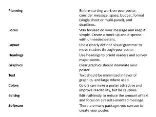
Layout: Balance andwhite space Your poster should have a good visual balance of figures and text, separated by white space. Balance occurs when images and text are reflected (at least approximately) across a central horizontal, vertical, or diagonal axis. This axis is know as the axis of symmetry.
Use color to attract attention, organize, and emphasize - but don't overdo it. • Use a light color background and dark color letters for contrast. • Avoid dark backgrounds with light letters - very tiring to read. • Stick to a theme of 2 or 3 colors - much more will overload and confuse viewers. • If you use multiple colors, use them in a consistent pattern - otherwise viewers will spend their time wondering what the pattern is rather than reading your poster. • Overly bright colors will attract attention - and then wear out readers' eyes. • Consider people who have problems differentiating colors, especially when designing graphics - one of the most common is an inability to tell green from red.
FEEDBACK from GRADUTE STUDENTS: • Know size/format/printer requirements • Large Font; Deep colors • No paragraphs – use bullet lists • Less text, more pictures, photos, etc • Use the section titles/subtitles to guide you in the presentation – should be easy to see/say • Spellcheck and proofread!!! • Placement of the most important information in the center • Know appropriate ways to make figure/plot bigger – issue of pixellation • PRESENTATION TIPS: • Be excited!!! • Presentation should be not more than 5 min; about 20 sentences. • Allow people to look at the poster for a few minutes before “attacking” them • Do not present the sequence of How you did it; Choose information wisely and present only the most important results, leave the rest for questions. • Rehearse the presentation with correct pauses and intonations.