Kate Moross
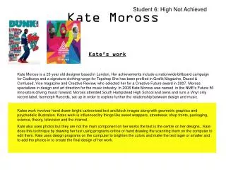
Student 6: High Not Achieved. Kate Moross. Kate's work.

Kate Moross
E N D
Presentation Transcript
Student 6: High Not Achieved Kate Moross Kate's work Kate Moross is a 25 year old designer based in London, Her achievements include a nationwide billboard campaign for Cadburys and a signature clothing range for Topshop She has been profiled in Grafik Magazine, Dazed & Confused, Vice magazine and Creative Review, who selected her for a Creative Future award in 2007. Moross specializes in design and art direction for the music industry. In 2008 Kate Moross was named in the NME’s Future 50 innovators driving music forward. Moross attended South Hampstead High School and owns and runs a Vinyl only record label, Isomorph Records, set up in order to explore further the relationship between design and music. Kates work involves hand drawn bright cartoonised text and block images along with geometric graphics and psychedelic illustration. Kates work is influenced by things like sweet wrappers, streetwear, shop fronts, packaging, science, theory, television and the internet. Kate also uses photos but they are not the main component on her works the text is the centre on her designs.. Kate does this technique by drawing her text using programs online or hand drawing the scanning them on the computer to edit them. Kate uses design programs on the computer to brighten the colors and make the text lager or smaller and to add the photos in to create the final design of her work.
Saul Bass Saul's work Saul Bass born May 8, 1920 – April 25, 1996 was a graphic designer and filmmaker, best known for his design of film posters and motion picture title sequences. During his 40-year career Bass worked for some of Hollywood's greatest filmmakers. Bass designed some of the most iconic corporate logos in North America, including the AT&T "bell" logo in 1969, as well as AT&T's "globe" logo in 1983 after the breakup of the Bell System. He also designed Continental Airlines' 1968 "jetstream" logo and United Airlines' 1974 "tulip" logo which became some of the most recognized airline industry logos of the era. Saul Bass designs are influenced by henri matisse cut-outs and the bauhaus minimalism and geometicism of the 20’s and 30’s. The “Man with the golden arm” poster is very different from those of the time in that it doesn’t have a picture from the film or of the main actors. The leonardo decaprio film ‘Catch me if you can” used Saul’s style to get a 50’s feel
David Carson David's work David Carson was born September 8, 1954 is an American graphic designer. He is best known for his innovative magazine design, and use of experimental typography. He was the art director for the magazine Ray Gun. Carson was perhaps the most influential graphic designer of the 1990s with his widely imitated "grunge typography" style. Carson recently has been involved with design in the quicksilver brand and his work has use of handwritten text, layering, and image distortion. David’s influences include the environment around him. Surf culture is strongly used throughout his work. Carson uses the approach of image distortion by layering text and colors on images he is able to do this by using Photoshop, he does this to give his work a unique grungy style which Carson is known for.
Similarities and differences between artist models The artist models I choose for influences on my magazine cover designs are Saul Bass, David Carson and Kate Moross as their work relates to my ideas for my designs. These three designers have similar aspects of their work although they have each got their own individual style to their work. The late Saul bass has work similar to Kate and David although it is from a older erra, this shows how Saul has influenced designers in the 21st century's with his block color and simple designs. Kate and David are both from different countries so they have different environments for influence on their work, Kate's design relates to street art which is often seen in London where her work is mainly based. Davids work is more of the surfing culture which is in the environment of America. Kate's work began with using pen and paper but as her work became more recognized and technology improved she is now using computer software along with still using her hand drawn skills. David's designs Contain images which are sometimes digitally enhanced so technology is often used in Carson's work.