Download
1 / 12
120 likes | 263 Vues
My Music Magazine Evaluation. By Ryan Robinson. Forms and Conventions. In what ways does your magazine use, develop or challenge forms and conventions of real music magazines? Front cover :

E N D
My Music Magazine Evaluation By Ryan Robinson
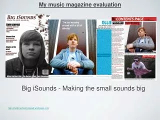
Forms and Conventions In what ways does your magazine use, develop or challenge forms and conventions of real music magazines? Front cover: My front cover uses many conventions of a real music magazine because my music magazine follows the main aspects which is a masterhead, main image, sell lines, a barcode, issue number and the price. Furthermore my front cover model gives eye contact to the camera which represents an ordinary music magazine. I have decided to use a mid shot for my front cover because most music magazines uses a close up or mid shot to express the models emotions. In addition the background of my front cover music magazine is similar to other front cover music magazines because the background is plain, most front cover music magazines are either plain or blurred. This makes the audience focus on the model and sell lines. The masterhead subverts from most music magazines because well known music magazines such as “Vibe” and “XXL” masterhead is covered by the model however my magazine doesn’t follow this, it is new to the audience and I would like the audience to be aware of the name which makes it unique from other music magazines. Furthermore most music magazine main sell line is normally on the side of the front cover but on the other hand my main sell line is in the middle of the front cover. I have decided to put my main sell line in the middle of my front cover because I want the audience to be aware of the main article and what it features, also I have decided to create the font big to make the main sell line appealing to the audience.
Forms and Conventions In what ways does your magazine use, develop or challenge forms and conventions of real music magazines? Contents: My contents page uses many conventions of a real music magazine because the contents includes: a contents title, feature articles with page numbers, main image, the date and the editors note. The feature articles is clear and also includes a little description which is underneath each article to explain to the audience about the articles in the magazine. I decided to use an editors note so that the audience can understand this edition of the music magazine from the editors view and to beware of who the editor of this music magazine is. There is no advertisement which subverts from a music magazine because normally a music magazine contents page features advertisement about fashion etc. Also I only used one image which is the front cover model, I decided to use one image because I wanted to encourage the audience to read the main feature article about the model. Most music magazines uses many pictures to ensure that the audience are understanding what is happening in the magazine. Double page spread: My double page spread uses many conventions of a real music magazine because it includes quotes, images and the article. My double page spread uses colour schemes to attract the audience which is portrayed in ordinary music magazines. I have decided to use black and green which could represent club lights, this will help the audience to identify between the questions and the answers. I used a quote from the artist as a title of the double page spread because I want to audience to realise that it is a very important quote from the artist. My double page spread layout subverts from most double page spreads because normally there is one image and covers the top of both pages. Furthermore most double page spread articles are displayed within a column format however my double page spread is displayed in rows so that the article is easier to read.
Representational Issues My Magazine represents young people who are interested in UK Funky House, my front cover model is a young person which could symbolise the young audience within the UK. However my model doesn’t stereotype a “Funky” person because he doesn’t have a microphone and headphones and he is also wearing a black jacket with a hood. This relates more to the genre “Grime” but I wanted to ensure that this magazine could also be introduced to grime audiences as these two genres are quite close and is very well known among young people in the UK. The group of people who will be interested in my magazine are interested in dancing, going to parties and being unique from everybody else; these group of people can be from teenagers to early thirties. How does your magazine represent particular social groups?
Institutions Many institutions may distribute my magazine in places such as major retail stores such as Tesco and Asda. I believe that my magazine may be sold there because most of my target audience need to purchase groceries in major retailers, my magazine could be displayed on the entertainment section where there are many other genres of music competing. Another institution could be WH Smith; WH Smith is a stationary store which also sells magazines, books and refreshments. The target audience for WH Smith are students because they can buy school equipment from the store and my magazine targets young people. This will be a perfect store for my magazine because WH Smith will have a lot students especially when the school academic year begins which is between late August to early September. What kind of institution might distribute your magazine and why?
Target Audience Who would be the target audience for your magazine? My magazine is targeted at a younger audience, the age range could be between 14-30 year olds. My target audience are from different ethnic and culture backgrounds who are living in the UK, the target audience could be middle class people. My target audience are people who listens to the genre to express their emotions by dancing to the beat of the song, most UK Funky House songs express their lifestyle through music. Most of my target audience are interested in fashion and jewellery, some wear bright colours such as red, yellow, green and blue to parties which features UK Funky House. However my front cover magazine subverts this because I didn’t use much bright colours. The reason I have chosen the colour scheme is because I felt that the bright colours of the sell lines will be overlapping and the front cover wouldn’t look attractive.
Addressing the readership I have used sell lines, colour schemes and my main image to attract my target audience. Firstly I decided to use big fonts for my main sell line because the audience will see the artists name straight away and underneath the artist name the sell line says “Funky underneath the hood”, this automatically tells the audience that it is a Funky House magazine. On the other hand I used short sell lines such as “Four tickets up for grabs”, this persuades the audience to purchase the magazine because the audience will want to know what the tickets will offer e.g. a holiday. I used different texture of the colour green as my main colour because green is a unisex colour which means that my magazine could attract both male and female audiences. Also for my main sell line I decided to use black and white to fonts to blend in with the models clothing and the background of the front cover. How did you attract / address your audience?
Technical/Construction Issues Throughout the making of my front cover, contents page and double page spread I have used varieties of software’s such as Microsoft word, Microsoft powerpoint, Abode Photoshop and Microsoft publisher. I used Microsoft word to analysis a front cover magazine from XXL, I also used Microsoft powerpoint to analysis a contents page, double page spread and experiment on my masterhead fonts. However I used two software’s to help me create my final production. I used Abode Photoshop to cut out the model and placed it on a grey background and to create my sell lines but on the other hand I had to use Microsoft publisher to create my masterhead because I had a few technical difficulty uploading my chosen masterhead font on Abode Photoshop. To ensure that my photos for my front cover, contents page and double page spread were unique I used a Samsung S830 camera which has 8.1 mega pixels and 7.4 - 22.2 mm zoom. What have you learnt about technologies from the process of constructing your magazine? (software, photography etc)
Comparisons between prelim and main tasks. Looking back to your school magazine cover, what do you feel you have learnt between creating that and creating your music magazine? How did the school magazine task help?
Comparisons between prelim and main tasks. I learnt a lot throughout the making of both magazines, my understanding of magazines have widened. Similarities: My preliminary task and main task followed the aspect of a magazine because both magazines have a masterhead, sell lines, a barcode, the date and a model. Both models are wearing similar clothing, giving eye contact to the camera and the camera shot is a mid shot. Moreover my model for my preliminary task is holding a prop while the model for my main task isn’t. Furthermore the contents page format for both magazines is similar because there is only one image and the two models looked at the camera with a mid shot. There is a editors note and the title “Contents” is placed on the right hand corner of the contents page. Differences: Firstly my preliminary school magazine front cover has more sell lines than my main task which makes it difficult to read however I have made better changes which includes least sell lines which enhances audience understanding because it is separated which makes it easier to read. Furthermore the background of the magazine is a distraction for the audiences but on the other hand in my main task the background is plain. The colour schemes of the masterhead and sell lines are too bright and stands out which doesn’t focus on the model and his prop, the prop was trying to symbolise education and how education is very important which is aiming at students. My preliminary school magazine contents page articles could be quite confusing because I used many colours such as yellow and orange. In my school magazine I only used one colour which was green and was easier for the audience to identify each articles. All of my articles were together which makes it difficult for the audience to identify the page numbers on each article. My editors note wasn’t appealing to the audience because the note was written in a white box with few written words. However my editor note in my main task is displayed in a box which shows more professionalism and the editors name properly. Looking back to your school magazine cover, what do you feel you have learnt between creating that and creating your music magazine? How did the school magazine task help?