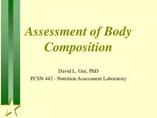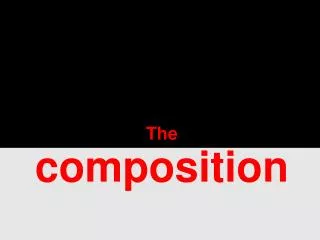
Glamorous Prada Perfume Advert for Women
Eye-catching pink and orangey ad featuring a lady and perfume bottle, targeting women aged 17-20 with bold typography and colors.
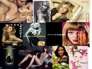

Glamorous Prada Perfume Advert for Women
E N D
Presentation Transcript
Setting- The perfume add looks eye catching with the bold font and titles font, the lady is pale to show that the advert is for any women. Composition – The main focus on the advert is the lady and the perfume bottle because it shows that it is for women you can only see one of the lady's eyes that show that its eyes catching. Typography- The font used is know as a Prada font and therefore is know as a Prada perfume. Colours- The colours that appeal for this advert are that it has pink and it goes with orangey perfume bottle which stand out to the women than want to buy it. Target audience- women The age for this advert is between 17-20 I feel this is because its got pink background and a glamorous perfume bottle and a lady so it shows its mainly for women. Prada is know as a very good brand and stand out to a lot of women.
Target audience- This target at girls teenagers it is aged for 14-17 I feel this because it has dolls and is girls colours like pink and bright coloured. Looks like it’s a colourful life style with this perfume advert. Typography- the font used is know as Maria juku lover it is quit a popular perfume and teenagers mainly go for this perfume. Colour- The colours that appeal for this advert are bright coloured and mainly pink the colour of the girls skin goes with the background and the font. With the dolls that have different colour heads that stand out in the girls hair and her hand. Composition – The main focus of the advert is that the font is bold and the girls is holding dolls that goes with what the advert about and the colours that are also in the advert. Settings- The perfume add is eye catching to teenage girls that like it being pink and stands out with dolls and different colour dolls.
Target audience- The age for this advert would be 20-27 I feel this because it is fruity and clam and the green background of apples is more for women than teenagers. Composition- The main focus of the advert are the apples and the women in the picture because she is showing what she is advertising because the bottle is the shape of an apple. Colour- The colours are bright and different to all other perfume adverts the colour green is different to be in an advert for women and the women's skin is tanned and looks good with the apples. And the colours of the perfume ad make people want to buy it. Typography- The font used is know as DKNY it is a famous brand that a lot of people know about. therefore it is know as an DKNY perfume. Settings- The perfume advert is eye catching to women because the green stands out to the people who want to buy it.