Download
1 / 31
310 likes | 325 Vues
This analysis explores the historical context, media language, representation of gender and age, and intertextuality in a Quality Street print advert from 1956. It highlights the patriarchal and misogynistic elements present in advertising during the 1950s.

E N D
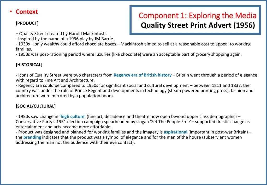
Component 1: Exploring the Media Quality Street Print Advert (1956) • Context[PRODUCT]– Quality Street created by Harold Mackintosh.- inspired by the name of a 1936 play by JM Barrie. - 1930s – only wealthy could afford chocolate boxes – Mackintosh aimed to sell at a reasonable cost to appeal to working families.- 1950s was post-rationing period where luxuries (like chocolate) were an acceptable part of grocery shopping again. [HISTORICAL]- Icons of Quality Street were two characters from Regency era of British history – Britain went through a period of elegance with regard to Fine Art and Architecture.- Regency Era could be compared to 1950s for significant social and cultural development – between 1811 and 1837, the country was under the rule of Prince Regent and developments in technology (steam-powered printing press), fashion and architecture were mirrored by a population boom.[SOCIAL/CULTURAL]- 1950s saw change in ‘high culture’ (fine art, decadence and theatre now open beyond upper class demographic) – Conservative Party’s 1951 election campaign spearheaded by slogan ‘Set The People Free’ – supported drastic change as entertainment and arts became more affordable.- Product was designed and planned for working families and the imagery is aspirational (important in post-war Britain) – the branding indicates that the product was a symbol of elegance and for the man of the house (subservient women addressing the man not the audience with their eye contact).
Media language(creation of meaning)- Structure and design of the advert – anchorageof the gold frame (connotations of halo effect around the man and product), triangular geometric composition of the poster to help secondary anchorage o the product, product takes central framing.- Typography – bottom third of the poster, bold purple colour on white background – hand-drawn, artistic nature of the design.- Persuasive language techniques – alliteration, emotive language and superlatives – appeals to a scholarly audience – the serif font styles also connote richness. • Media language (creation of narratives)- connotations of female characters dressed similar to sweets (intentional association).- inference of a dilemma: - male hero choosing between two ‘damsels in distress’ (Propp’s theory). - females choosing the chocolate (suggestion of female stereotyping).- costume and dress of male character indicating the formal nature of his dilemma – connotations of a higher class and richer society.- patriarchal narrative indicative of the time. • Intertextuality- characters in the gold frame – Miss Sweetly and Major Quality (part of the brand identity of the product since 1936).- characters are symbolic of the Regency era of British history (referenced by characters’ dress codes in gold-framed picture within advert). • Further Investigation- advert is part of a brand identity campaign – Major Quality and Miss Sweetly originate from the 1930s product. Component 1: Exploring the Media Quality Street Print Advert (1956)
Representation[GENDER]- Image suggests hegemonic masculinity – in control of product, centrally frame – connection to Mulvey’s male gaze theory – male character anchors audience’s eyes to the product which has significant phallic symbolism.- dress code relates to modern working businessman (personified as the ‘provider’ of the brand).- women have two stereotypes in advert – need for chocolate and subservient body language to the dominant man – implication is that to be successful, you will need to be romantically led by a man.- further analysis – sense of manipulation with the women distracting the man through romance to access the ‘prize’ that is the product in his lap.- historical representations of Regency characters show strong feminine colours – showing of flesh for Miss Sweetly, and the formal uniform dress of Major Quality – signifies importance and power in their own relationship.[AGE]- two adverts, two target audiences (25-40 and 50+) – audience identification with characters within their age demographic. • Considerations- the role of women in advertising.- examples of advertising from the early 1950s – ‘the role of the housewife’.
Another 1956 QS Ad [Intertextual allusions] Patriarchal advertising Mad Men A recent TV series exploring patriarchal corporate 1950s cigarette advertising companies. Two paradigms in QS ads1. The liberal (but still patriarchal) playboy bachelor (audience - 25-40) 2. The conservative nuclear family (target audience - 50+) Part of the same advertising campaign as the chosen text but marketed towards an older generation. It is clear that ‘Quality Street’ intended to broaden their consumer demographic (age, class and gender) to varying degrees of success.
Patriarchal and misogynistic 1950s advertising: the marginalised and objectifying representations of women
Patriarchal and misogynistic 1950s advertising: the marginalised and objectifying representations of women
Component 1: Exploring the Media This Girl Can Print Advert (2015) [CODES AND CONVENTIONS] • Central, striking image to engage the reader in the content of the advert. • A medium close-up of a woman in her thirties exercising (not a celebrity) which emphasises the aim of the advert to target ordinary women of all ages and promote a sense of familiarity. • The woman is wearing a turquoise loose vest, her hair in a ponytail and is sweating profusely from exerting herself. She is not wearing the latest range of sportswear, encouraging the viewer that exercise isn’t just for the elites. • The dominance of this image suggests that she is the protagonist for this narrative – the hero (according to Vladimir Propp’s theory) – she is heroic because she is embracing sports – she has a fearlessness with losing her inhibitions and is absorbed in the moment looking carefree and happy. • Mantra: “sweating like a pig, feeling like a fox” – the transformative technique of turning an insult into a compliment. • Historically, it was considered unladylike to break into a sweat – physical exertion causes a redness in the face – feeling unattractive – the advert reinforces that physical exertion is exactly what brings out one’s attractiveness. • The slogan “This Girl Can” has connotations of determination – it aims to break stereotypes of male domination in athletic participation. [BACKGROUND CONTEXT] • This Girl Can is a national campaign created by Sport England (and partnership organisations). • Aim: to break down barriers holding women back from sports participation (fear of judgment). • Campaign celebrates active women regardless of ability level and condition after sporting activity. • Campaign is funded by National Lottery and backed by Sport England – no commercial aspect to it at all. [Part 1 – STARTING POINTS – Media Language][SOCIAL AND CULTURAL CONTEXTS] • Sports England research revealed gender gap in sports participation. • 2 million fewer 14-40 year old women partake in sport regularly (13 million women said that they would like to participate more in sporting activity and over 6 million are not currently active at all). • Fear of being judged was the number one barrier for most women feeling that they were unable to participate. • The campaign has been a catalyst for 1.6 million women to start exercising and there is a greater increase in the number of women starting to exercise than men. • Nike responded to the This Girl Can campaign with a motivational Better For It which also portrayed the ‘real’ side of fitness.
[CODES AND CONVENTIONS] • The unusual text as an “enigma code” (Roland Barthes) for the audience – who is the character and what does “This Girl Can” mean? • Top left-hand corner – hashtag ‘#thisgirlcan’ – to connect the readers to the relevant social media pages – also, logos for the producers of the campaign Sport England and National Lottery– the aim of the hashtag promotion approach is to connect women with like-minded others and create a sense of social cohesion.- also takes the print readers to the full YouTube advert in order to see many more positive representations of women in sport. [Part 2 – STARTING POINTS – Representation][FEMININITY] • Campaign has a representative rawness focusing on ‘real’ women. • No glossy finish, no high-end advertising techniques that are produced by commercial sporting brands. • These females are supposed to be seen as ‘heroic’ – aspirational role models for the readers – audience members should identify with some of the features of these women, bringing out their own fear of judgment – that physical exertion can be fun despite the sweating and red-faced implications. • The brand name uses the word “girl” as an all-encompassing term – used to represent the whole of the female population and create a sense of inclusion – a united front, a force to be reckoned with. Component 1: Exploring the Media This Girl Can Print Advert (2015) [FEMININITY CONTINUED…] • The term “girl” can have negative connotations in a sporting context – “throw like a girl” is a common simile used to mock someone who cannot throw - the advert seeks to de-stigmatize the term “girl” and re-appropriate it with positive, noble connotations- the advert subverts the stereotype that girls cannot play sport- the fact that the word “girl” has been used instead of “woman” broadens the demographic of this advert too – to include children as well as adults (the danger is that adults feel alienated by the advert) • The advert aims to encourage women to participate in the activities, and in doing so, challenge the dominant ideology- the campaign (throughout its series of posters) repeatedly affirms female participation in sports • Stereotypically, women are often thought of as the weaker sex (particularly in sports)- this poster campaign challenges the stereotype- in this poster, the woman is positive, confident and happy, focused, enjoying the exertion and immersed in fun • The producers are seeking to challenge the patriarchal dominance in sport.
Component 1: Exploring the Media Spectre Film Poster (2015) • Context[PRODUCT]– Spectre is a James Bond film released 26 October 2015(starring Daniel Craig as 007 in his 4th performance as thefictional MI6 agent).- Based on a book by Ian Fleming – film produced by the British company Eon (Everything or Nothing) Production and distributed by United Artists.- The $245 million budget was extensive – it grossed over $880 million at the world wide box office.- The poster was designed by Empire Designs (a British film promotion agency). The poster was released on 3 September 2015 as part of a wide global marketing campaign for the film. • [PART 1: STARTING POINTS – MEDIA LANGUAGE][SOCIAL AND CULTURAL CONTEXTS]- Masked man in the background is wearing a skeleton mask – used to symbolise the Mexican festival of the ‘Day of the Dead’.- The opening sequence of the film shows a ‘Day of the Dead’ parade in Mexico City – this is not something that took place in real life.- The government’s determination to promote pre-Hispanic Mexican culture meant that one year late, the local authorities decided to organise such a parade (Dia de losMuertos) on October 29th 2016 – huge success attended by 250,000 people.- The Tom Ford white tuxedo worn by Daniel Craig (revival of 1970s fashion trend) – previous Bonds have worn white tuxedos and John Travolta famously sported one in the film Saturday Night Fever in 1977.- It has been argued that Daniel Craig initiated a fashion trend – celebrities like David Beckham and Benedict Cumberbatch were photographed wearing a white tuxedo around the time of the release of Spectrepublicity – underlining of the cultural significance of the Bond franchise. • Media language(creation of meaning)- Central image – long shot of James Bond, smartly dressed, arms folded, with gun pointing to his left. The dominance of this image suggests he is the film’s protagonist – according to Vladimir Propp’s theory, he would be considered the ‘hero’ – reinforced by the use of colour – Bond’s white jacket connotes his heroic status, contrasting with the dark, shadowed antagonist in the background.- Bond’s clothing connotes business and professionalism – the gun is an iconic part of Bond’s ‘uniform’ – a common prop used in the action thriller genre and so audiences can expect violence, action and danger – gun is casually pointed, connoting that Bond is never off duty – he is always alert and ready for action.
Media language(creation of meaning)- The tuxedo is iconic of the Bond image – the white tuxedo connotes luxury, wealth, sophistication, the ‘high life’ that off-duty Bond enjoys (linked to martinis, women, gambling). The red carnation has connotations of romance, passion and danger.- Bond’s strong yet casual pose – audience reminded of the cool/calm/collected persona of Bond – he is a trained assassin and working for MI6; he is relaxed here, but in control – we are reminded of his ability to keep his composure in any situation.- Direct address – Bond looks at the audience – a common convention of film posters adding a personal approach to the format – intensity of his stare and lack of a smile could suggest how seriously he expects to be taken.- Common convention of film posters – to have actor’s name prominently to entice the audience – this poster subverts that convention (name in small font in the upper left corner of the poster – producers are confident that audiences will all recognise him – Daniel Craig’s name also appears alongside many other names (Albert R. Broccoli’s EON Productions presents Daniel Craig as Ian Fleming’s James Bond) – this showcases all the iconic figures that help to continue the franchise.- Bottom of poster – title of the film appears along with the iconic 007 logo – gold font connotes luxury, wealth, aspiration and exclusivity – capitalised title suggests power and strength. The title SPECTRE relates to an organisation in opposition to Bond in the narrative – double meaning – connotes a ‘ghost’ from Bond’s past.- Beneath title – credit block – industry information (star names, directors, producers) – small text to not divert attention from main image and core text. [INTERTEXTUALITY]- White tuxedo is an intertextual reference toother Bond films (specifically Sean Connery in Goldfinger but also Roger Moore) – this motif provides a sense of familiarity – nostalgia and pleasure to fans who recognise the link.- Bond films deliberately reference earlier films in the franchise – for instance, the ‘Bond girl’ emerging from the sea (Ursula Andress in Dr No and Halle Berry in Die Another Day – Daniel Craig also emerges from the sea in Casino Royale – his first outing as Bond.- The skeleton costume is also present in a cult film Donnie Darko, suggesting that Bond wants to reach out to an emerging male demographic. [NARRATIVES]- In background – image of a man wearing skeleton mask and bone design on his jacket – skeleton has connotations of death and danger – mask is covering up someone’s identity – someone who wishes to remain hidden lurking in the shadows.- According to Propp’scharacter theory, we can easily assume that he is a ‘villain’ (mask is reminiscent of Halloween) – he is Bond’s antagonist and no doubt wants to kill him – the mystery of this character’s identity acts as an enigma code (see: Roland Barthes) – we want to find out who this character is and why he wants Bond – skeleton also references the title of the film Spectre, connoting a ghostly haunting presence from Bond’s past.
Representation- James Bond is an action hero (since the 1960s) – constructed to embody many masculine stereotypes of strength, independence and sexual prowess.- Representation of women in the franchise has been traditionally stereotypical – the ‘Bond Girl’ (the beautiful ‘love’ interest) – Propp’s ‘princess’ – treated as insignificant in the narrative and ultimately disposable.- Representation of gender in the Bond franchise has evolved over time in order to reflect the changing social context – the role of women is far less submissive and stereotypical in recent Bonds than in 60s and 70s films.- The poster of The Man With The Golden Gunobjectifies women far more than Spectre does – elegance and class is emphasised over outright objectification, but sexual connotations of the ‘Bond Girl’ remain.- Craig’s Bond is not as sexist or overtly stereotypical as earlier incarnations – reflects contemporary notions of masculinity as Bond is older, more thoughtful and shows signs of vulnerability.- The poster does not reflect this development and represents Bond as the familiar action hero in order to sell the film.[GENDER]- Bond’s masculine representation connotes bravery, intelligence and strength – his posture is strong, dominant and arms are folded in a stereotypically masculine stance – this closed body language connotes his lack of emotion, independence and role as a rational, ruthless assassin.- Use of key light on Bond is stark and highlights his chiselled features – construction of a tough, inscrutable masculinity.- The gun suggests danger but his posture connotes confidence, with a relaxed attitude towards danger.- The ‘hero’ archetype is typical of the action genre – audiences are led to believe this is how a man should be.- The absence of female characters on this poster subverts a feminist perspective – women are still under-represented within action film franchises – there are stronger female characters in Spectre, however, this poster does not feature them –infer that much of the marketing prioritises Bond as an iconic male figure. • Industry[HISTORICAL CONTEXT]- Hollywood is the oldest film industry in the world – originating in the 1890s – first motion pictures were less than a minute long due to limitations of technology – sound was not introduced into films until 1927 – Hollywood is considered the ‘film factory’ of the world and exports products to most countries.- Media production stages – development, pre-production, production, post-production and distribution - Development – ideas created, rights bought, screenplay written, financing sought. - Pre-production – Cast and film crew found, locations chosen, sets built. - Production – film is shot. - Post-production – Recorded film is edited. Crew work on sound, images and visual effects. – finished film is distributed. It is screened in cinemas and released for home viewing.
- Industry issues which could be explored for Section B questions: - Company names – MGM, EON, Columbia, Sony – researched in terms of production and distribution, ownership, issues, conglomerates. - Names of actors – persona, star appeal, previous roles. - Director, writers, other crew (DOP, costume designer) – exploration of production process roles. - IMAX – role of technology in exhibition, circulation of products. - Hashtag, website – role of new technology and social media in marketing film products. - Soundtrack on Decca records – synergy and convergence of different platforms to promote the film.[MEDIA OWNERSHIP]- James Bond series is produced by Eon productions– British film company based in London, Sony Pictures and MGM.- Video rights of all of Eon’s films owned by MGM’s distributor 20th Century Fox Home Entertainment.- 9th April 2010 – 18 months into making 23rd Bond (Skyfall), producers decided to suspend production due to MGM spiralling towards bankruptcy – end of 2010 when new owners of MGM able to secure $500 million revolving credit line so that film could continue.- Film made an astonishing $1.1 billion at the global box office – more than any other Bond film – this allowed the Bond franchise to continue.- Bond is renowned for its exotic locations across the globe – Spectre conforms to this convention – shot in Mexico City, Rome, Solden, Morocco and Austria.- Buoyed by success of Skyfall, Spectre used Pinewood studios in London as base.[MEDIA REGULATION]- Film and video releases amongst the most tightly regulated in the Western world – age restrictions placed on all commercially released films by the BBFC and some are even expected to make cuts or alter the film to conform to contextual guidelines.- Sony cut some violence from Spectre in order to secure a 12A UK rating instead of 15 classification the BBFC originally recommended – sensible decision in order to secure a wider audience – might not be the original movie that Sam Mendes (director) wanted. [MEDIA INDUSTRY]- Long-running Bond franchise has established fan-based and Spectre, a US/UK co-production, received global distribution (theatrically, DVD and Blu-ray) to reach a large audience.- Unlike many media products, it is difficult to specify a specific target audience other than mass audience for Bond – it has spanned so many decades, so many leads, so many directors – great commercial appeal with distinctive USP – Bond is universal: charming, suave, good looking and catches the bad guy (Levi-Strauss good and evil binary opposition).
Sean Connery Bond Posters Roger Moore Bond Posters
Component 1: Exploring the Media The Man With The Golden Gun Film Poster (1974) • Context[PRODUCT]– Part of the James Bond film franchise (9th in series) releasedon 19 December 1974 starring Roger Moore as 007.- This was Moore’s 2nd appearance as the fictional MI6 agent.- Based on an Ian Fleming novel (same name) – film produced by British company Eon (Everything or Nothing) Productions and distributed by United Artists.- Film had a $7 million budget and grossed over $97 million at the world wide box office.- Martial Arts film genre – to reflect the rise in this sub-genre’s popularity (Bruce Lee, Jackie Chan), several Kung Fu scenes were evident – predominantly filmed in Asia (shot in Hong Kong, Thailand and Macau).- Artwork for poster produced by Robert McGinnis.[HISTORICAL]- Prior to 1990s, illustrations were used more on film posters (due to limited technology available).- Film was set in the middle of the 1973 energy crisis (oil producing Arab nations proclaimed an oil embargo causing an oil crisis (short/long-term effects across political and economic international spheres) – the poster’s iconography hints at this (power plant in the lower left corner and the energy beam directed at Bond). • Media language(creation of meaning)- Image focused film poster (aesthetic design) – genre/narrative codes and conventions present visually.- Central image = mid-shot of James Bond, smartly dressed holding a gun across his body – dominance of his image suggests he is the film’s protagonist and is probably ‘the good guy’ – according to Vladimir Propp’s theory, he would be considered the ‘hero’ – Bond’s attire connotes business and professionalism – the gun is the most iconic part of his uniform (signifying danger and action) – he gives a direct address to the audience (intensity of stare and lack of smile could connote how seriously he should be taken – calm amidst the chaos) – this is central to the Bond persona – keeping composure in any situation.
Media language(creation of meaningcontinued…)- Top of poster – actor’s name: Roger Moore – common convention for action poster to have actor’s name – Roger Moore was a household name after starring in TV series The Saint and his first appearance as Bond in Live and Let Die – ‘Roger Moore as James Bond 007’ reinforces familiarity. (intertextuality)- Bottom of poster – Title of film appears with name of the author – then credit block detailing industry information features (other star names, directors, producers – cast and crew) – this is much smaller (not to divert the audience away from the main image/rest of the poster). • Media language(narrative)- Bottom of frame – extreme close-up of a golden gun (foreground) – pointed at Bond with hand loading it with a bullet engraved ‘007’ – reader can interpret this as an antagonist’s attempted assassination of the protagonist – colour of gun connotes wealth and status (we can only see the hand of the shooter – Roland Barthes’ ‘enigma code’ established – mystery of who is trying to kill Bond) – Propp’s character theory – the role of the ‘villain’ is introduced. - Central images - Surrounding Bond are even more enemies and people trying to kill him – images of destruction and explosions – codes that signify to the audience that this is from the action thriller genre.- Central images – Bond is flanked by scantily-clad female (typical of Bond franchise) – these women are highly sexualised and objectified, slim, with hour-glass figures and long flowing hair – body language: one appears to be looking at the golden gun assassin whilst pointing at Bond – the other seems to put her arm out in front of him, seemingly protecting him – Barthes might argue there is another ‘enigma code’ suggesting to the audience that Bond has female allies and enemies (yet all look the same – who is thefemme fatale and who is an ally?) • Media language(representation)- Minority ethnic types were represented in a stereotypical manner in the early 20th century – to be pitied, to be laughed at, the exotic or the dangerous – society had progressed towards racial equality in the 1970s but some stereotypes were still evident in mainstream films – feminist discourse would also criticise the objectification of women in this poster (Laura Mulvey’s ‘male gaze’ theory found in her 1975 essay ‘Visual Pleasure and Narrative Cinema’) – feminist critique argues that this kind of representation denies women human identity and relegates them to the status as objects to be admired for physical appearance (heterosexual desire). In addition, the producer of this artwork was a male (Robert McGinnis).- Producers have also encoded socio-political ideas into iconography (power sources related to explosions – oil embargo in 1970s Arab/Asia.
Component 1: Exploring the Media Front Cover of ‘GQ’ – July 2016 Context[PRODUCT]– Launched in 1931, GQ began its life as a quarterly publication called Gentleman’s Quarterly, aimed specifically at fashion industry insiders. - Its popularity with customers caused its rebranding in 1967 to GQ. • Produced by Conde Nast, today GQ is a multi-platform brand (published in print and on the iPad, as a website, iPhone apps, and an annual event called ‘GQ Men of the Year’. • GQ has an average circulation of around 115,000 and a readership of almost 400,000 through its various platforms. • GQ’s catchphrase is ‘the magazine for men with an IQ’. – the brand is built around more traditional ideas of masculinity.- coverage: executive concerns, targets the serious minded, conservative, older reader – other magazines like Loaded and FHM reach a more laddish audience. [PART 1: STARTING POINTS – MEDIA LANGUAGE][SOCIAL AND CULTURAL CONTEXTS]- In 1994, Mark Simpson (author and journalist) coined the term ‘Metrosexual’ in an article for the Independent newspaper after he attended Britain’s first GQ style exhibition – he said “I had seen the future of masculinity and it was moisturised” – David Beckham popularised the concept of the ‘metrosexual’ making it more socially acceptable for men to openly care about their looks, clothing and skincare regime. • Men’s magazines embraced this through their content and advertising – the primary role of these magazines is to encourage spending amongst its readers. • In 2014, Simpson introduced the term ‘spornosexuals’ – men who are extremely body-focused – who spend all their time at the gym and make their bodies their best accessory – the GQ cover shot (with Johnson’s bicep in the foreground and the rest of the image secondary to it and the coverlines around it support this concept. [MEDIA LANGUAGE – MEANING]– The overarching theme for this issue appears to surround ideas of masculinity. • The strapline tells us it is a special issue dealing with ‘Mind, Body & Masculinity’. • The extreme close-up of Dwayne Johnson with his huge bicep in the foreground. • The cover line to the right tells the reader to “Man up! How to be a man in 2016”. • If we consider the selection process that takes place when creating a magazine cover, there was clearly a conscious decision to associate ideas of masculinity with physical strength. [SEMIOTIC ANALYSIS] • The red, black and white colour palette used for this cover supports the ideology of power – red is associated with strength and the black emphasises bold strength. • Johnson is giving a direct address to the audience – a common convention of magazines and helps to add to the more personal approach of this format – the intensity of his stare and the lack of a smile suggests how seriously he expects to be taken seriously – just as the readers should with regards to their own bodies. • Johnson’s experience as a professional wrestler earned him the ring name ‘The Rock’ which has connotations of strength and stability. • This name is used prominently across his image with his actual name appearing smaller and below it – perhaps he is more famous as ‘The Rock’ or perhaps the magazine is suggesting that his persona and look are more important than the man beneath.
Component 1: Exploring the Media Front Cover of ‘GQ’ – July 2016 [PART 2: STARTING POINTS – REPRESENTATION] [HISTORICAL AND POLITICAL CONTEXTS] - African Americans have had a long and complex history in the motion picture industry – start of 20th century – many films depicted black characters with stereotypes: incompetent, hyper-sexualised and/or criminals.- The Civil Rights Movement – push against the status quo – still some way to go.- 2015 – April Reign (Broadway Black managing editor) created the hashtag #OscarSoWhite to bring attention to the Academy’s tendency to overlook performances and achievements by non-white professionals.- 2016 – little had changed – actors/actresses branded the Oscars ‘racist’ and ‘too white’. [REPRESENTATION OF ETHNICITY AND GENDER]- Hugely successful black cover star (Dwayne Johnson is half Samoan and half African-American) as GQ’s dominant image shows that GQ is presenting a role model for its readers – someone to aspire to be like.- Johnson’s Hollywood success might be outside most reader’s possibilities but his work ethic and desire to want to better himself isn’t.- Johnson’s success as a wrestling character – mainstream culture – black actors – always been paid less than their white counterparts and so for Johnson to be considered one of the most bankable Hollywood stars is an achievement and his success is even greater than one first realises – his iconic bicep with its Brahma bull tattoo reinforces the stereotype of men as having to be hyper masculine, strong and muscular. Social, cultural, political – societal expectation of body image and consumerism, image as commodity and ‘Uses and Gratifications Theory’. [MEDIA LANGUAGE - MEANING]– The strapline on the right third of the cover – “Your ideal beach watch. The best for under £300” should be considered when thinking about the magazine’s target audience. • Modern print magazines survive predominantly because of their advertising revenue – they are adept at selling you things you didn’t even know you wanted – a £300 watch specifically for the beach implies a certain level of wealth of the target audience. • Another coverlineadvertises ‘The Style Guide’ – a new section – in today’s competitive society which focuses heavily on aesthetic and where having the right look is perceived as ‘very important’, the reader then begins to think of this magazine as a casual ‘how to’ guide when it comes to being a man. • Newsworthy topic – positioned at the bottom of the page – “the extraordinary truth behind the Viola beach tragedy” – reference to the band ‘Viola Beach’ who all died in a tragic car crash in Sweden – speculation around the crash and this cover line suggests that GQ has the answers – serious journalism juxtaposes entertainment and fashion advice – magazine is broadening its range of offerings for its audience members. [FURTHER INVESTIGATION] • Genre codes and conventions of the magazine cover, layout, use of cover star, house style, mastheads, ever-changing hybridity, journalism features as well as entertainment and fashion advice – magazine is broadening its range of offerings for audience members. • Comparing men’s magazines – FHM – consumerism with images and cover lines that inform men about what they supposedly need – “the essential wellness gadgets” – “your ideal beach watch”. • Cover line – “How Dwayne Johnson became the Hollywood’s most bankable star” – reader understands this to mean that he is a success in Hollywood – he brings in a lot of revenue of film companies – reinforcing capitalist ideology – for a man to be thought of as successful, you must be wealthy and make a lot of money. • Narrative – cover lines on the front cover tease people to want to read certain stories within the magazine (could be linked to Roland Barthes’ enigma codes).
Useful information on GQ • – Launched in 1931, GQ began its life as a quarterly publication called Gentleman’s Quarterly, aimed specifically at fashion industry insiders. • - Its popularity with customers caused its rebranding in 1967 to GQ. • Produced by Conde Nast, today GQ is a multi-platform brand (published in print and on the iPad, as a website, iPhone apps, and an annual event called ‘GQ Men of the Year’. • GQ has an average circulation of around 115,000 and a readership of almost 400,000 through its various platforms. • GQ’s catchphrase is ‘the magazine for men with an IQ’. – the brand is built around more traditional ideas of masculinity.- Coverage: executive concerns, targets the serious minded, conservative, older reader – other magazines like Loaded and FHM reach a more laddish audience.- Men’s magazines embraced this through their content and advertising – the primary role of these magazines is to encourage spending amongst its readers. • GQ have explored representations of the male gender in a variety of issues – metrosexuals (men who groom themselves) and spornosexuals (men obsessed with fitness training) – recently, GQ have moved away from metrosexual representation, focusing on alpha male macho men.
Criticisms of GQ – Sexist representation • According to feminist theory, GQ has a history of objectifying women in its magazine, which promotes a chauvinist attitude towards women (see: Mulvey’s object of the male gaze theory). • Beginning in the 1990s, the magazine pivoted from a near-strict pattern of men-only on the cover to introducing including some female actors, models, and music artists on the cover. • While the men on the covers remained clothed, the photographs of women were mostly shot less than fully clothed. • Present day GQ magazines frequently depict women drastically different than how it depicts men. • Some women are nude not just on the cover but also within the magazine and on the magazine's website. • In fact, the magazine's website has an entire section dedicated to women (but not targeted to women readers). GQ also publishes a yearly list of "Sexiest Women" with accompanying photos. This is in sharp contrast to how men appear on the covers - all four of the "Men of the Year" appeared fully clothed for their covers.
Component 1: Exploring the Media Front Cover of ‘Pride’ – Nov 2015 Context[PRODUCT]– Pride is a UK monthly women’s lifestyle magazine primarily targeting women of colour.- Publication since 1990 – circulation of 300,000 copies per month and a readership of 146,000.- Pride is distributed in the UK by COMAG (part of Condé Nast).- It is easy to see how people often mistake Pride for an LGBTQ+ magazine as the term ‘pride’ has become synonymous with the gay community over recent decades.- In fact, the modern gay movement has its roots in the black liberation movement of the 1960s as Gay Pride borrowed its name from Black Pride.[SOCIAL/CULTURAL]- 1950s/60s – women’s magazines moved away from articles on homemaking and moved towards articles on beauty. - Fashion also moved up the agenda – less about how to make it and more about how to wear it. - Consumption was at the top of the agenda – less about how to make and more about how to wear. - Readers reminded they should look/feel the best they could and the best way to achieve a ‘look’ was cosmetics and hair care (often advertised within the magazine’s pages) which remains its ethos. - The ‘Uses and Gratifications Model’ suggests that audiences interact with texts for different reasons (information, personal identity, social interaction and entertainment) – personal identity is arguably the main one in relation to the appeal of ‘Pride’ to its readership – the USP is that it is the only black media company that remains in black British ownership. [MEDIA LANGUAGE – MEANING]– Title of the magazine, Pride, has connotations of self-respect, self-esteem, dignity and strength – subtext of resistance and affirmation of cultural identity. • Some of the masthead is lost behind the cover star’s head (superimposition) – this suggests her dominance and shows how confident the magazine is that their readers will still recognise their brand, despite not being able to see the whole title.- The strapline is “celebrating 24 years at the top!” – this claim encourages the read to feel part of something despite its ambiguity. The suggestion is that racial pride and confidence is stronger than ever – and that the cultural revolution of the 1960s continues to gain momentum thanks to magazines like ‘Pride’.- The red and black colour palette is used for the cover lines and helps to support the idea of pride - red is associated with pride and strength and black is a strong, bold statement which is perhaps representative of the target audience – women of colour. • The pose used by the cover star, Naomie Harris (hand on her hip) suggests confidence and sass – a photographer’s trick is to lengthen the appearance of the torso (to make her look taller and slimmer) to accentuate her beauty as an aspiration for the target audience. • Harris is giving a direct address to the audience – a common convention of magazines which helps to add to the personal approach of the format.
Component 1: Exploring the Media [MEDIA LANGUAGE – MESSAGES AND VALUES]– Many of the cover lines focus on body image reminding readers that they could and should look better, and that they will be judged on their appearance. - One cover line reference Female Genital Mutilation (but only uses the acronym FGM). – there’s an assumption that the reader will understand this and so have a certain level of understanding. – the acronym also has a euphemistic quality meaning that the harrowing message regarding a controversial topic doesn’t become over-bearing (it is an example of serious investigative journalism amongst the more light-hearted and fashion-based messages amongst the content). - it is also a compliment to the maturity of the readership – that they can handle such topics and are educated enough to engage with it. - Harris cover line, “Bond and Beyond”, suggests that her role as Eve Moneypenny in the Bond film was a defining role for her and her career has continued to improve ever since - She has been in other blockbuster franchise such as Pirates of the Caribbean and has since starring in the Oscar-winning drama Moonlight). - Her role as a ‘Bond girl’ has associations with beauty, femininity and overt sexuality. [FURTHER INVESTIGATION] • Genre codes and conventions of magazine covers, layout, use of cover star, house style, mastheads, hybridity of magazine development. • Narrative – cover lines on the front cover give enigma codes about content within the magazine (a teaser). • Function of magazines – “to provide readers with a sense of community, comfort and pride in this mythic feminine identity” (Media Semiotics, Bignell, 1997, p61). - magazines promote a “feminine culture” and “define and shape the woman’s world” (Feminism and Youth Culture, McRobbie, 2000, p69) • Theoretical perspectives on representation (Stuart Hall) – stereotyping, selection and the magazine’s subversion from typical representations of ethnicity and gender and the unintentional reinforcing of them. • The role of the image as a commodity and the decision to tackle FGM seriously. Front Cover of ‘Pride’ – Nov 2015 [PART 2 – STARTING POINTS - REPRESENTATION] • Support for ‘Black Lives Matter’ which campaigns against violence and systematic racism towards black people - movement started in 2013 with hashtag #blacklivesmatter after the controversial acquittal of George Zimmerman in the shooting of Trayvon Martin. - now internationally recognised (social media and street demonstration which grows after examples of police brutality and unjust deaths of black people. • The dominance of this movement on social media may have something to do with the huge number of Twitter followers and Facebook likes Pride magazine now has. - According to their website, they have 300% more followers and likes than any other title in the ethnic market. [HISTORICAL AND POLITICAL CONTEXT] - 1960s Civil Rights Movement – Black Pride was a response to dominant white cultures and ideologies that encouraged celebration of black culture and embracing African heritage. - the Afro hairstyle – associated with everything natural – came to symbolise Black Pride and Power – in contrast to the artificial hairstyles of those wearing wigs or having relaxed hair (both of which were seen as pandering to European notions of beauty). - this text has a cover line which references ‘the wig revolution’ and Harris has straight hair rather than her natural curls. - does this relate to the consumerist context of the magazine – which is filled with hair care products such as relaxers and photos of black women with long, flowing, straightened hair. [REPRESENTATION OF ETHNICITY AND GENDER] - Cover star – successful, Black, British – role model for readers, from their community.- Harris was raised in a single-parent household and came from a working class background.- Magazine declares itself “the fact of this new young, Black Britain; outgoing, confident and ambitious whilst still maintaining pride in their culture and origins – Harris epitomises this.
Component 1: Exploring the Media Front Page of The Guardian – 4th September 2015 Context[PRODUCT]– The Guardian is a British national daily newspaper with an average daily circulation of roughly 189,000 copies of their print edition in the UK.- The Guardian newspaper targets a well-educated, relatively young, predominantly male and liberal audience. The demographicis 89% ABC1. 52% of Guardian readers are male, and the average reader age is 44.- The Guardian has a UK online edition which has over 42.6 million readers (as of October 2014).- In 2006, The Guardian went through a complete redesign. It became smaller, had a new typefaceand balanced the longer pieces of journalism out with many shorter stories. This was to adapt with a changing market (The Independent and The Times now had a tabloid format) and to adapt to peoples’ reading habits (increasingly ‘reading on the go’). [SOCIAL/CULTURAL CONTEXT]- In March 2011, civil war in Syria broke out and an estimated 11 million Syrians have fled their homes since then.- The majority have sought refuge in countries that border Syria, but an estimated one million have requested asylum in Europe. Families have been broken up and many are making dangerous and difficult journeys across land and sea to get to ‘a safe place’.- Opinions on these migrants vary: there is a lot of support and aid being offered by individuals and charities, but there is also a lot of fear and uncertainty about how countries will cope with the increased populations and the impact such migrants will have on their societies. [CULTURAL CONTEXT]– It is expected that audiences will recognize two robots in top third of the magazine (C-3PO and R2D2 from Star Wars franchise) – social inclusion, shared knowledge and cultural understanding is a key technique for The Guardian.- This was a subtle form of advertising (3 months before the release of the latest film in the Star Wars sequel trilogy – The Force Awakens) and the day all the new merchandise was released.- These images can be considered intertextual references that the audience will spot and then be able to bring a shared understanding to the text. [MEDIA LANGUAGE – MEANING]- The Guardian’s masthead is written all in lowercase with a curved font (unusual for a broadsheet newspaper) – its uniqueness is a stylised ploy (use of cacography) which caters for a different ideologicalaudience to The Daily Telegraph and The Times (despite being equally well-educated).- This more personal mode of address offers an alternative form of journalism to the rest of the country.- The dominant image of the two little boys who drowned (along with their mother who is not pictured) whilst crossing from Turkey to Greece gives a human face to the Syrian refugee crisis. The image depicts happy little boys, wearing typical clothing and a cheeky smile.- The humanising approach is a common conventionof the news, allowing the readers to engage with a story on a personal level – use of children is particularly effective – connotations of innocence and vulnerability.- Photograph is anchored with the caption “Aylan and GhalibKurdi were drowned after the boat they were in capsized” and the headline explains their deaths as wholly accidental.
[FURTHER INVESTIGATION]– Codes and conventions of newspaper covers – layout, use of cover photographs, images, house style, mastheads.- Narrative – headlines used to tease people to want to read certain stories (could be linked to Roland Barthes’ enigma code theory).- Active/passive audience – historically, newspaper readers were considered passive (read what was put in front of them and believed it) – expectation that what is shared in the news genre is true.- Today’s audiences are much more active and can interact with the news they read – option to read it online, comment and discuss below an article and share on social media. This can change the way information is interpreted. [POLITICAL CONTEXT] - Representation- The Guardian is described as having mainstream left political values (left-leaning, centre-left). It does not have an affiliation with any political party (but has supported Labour and Liberal Democrats in recent elections).- It paints a picture of an uncaring Conservative Prime Minister – alternative viewpoint to the more right-wing press – encourages their readers to see refugees as victims of war who deserve our help.- The Guardian is not owned by a group of shareholders like most newspapers (for whom making a profit is imperative) – they believe that can hold true to their core journalistic principles. [REPRESENTATION OF REFUGEES]- The text of the main article is carefully constructed to position the audience into accepting the newspaper’s viewpoint, analysis and opinion.- The image and the language used position the Kurdi family, and therefore all refugees as blameless victims – a story of personal tragedy which would be viewed as a heartbreaking catastrophe – political conjecture on the migrant crisis makes simple conclusions problematic – divisive issue (irresponsible father?). [THEORETICAL PERSPECTIVE]- Hall’s Representation Theory, selection/omission, dominant media stereotypes (children, migrants), ideological contrast to The Sun. – The emotive language used at the start of the article: “anguish”, “tragedy” and in the lead paragraph “disaster” and “devastation” evokes a huge sense of sympathy from the reader.- The audience is positioned in such a way so as to support these families and apportion blame to Europe’s governments and international authorities who have created this crisis and allow it to continue. [MEDIA LANGUAGE – MESSAGES AND VALUES]- Alongside the main article, there is a linked article about how the Prime Minister at the time was under increasing pressure to allow more refugees into Britain. The phrasing of the headline, “PM bows to pressure” attempts to show David Cameron in an unfavourable light – it suggested that he conceded despite disagreeing.- When placed alongside the main article and picture of boys, the subtext is that he lacks compassion and empathy for these victims of war, arguably reflecting the values and political leaning of The Guardian. [MEDIA LANGUAGE – CODES AND CONVENTIONS] - A much smaller part of the front page is given over to g2 film & music – a regular segment in the paper – this entertainment segment offers a lighter alternative (soft news) to the hard-hitting (hard news) stories of the rest of the newspaper.- It manages to be a broadsheet that offers a range of hard news and soft news features.- Iconic images of R2D2, C3PO, Woody Allen, Emma Stone, Acid and Rave Classics – appeal to a broad variety of audiences.
Component 1: Exploring the Media Front Page of The Sun – Wednesday 18th December 2013 – The most notable controversy was The Sun’s coverage of the Hillsborough Football Stadium disaster in Sheffield on 15th April 1989, in which 96 people died.- The paper ran a front page headline of “The Truth” and printed allegations that fans pickpocketed victims, urinated on members of the emergency services and assaulted a policeman who was administering the kiss of life to a victim.- The story was seemingly based on allegations from anonymous sources that were later proved to be false and The Sun apologised.- The front page caused outrage in Liverpool where it was soon titled “The Scum” and a significant proportion of the city’s population still boycott the paper today with many shops even refusing to stock it. [MEDIA LANGUAGE – CODES AND CONVENTIONS]- The dominant image is of some red tape put across a world map, separating the UK from the rest of Europe. This is anchored by the headline “Draw a red line on immigration or else!”- The red tape with the white strip going through it is reminiscent of the St George Cross, which is part of the English flag. Subconsciously, the image connotes patriotism, nationalism and all things English.- ‘Red tape’ is also an idiom for bureaucracy and, since joining the EU, people often talk about ‘cutting the EU red tape’ relating to the restrictions on how things should be done in the European Union. This visual image could be referencing this.- Main headline – although seemingly directed at the Prime Minister, has a very informal register – the use of the imperative and “or else!” at the end is both inappropriate and disrespectful to the leader of a country. However, it is arguably perfect for the intended audience who may feel they need to shout to be heard.- In the bottom left corner, The Sun has selected a close up shot of the Prime Minister in which he looks tired and stressed. This shot will have been selected from numerous images, probably none of which have been taken in connection with the article, perhaps to show how difficult a job he has trying to balance the views of the country with the responsibilities he has as a member of the EU. Context[PRODUCT]– The Sun is a British tabloid daily newspaper owned by Rupert Murdoch’s News Corp.- It was originally published six days a week until News Corp, also started producing The Sun on Sunday in February 2012 to replace News of the World.- With an average daily circulation of roughly 1.6 million copies of their print edition in the Uk, and a daily readership of around 4.1 million (http://www.newsworks.org.uk/The-Sun), The Sun has the largest circulation of any daily print newspaper in the United Kingdom. In addition, The Sun on Sunday is the UK’s biggest selling Sunday newspaper.- 18th December is International Migrants Day. A day where the UN encourages the world to acknowledge the importance of immigrants.- Just days before this front page, a YouGov Poll revealed that 42% of their responders said immigration was the key area where Britain needed to win back power from Brussels.- Britain ultimately voted to leave the EU on June 23rd 2016 – Brexit – and it is believed that many people voted this way due to their feelings about immigration.[MEDIA LANGUAGE – HISTORICAL/CULTURAL CONTEXT]- The Sun started life as a broadsheet in 1964, becoming a tabloid in 1969 after being purchased by its current owners.- Sex was an important feature of the paper’s marketing strategy and the first topless page 3 model appeared in November 1970.- This soon became a regular feature of the paper and has been an area of contention for some people.- The Sun has always been considered controversial in terms of its output, partly due to its over-reliance on sensational news, fabrications (defamation – “Freddie Star Ate My Hamster - 1986) and phone hacking.
[HISTORICAL/POLITICAL CONTEXT] - Representation • In its early years, The Sun nominally supported the Labour party but has moved back and forth between Labour and the Conservatives depending on party leadership. The paper has always been very vocal in telling its readers how they should vote (“Why it must be labour” 1970; “Vote Tory this time” 1979; “Do you really want this old fool to run Britain?” 1983). • Today, The Sun is described as having political allegiance to the Conservative party and does not support the EU, so it is not surprising that the language of this main article seeks to apportion blame to the EU, suggesting they are the reason for such high levels of immigration. • It might be helpful then to compare this cover with another from the left-leaning press (such as The Guardian or Daily Mirror) which provides a more supportive view of migrants. [IMMIGRATION] - Representation - The cover has been produced based on a YouGov poll where 42% of the responders said they thought Britain should be able to limit immigration from the EU, and also on their own Sun poll – the results of which are not reported on this cover.- The Sun’s cover interprets this information as all of its readers want a blanket ban on immigration, which is not wholly accurate and so some people have argued that this front cover is xenophobic.- The fact the newspaper has chosen to name only two other countries on the map, could suggest where The Sun imagines the main ‘threat’ is coming from – Bulgaria and Romania.- The way in which The Sun has constructed this immigration narrative serves to perpetuate the negative stereotype of migrants as people to be feared, potential terrorists, benefits scroungers and criminals.- The text of the main article is carefully constructed to position the audience into wholly accepting the newspaper’s viewpoint, analysis and opinion.- The use of direct address – “you tell him” and the collective term “The British people” ensures that the readers feel a part of this so-called demand on the PM and therefore also assume this viewpoint on immigration.- The issue of immigration is complex and divisive – some see UK at capacity, others advocate for multi-culturalism emphasising the benefits immigrants bring society – the selection of images and text means that readers are positioned to agree that immigration is bad and needs to be stopped. • The opening to the article can be seen on the left third of the cover beginning, “The Sun says…” as if the newspaper has any real weighting when it comes to the decisions the Prime Minister makes. The language in the article is emotive at times describing immigration as “the flood”, as something unwanted and destructive. • The article continues by issuing an ultimatum, another inappropriate way to address the head of state, that if he isn’t able to get power back from the EU to stop immigration, the readers will likely vote out of the EU altogether at the referendum. There is no evidence to suggest this is what the people of Britain have said they would do and, by including this, the newspaper was perhaps subtly planting the seed for how readers should vote if they felt strongly about immigration. • The masthead is in block, capitalised text and uses the colours red and white. Other newspapers in the UK also use this design (such as The Mirror, Daily Star and the Daily Sport) and these are termed “red tops” as they specialise in tabloid journalism – relying on sensationalism, celebrities and gossip. • The masthead also displays an advert for money off at Aldi supermarket. This voucher offer is in keeping with the demographic of the target audience who are mainly middle class and below. It may also be a way to target new readers, anyone who is looking to save money. [FURTHER INVESTIGATION]- Codes and conventions of newspaper covers – layout, use of cover photographs and images, house style, mastheads.- Roland Barthes enigma codes – headlines used to tease people to want to read certain stories.
[TARGET AUDIENCE] – Audiences- The Sun targets the middle social classes, most of whom haven’t attended higher education. Two thirds of its readers are over 35 years old, 54% are male and its biggest audience share comes from the C2DE demographic.- According to www.see-a-voice.org, the average reading age of the UK population is 9 years old. The Sun has a reading age of 8 years. Use of words in bold, lots of visuals and smaller chunks of text means they are purposefully making their product accessible to everyone and especially appealing to members of our society who have weaker literacy skills.- In addition, this way of formatting makes it easier to read at speed – on the daily commute for example – and to skim and scan the paper to find specific articles to interest you. This could help explain why The Sun is “Britain’s most popular paper” as stated by its tagline, as it is an easy read. [THEORETICAL PERSPECTIVES]- Active/passive audience- historically, readers of print newspapers were considered to be passive (read what was in front of them and believed it) – expectation that what is shared in the news genre is true – however, today’s audiences are much more active and understand how tabloids often don’t report full facts. This potentially changes the way they interpret the information they are given.- Also consider: Gerbner’s Cultivation Theory for high ability pupils. [FUNDING] – Media Industries- Newspapers increasingly earn revenue from their advertisements – journalism is being seen more as a commodity who purpose is for profit.- £1 in every £7 spent on groceries is spent by a Sun reader making it a very attractive advertising vehicle.- As readership figures of print news continue to drop and advertisers choosing to leave if figures drop too low, newspapers are under increasing pressure to capture audiences, so the purpose of the dominant image and the main article is to sell papers.- In the first quarter of 2016, The Sun recorded more than £250 million in losses predominantly through loss of publishing rights but also due to setting aside £50 million to cover legal costs and pay-offs for the ongoing phone-hacking scandal – the scandal has previously cost News Corp £366 million. [TECHNOLOGIES AND CONVERGENCE] – Media Industries- In August 2013, The Sun launched Sun+, a subscription service digital entertainment package – subscribers paid £2 per week but were able to access of the The Sun’s regular content as well as exclusive access to Premier League clips, digital rewards and lottery entry.- The Sun gained 117,000 subscribers who they could engage with on a more personal level due to the brand loyalty created from the subscription – just one of the ways The Sun adapted to people’s reading habits, with people now having little time to spare and increasingly ‘reading on the go’.- However, in November 2015, the paper had to remove the paywall and offer most of its web content for free in order to compete with major rivals such as The Mail Online. - Since paywall removal, it now has 1 million browsers per day.