A2 Media Evaluation
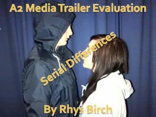
A2 Media Evaluation. By Amy Pope. 1) In what way does your media product use, develop or challenge forms and conventions of real media products?. 1a) Film poster 1b) Film magazine front cover 1c) Film trailer. 1a) Film Poster.

A2 Media Evaluation
E N D
Presentation Transcript
A2 Media Evaluation By Amy Pope
1) In what way does your media product use, develop or challenge forms and conventions of real media products? 1a) Film poster 1b) Film magazine front cover 1c) Film trailer
1a) Film Poster The film poster I have created ties in well with stereotypical conventions of a horror film. In order to get the desired effect, I researched other media posters of the same genre. The colours were generally quite monotone or cold colours e.g. grey, blue, green. These colours create a sense of loneliness, isolation and dread compared to yellow, which connotes happiness because it’s got a bright feel and a warm glow to it. Red is also used in horror a lot as it connotes blood and anger. Below are two examples of horror film posters on the left and right, and my final film poster in the middle. You can instantly see the similarities with regards to the colours used.
1a) Film Poster Other horror poster conventions: • Centred main picture • Cold colours • The use of red somewhere in the poster to connote blood • Portrait • A black background to represent darkness and mystery My horror film poster conventions: • A centred main picture • Use of red in the film title • Portrait • Blur • Black background
1a) Film Poster I have added blue here to give my poster a cold and isolated feel, doing this then removes any emotion from the picture and can make it look slightly supernatural. The blur distorts to character slightly. This creates suspense because the audience are unknown as to what this character actually looks like. The tagline is in white which contrasts with the dark background as white represents innocence and purity. Other horror film posters have a similar style to this. Use of a black background connotes evilness and hints that there is something evil lurking underneath the character. Also it makes the credits, title etc. stand out even more. I have added red in the title of the film to connote that their will be blood in the film, and because there is a lot of red it hints that there will be a lot of blood. I’ve mirrored most film posters in general here by adding credits underneath the film title.
1a) Film Poster My film poster has in some ways challenged conventions of real media products as I didn’t have a solid black background, I felt that if you had the full picture but fading to black at the bottom it would give the viewer a greater sense of setting. Furthermore, there was a lot more space to write me title, credits etc. as there was lots of black space underneath the picture to write in.
1b) Film Magazine Cover The film magazine front cover I have created mostly follows conventional patterns of real media products. I have found these to be: • The magazine name is clear and at the top. Usually going across and behind the main image. • Images on the front targeting a certain audience or reflecting a specific and easily recognisable film genre • Colour schemes are matching and perhaps tie in with the main image • Font sizes vary on more important headings • Several cover lines surrounding the main image to show what’s inside • The price and barcode are displayed
1b) Film Magazine Cover The magazine front cover has one main image, following the conventional patterns of other magazines. Much like my magazine, Scream has cover lines spread around the main image. Even though I have added a few, it still focuses on Alone, and doesn’t cover the image up. Scream appears to have little cover lines. I have tied in the colour of the writing with my main image to make the page look neat and attract attention. The blood on her face is red therefore some of my writing is red. This doesn’t appear to be the same for Scream as most of the writing is white.
1b) Film Magazine Cover My magazine title is in the centre of the top of the page, and is in front of the image as this is one of the most important things for readers to see. This also applies to Scream magazine. However, Empire is behind the image, making that appear of more importance. This is the same for a lot of other magazines I have researched.
1b) Film Magazine Cover Here I have added a heading to my magazine of the title. The boldness of the writing is to draw the reader in and grab their attention. Looking at this image, it is easy to distinguish the genre of film. Her ghostly white face makes her look gothic and scary., relating to specific psychological horrors. She also has blood coming from her mouth which suggests she is the victim and reflects the murders carried out in the film. ‘Sneak peek’ is written in bold capitals, much like the title of the magazine. This focuses it’s importance as new and exclusive which is enticing for a reader. ‘Alone’ is written in black, but with a hint of white around the outside of the writing. This ties in well with the colour schemes of the rest of the magazine and could connote evilness vs. innocence as the colours are black and white
1c) Film Trailer The film trailer we have created has many conventions of horror trailers, and after studying and analysing others, some of the conventions I found consist of: • A happy/romantic first scene to connect the audience with the characters and contrast with what’s about to happen • Blackouts throughout with words on them to help the narrative (for example: ‘Behind closed doors’) • Pace rapidly progressing • Creepy music • Screams • Contains film title and opening date
1c) Film Trailer Happy scene The beginning of our film trailer is similar to other openings of horror trailers. Orphan (below) opens also on a happy note, with children playing. This is very similar to our trailer (left) as the group of girls are singing and dancing together. This happy scene is mainly placed at the beginning to contrast with other more intense and horrific scenes. It also gives an insight into the characters lives and personalities to give them sympathy later on. This is very common in horror films and appears in many I have analysed.
1c) Film Trailer Throughout my trailer I have added writing in order to give the audience clues about the narrative. This builds tension and is stereotypical of horror trailer conventions. ‘He’s always watching you.’ This uses vague language to keep the audience wondering who exactly is this murderer?
1c) Film Trailer • As my trailer progresses, the pace begins to fasten, the music gets more intense and the clips become shorter giving a mixture of different clips at once. This is a strong convention of horror trailers as the pace builds to get ready for the end result. For example, in my trailer the music throughout is getting creepier and more intense. Lots of clips flash up quickly to give a teaser to what could happen without seeing what actually does and ruining the film. • The time of our trailer is 1:10, so almost 1 minute. This is short for a horror trailer and most stop nearer the 2 minute mark. The Strangers is 2 minutes, however Orphan is 2:30 minutes, therefore the time does vary from trailer to trailer. • My trailer also includes the title, ‘Alone’, the tagline, ‘You are never’ and ‘Coming soon’ all in separate blackouts to give an abrupt feel. This is much like other trailers but instead of coming soon may have an actual release date.
2) How effective is the combination of your main product and ancillary texts? The two ancillary texts and my main product all work well together to create what could be a realistic film. Horror conventions are within all of my products and reflect those of real media products. The two print based texts, my magazine front cover and film poster both share similarities. A majority of the font is white on both the two products which was conventional for the horror posters and magazines I had researched. The ancillary texts, along with my main product are all aiming to promote the film, that is their main purpose. The three things throughout sustain the same genre which is horror, and after researching into real media products and their conventions, I am able to stick to horror conventions.
3) What have you learned from your audience feedback? To gain audience feedback, I have setup an account with surveymonkey.com and created a questionnaire which was also distributed to a large group of students of all ages at the media showcase my school held. After collecting all of the results, I have arranged the results into charts which is on my previous post.
3. The Poster This shows that the majority of the audience felt my poster carried on the same genre and idea as my trailer, which is what I was aiming for by using the codes and conventions of real media posters. However, 10 people were unsure as to whether my poster achieved this or not. This tells me I perhaps need to do something to link the two better but I’m unsure at this stage what else I could have done.
3. Magazine The majority of people said that the magazine cover did sell itself and that the cover article made them interested in the film being discussed but there are still clear problems. These problems could be due to it being to cluttered, too many colours, lack of interest etc. but there are still amendments that would need to be made to attract a wider audience.
3. Trailer The majority of respondents felt either scared or interested after watching the trailer, the rest of the answers still generally relate back to horror but if this is not their favoured genre then it is clear that they would not have the same level of interest as one who enjoys horror films and would find the trailer quite boring. This would also link to the second question where the majority of respondents claimed they would want to watch the whole film but, as with any trailer, there were people who didn’t want to watch it for one reason or another.
3. Trailer All the similar films that were mentioned were horrors and there were a couple of films mentioned that I had researched and taken bits out of. This shows me that the genre of my trailer was made very clear to the audience. This is good to know as I can now see that I have followed the correct codes and conventions to portray the horror genre in my trailer.
3. Trailer Most people found the sound and music was most effective in communicating with them, I was mostly focused on this when making my trailer as I found most horror trailers used sound and music to portray the genre and to sell their film, this could be the reason most people felt the features helped grab their attention. The acting and story seemed to let me down, which could be why some people felt the features didn’t work well with capturing their attention, I’m not so worried about this though as I didn’t want to give too much story away and ruin the film and low budgets meant I couldn’t afford proper actors so just used my friends.
3. Trailer It’s good to know that most people didn’t lose interest at any point in my trailer but I knew the beginning was going to be an issue. I knew this because a small sample group that watched my film also said the first scene was too long however, I didn’t have chance to rectify this and thus knew that it would get a high amount of votes. This is also apparent in the question about if they would change anything in my trailer however, most people said they wouldn’t change anything which is good feedback especially as you can’t please everybody.
How this feedback has helped me… After studying my results, I have learnt that overall, my products are generally fitting for the horror genre they are and follow the right conventions. The happy scene was a convention I discovered in horror trailers to contrast with scenes later on, and the feedback tells me this is well communicated and the effect I wanted has been portrayed but it was too long. However, they said that the sound and music was used effectively which was the main thing I was aiming for.Overall I have got some positive feedback and am pleased as the effect I had aimed for has been understood and recognised.
4)How did you use media technologies in the construction and research, planning and evaluation stages? Throughout every stage of my coursework I have used new technologies to communicate, create, edit and evaluate my work. To begin with, my work is located on a blog on the internet called wordpress, which helped to easily distinguish every different page.
4) RESEARCH &PLANNING By using YouTube I could view appropriate horror trailers in order to analyse their conventions. I also used Google and Google images to find horror film posters and magazine front covers to find out the conventions of these ready to apply them to my media products. This was also used in my planning stage, I Googled a certain image I wanted, for example a girl looking creepy, and added that to my draft posters and magazine covers in order to get an understanding of what sorts of images I wanted. I also used Wikipedia to research into the history of film magazines, and well known and particular film institutions. To plan and draft different copies of my media text products, (film poster and magazine) I used Photoshop as I found it had more tools, features and was more equipped for picture editing.
4) CONSTRUCTION This process involved me taking and editing the pictures I had planned. This is where I started to use hands on technology, for example digital cameras and editing programmes, as I could finally put to practise my own initial ideas. I used Photoshop to edit my pictures. This was helpful to get the right lighting, colour and text. It was easier to add the main text such as the title ‘Alone’ for the poster instead of doing this on Publisher as it gave a range of different fonts, and the text was easy to rearrange. Picasa however, is ideal for getting a feel for fonts and font sizes of headings. I created my whole magazine cover on Photoshop but I needed to work on the font sizes for the cover stories and headings to give the audience an idea of the most important things on the magazine. Photoshop was easy to edit fonts and the size, you could just grab and drag to the size you wanted.
4) CONSTRUCTION When filming my trailer, I used a Flip Video UltraHDFlipcam. This was used to capture film and audio footage on. However, to edit these the way I wanted I had to use further technology. I used a Mac, and iMovie to edit my video footage. Once the footage was transferred from the camera to the Mac and onto the iMovie library, it was only then when we could begin to edit clips together, along with adding: Sound by recordings Music downloaded from websites Editing the speed and flow of clips by using iMovie Transitions; blackouts, fades, blurs Titles and writing
To Conclude… After looking over everything I have evaluated here, by a combination of vast amounts of new technologies, I believe my two ancillary texts and main product work together in challenging, using and developing real media products with only a few minor issues.