Exploring Hybrid Genres: The Narrative Techniques of 'Bail' in Short Film Drama
The short film 'Bail' challenges conventional expectations of the short film genre by prioritizing character relatability and emotional engagement. Unlike typical short films designed solely for audience enjoyment, 'Bail' delves deep into its characters, inviting viewers to connect with their stories. The film's realism, set against familiar settings, heightens audience empathy, even as it risks presenting scenarios that might appear unrealistic given the low-crime context of Wiltshire. The use of establishing shots models audience expectations, offering a stark contrast to traditional framing seen in films like 'The Fellowship of the Ring,' firmly grounding the story in realistic drama.

Exploring Hybrid Genres: The Narrative Techniques of 'Bail' in Short Film Drama
E N D
Presentation Transcript
A2 Media Studies - Evaluation Niall McCaughan
How does your media product use, develop and challenge forms and conventions of real media products?
Forms and Conventions The genre of our media product, Bail, is a hybrid genre; a short film drama. One said convention of short films is that they are purely for the audience’s viewing pleasure, and not intended for them to relate to any specific character. This convention was very much usurped in the film, with the profiles of the characters a somewhat central focus of our film – we really wanted the audience to feel strong emotionally about our characters, giving them an on-screen representation that they can relate to. Achieving this with the five to six minutes we were aiming for was one of the more difficult elements of the production of the film. Due to weather conditions, actor availability and other restraining factors, the representations were not always as strong and consistent as they could have been. In hindsight, I am pleased with the eventual outcome of our film, and their compliance with the forms and conventions – however, the fact our film usurps some of the classic forms and conventions of the short film genre this may deter consumers as well as attract them. By filming in locations we are familiar with, it helped us to establish the characters in our film with a high degree of realism. As an actor in the film, I am familiar also with the representation I was attempting to convey; thus making the character realistic. The realism of both the storyline and the setting, as well as the characters complies with the conventions of a drama film. As Wiltshire is a low-crime county, however, the violent scenes in the film could be interpreted as unrealistic as it is not as common an occurrence as in more built up locations. Our film is also a drama as it follows a realistic story line with realistic setting and characters. This is a convention of a realistic drama which focuses on events that could happen in everyday life and can therefore me identified with by the audience. Our film follows this convention by re-enforcing the stereotype of a teenage girl and using recognisable settings like a school. however, our film does challenge the convention slightly by ending with a twist, which gives the story an ambiguous finish; something that an audience could interpret to be unrealistic.
Establishing Shots – How They Can Mould The Audience’s Perceptions The effect an establishing shot can have on the audience can make or break a film. Due to the minimal length of the film, the establishing shot is crucial in ensuring your audience remains interested. Not only does it mould the audience’s perceptions of a film, but it also sets the tone for the entire movie. The establishing shot here is from The Lord of the Rings – The Fellowship of the Ring (2001) directed by Peter Jackson. It is conventional of many establishing shots; employing the ‘moving pan’ shot, where the camera tracks the location. It also tracks the character of Gandalf – so not only is the idyllic representation of rolling hills, sunshine and green fields portrayed, but also the tranquil passage of a man on a horse. This enforce the idea that all is well, which of course is a tone which quickly deteriorates as the film progresses. Maybe this is a technique used by director Jackson in order to strengthen his representations later on in the film. Is the tranquillity of the setting being displayed through the open expanses of land? Or is the director trying to represent one man ‘on a mission’ by having him the only character in the frame? http://www.youtube.com/watch?v=Sqj7pNAHnWg Establishing shot – Fellowship (2001)
Bail - Establishing Shot Similar to the establishing shot seen in films such as The Fellowship of the Ring, our film conforms to the conventions of an establishing shot regarding the ‘moving pan’ – the camera slowly panning to reveal the location in shot. The location in the instance of our film is a police station, clearly identifiable by the police cars parked outside. Instantly, from first sightings of the police station, the audience are aware that something is an issue within the film, as police stations, naturally, are commonly associated with crime. The Mise en Scene in this establishing shot is something, as the cameraman for this specific shot, I am very proud of. The instant suggestion that something is up very much subverts the establishing shot of The Fellowship of the Ring however – disallowing any possibility of a change in tone but giving the audience scenes that they can get ‘stuck in to’ and feel involved straight away. The metal fence in the foreground of the frame gives the audience the impression that they are looking in on something restricted. This invokes a sense of danger, which is further reinforced by the apparentness of the police cars. The fact that the audience are ‘this side of the fence’ also suggests that they are trapped, isolated and suppressed; almost as if they were the ones imprisoned. The Police cars here give the audience something to query, thus maintaining their interest almost instantly
Opening Titles Although opening credits do not bear any particular forms and conventions, it can be said that they maintain a specific likeness to the remainder of the film. For instance, Sam Raimi’s 2002 film Spider-Man does not have credits over an establishing shot, but yet remains true to the theme of the film by having the credits placed on a spiders web. The titles are very much a subjective thing which are more often than not required to meet the forms and conventions carried throughout the film, for instance spiders in Spider-Man. Opening credits are often a prime example to also establish the characters within the film; something which as a group we felt we wanted to depict in our film. http://www.youtube.com/watch?v=1f5ykkGJvMU Spider-Man opening credits. (2002)
Bail – Opening Titles Having watched the opening credits of Raimi’s Spider-Man as a group, we came to the conclusion that we wanted to usurp the convention of ‘block titles’, and instead have the titles placed over moving images. This allows us to plug the tension more before the audience get a look at the establishing shot. With an array of sweeping shots, pans and cuts of shots of street corners and derelict buildings, this enables us to demonstrate the tone of our film from the very outset. In hindsight I would say this is a solid, strong opening to our film – however if there was one thing I would change it would be the font, as it is not totally cohesive with other elements of my overall production e.g. The ancillary texts.
Establishing Sound Due to the short length of our film (only 5 minutes) we felt that establishing the sound was essential. To us, it meant that the audience were instantly plunged into the atmosphere of our film rather than taking time to get into it much like real media products, where films can last up to three hours. The film begins with a piece of ‘drum and bass’ or ‘dubstep’ music in the background of the title shot, as this music is fast paced highlighting the fact that the film could be frantic and fast paced. We felt that the first non-diegetic sound that the audience hear is the most impactful and sets the tone for the rest of the film. For instance, the opening to the film ‘Layer Cake’ features the track ‘She Sells Sanctuary’ by The Cult, a rock track very different to that of our film, which gets straight in with the music often associated with the characters in our play. This is evidence of how through sound we are conforming to forms and conventions of society. Further evidence of music establishing a situation in our film is when Nabs collides with the stranger on his walk home with Neela. The track chosen is an aggressive rap/rock song, ‘Testify’ by Rage Against The Machine. The reasoning behind the choice of this track is due to its build of suspense before the riffs kicks in, allowing tensions to rise as Nabs flies off the handle. A second example of tension in music is in the ‘MS2 Store’ scene, where a seemingly acoustic track called ‘Cemetery Gates’ by Pantera is overlayed on a monologue spoken by Ash. As Ash and Delroy’s actions become more severe, the track gets heavier and heavier until eventually, the riff kicks in just as things get violent. The music is a perfect way to keep tension at a maximum and fully engage the audience. As a group we discussed and considered beginning the film with the low angle shot of Ash and Delroy’s feet as they walk down the steps. This idea meant we could begin the film with the diegetic sound of footsteps – with the audience trying to make a judgement on the characters from the purpose of their walk. However this concept was eradicated at the editing process, as we felt it would be too confusing for the audience to make sense of as well as losing a fair amount of the impact of our film which is so crucially important in order to maintain the full authenticity of our attempted representations.
Establishing Character In films, first impressions of a character are often the most important and can be very difficult to alter once they have been made up. The four of us decided that we wanted to get a strong, memorable first impression of each character in early in our film, and there was not a more obvious and fitting place to put these said impressions than in the opening titles. Using clips from later segments of our film in order to keep the audience interested, we implemented them at the beginning of the film to encourage the audience to watch on as well as giving them an idea of what each character is like before they have seen any footage. This means that the audience watch the film with a depiction already decided in their head; known as the hypodermic syringe theory, it is effective regarding the idea that the audience will believe everything you present to it. Vladimir Propp’s theorem of ‘character archetypes’ is applicable to our film in some ways, as throughout the film the audience establish who is a favourite or hero and who is a ‘heel’ or villain. The point-of-view shot used to depict Nabs is also used later on in the piece when Nabs assaults a stranger. This allows the audience to recognise later on in the film where this shot originally came from as well as being a good instigator for initial thoughts on the character. The text at the top displays the actors name and the character they play, in this case ‘Ali Wheeler as Nabs’. The text is of the same font seen in the remainder of the titles, maintaining continuity. The shot in question is a point-of-view from the audience’s perspective, with the character of Nabs punching the camera before it quickly cuts to another shot. The aggression on Ali’s face clearly emits the emotion that Nabs is furious, and the violent striking of the camera shows how the tenacity and hostility of nabs is one of the first impressions the audience get.
Again the same technique is used regarding ‘Niall McCaughan as Ash.’ Once again using a recognisable part of the film to give a sense of continuity, the self-assured and brash walk of Ash as he leaves the frame emits this ‘bad-man’ feel. The text is once again the same, further aiding the continuity of the piece. However, the text for this shot is black rather than the white text seen in Nabs’ shot. This is due to the poor visibility of the text on the murky backdrop of the red brick wall, as white was a more readable colour. Although this doesn’t aid the continuity in any way whatsoever, we felt that it was worth the sacrifice in order for the audience to understand what was being placed in the frame. Ash’s dress also adds to the ‘bad-man’ feel, with the baseball cap, zipped-up jacket and tracksuit bottoms somewhat concealing his identity making him more menacing and intimidating, similar to that of Nabs. The meaningful spitting that Ash does on the floor before he vacates the frame adds a sense of purpose to what he is doing, further painting a negative picture of the character and ensuring that the audience have a clear opinion on the character before the film begins.
The establishing introduction of the character of Delroy looks similar to that of Nabs and Ash, although the character could not be more different. The text, location and style of shot can all be likened to the establishing shots of the other two, however, what occurs in the shot is vastly different to what is seen in the other two. Delroy, played by George Tunnicliffe, has his head down and his hands in his pockets, with a certain look of unwillingness on his face. Not only can the audience tell instantly through his facial expressions and mannerisms that he is different to Nabs and Ash, but also through his clothes; a more upmarket dress is used to display how he is out of sorts and possibly in with the wrong crowd. Keeping with the forms and conventions used in the other establishing character shots, a part of the film which can be seen later on is used as an establishing motif. One of the major differences in this shot is the appearance of Ash, pulling and shoving Delroy out of the frame. It is the only establishing character shot where another character gets involved; this heightens the tension and further depicts Delroy as a weedy, out of place character. This first impression is once again crucial as it gives the audience a solid foundation on their opinion on the character which will be carried through the remainder of the film. An example of how we usurped a particular convention of real media products in this shot is for instance in ‘Cruel Intentions’, where the protagonist is first seen through the reflection of a rear-view mirror in a car – looking somewhat meaningful and important. This is not at all similar to Delroy who looks as if he needs some serious help.
The MS2 store scene depicts Ashley convincing Delroy to help him Rob a shop. It is the first instance in our film where there is a one-to-one conversation. We conformed to the forms and conventions of real media texts by implementing the classic conversation style through use of over-the-shoulder shots, shot-reverse-shots and mid shots. However we usurped many real media texts by using natural lighting rather than artificial. As it was an overcast day when this scene was shot, it was not the brightest light but it gives off the impression of gloom, with pathetic fallacy becoming apparent; the gloominess of the weather suggesting how something slightly dark and sinister may transpire. Due to the fact that many of the shots regarding conversation between the two characters were close-ups, this suggests that they are important characters and the expression on their face is important in order to construct an accurate representation. We also manipulated Mise en Scene to our advantage when shooting, which can be seen through the presence of the grey bins in the background of the conversation, as well as the steps they come down at the opening of the scene. The representation we wanted to construct is that Ash is a troubled young man who can be very persuasive, and uses force to do this. The pulling and pushing he does of Delroy, especially the shove into the shop (2.10-2.25) demonstrates the dominance Ash has over his peer. We did however discover that editing was going to be crucial in this scene, with quick cutting making it fast-paced and flowing. One particular cut is the shot where Ash grabs the Pringles off of the shelf and then places them in his jacket. Filmed as two separate shots, we used our experience in iMovie from the preliminary task to produce an effective professional edit of these two shots so that it looked like one fluid movement – from shelf to jacket – as if there was no cut there. We quickly realised that many real media texts rarely use transitions such as fade or dissolve to move from scene to scene. Therefore we felt we can maintain authenticity and continuity, as well as conforming to forms and conventions, by leaving out the addition of transitions. Using research from a short filmmaker’s website, he mentioned that the editing process was easily the most important and considerable care should be taken when doing it. As transitions are easily noticeable, in hindsight it was the correct decision to not use them as it means they cause the film to lose a degree of its professionalism, a trait we strongly felt we wanted to upkeep.
Adding Tension At the climax of the MS2 store scene, it was originally planned for Ash to ‘slash the shopkeeper’s face with a knife’ as it is stated in the original script. We quickly came to understand however that this was inappropriate for our audience – not to mention that the scene would have been increasingly harder to shoot requiring us to find an extra actor to portray the shopkeeper, as well as figuring out a way that Ash can slash the shopkeepers face convincingly without the need to go over the top. We discovered that it was the best idea after considering all possibilities, that we did not film anything relating to Ash wielding or slashing a knife – instead, we used the power of non-diegetic sound and title screens such as this one, in order for the audience to construct their own mental image of what happened. This is much more impactful as then each audience member will have their own vision of what happened, meaning there was no need to film additional shots of Ash’s violence. Due to continuity, we concluded that having one of these title screens after Nabs’ flashback too was appropriate. The full build up of the scene can be witnessed from 2.45 onward.
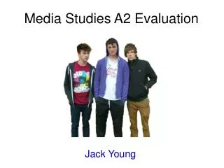
Having decided upon a picture of the three of us (George Tunnicliffe, Ali Wheeler and myself as Delroy, Nabs and Ash respectively) as a mainstay for my double page spread article, I felt it would be more than appropriate to maintain the professional level of continuity I was aiming for in my work. By likening the double page spread article to the poster, it allows consumers of my media texts to determine links between the texts, making them exclusive to my work. The block red outline is almost identical to the outline seen as a part of the image for my poster. The photograph I have chosen for the main feature of my double page spread article is one from the phooshoot we engaged in as a whole cast – a further benefit of how I did not require to go out and spend valuable time taking a photograph. The first page of my double page spread article comes to life with the addition of a title – ‘Standing Out.’ I chose this title for my article as it goes nicely hand-in-hand with the idea of the red outline – making the models stand out from the rest of the page, and this can be said for the poster also. Once again, taking every aspect of continuity into account, I maintained the same colour pallete of both red and black to make the double page spread article upkeep its authenticity. I wanted to make sure that the word ‘out’ was larger and had a greater impact than ‘standing’ – this was to further reinforce how I intend for the film to be a standout piece as well as the fact the poster is intended to stand out too. Font wise, I kept the colours of the fonts the same and where possible used the same style of font throughout this ancillary text. Adding a ‘preview’ of what is to come in the article is a modern convention of double page spread texts. The capitalisation on ‘Hailed’ where the ‘H’ especially is enlarged is a very famous convention of magazines that I wished to conform to. Keeping to the colour pallette of black and red, I went for the simplicity in this text as I did with the poster – dark text on a lighter background. This allows for the consumer to read the words easily, and makes certain that any colour that is evident is more noticeable. The connotations of the red and black is almost invoking a dangerous ambience to the piece. As the development of my Double page spread article expanded across two pages, the continuity of the font style and colour is a convention of magazines that I wanted to replicate in this ancillary text. Adding pictures of the actors allowed the consumer to make a clear connection between what is being said in the article to a photograph – thus putting a name to a face regarding the answering of the questions in the article. Keeping the text nice and aligned was a priority of mine during this development process, as columned text is something often seen in double page spread articles in the modern day. Using all of the things I have learnt from my double page spread piece from AS, I once again used Adobe InDesign to develop this specific ancillary text. Overall, I am very pleased with my finished article, and I took into consideration the audience feedback I received, picking out things which were successful and what things may have been improved.
How effective was the combination of both your ancillary texts and your main text?
Looking at Empire magazine for inspiration for my double page spread article, I knew that in order for the ancillary texts to be successful in conjunction with my main text, they had to be closely interlinked with a high standard of cohesion. The main target audience for all of our texts was young adults between the ages of 15 and 25. we quickly realised that due to the nature of our film, it was more likely to be focused towards the male side of our audience. However, that does not mean we can 100% rely on this and rule out the idea that girls will not watch it – so by making the double page spread article not totally gender specific, it allowed us to maximise the potential when reaching our target audience. The use of a simple layout for this text was something I wanted to convey, as simple is often one of the most successful techniques, and by analysing articles from Empire magazine, this certainly backs up my theory. The simplicity of the layout also allowed me to add hook-points, bursts and strap lines where necessary, meaning that the effect of the article is emphasised and therefore appealing to a wider audience. In order to achieve maximum effectiveness, I quickly realised that cohesion is essential. Using the colour palette as a way of maintaining this was effective, with the colours of black and red dominant throughout all of my texts – even this evaluation! The black suggests simplicity and maybe even reflects a shadowy, dark mood; something which is represented in our film through the narrative. The red is a colour that connotes danger, suggesting to the audience that the film has vast elements of danger and suspense.
After considering how the ancillary texts will combine nicely with my main text –the film – I wanted to make sure that the representations made in the film would interlink with said ancillary texts. The representations we were aiming for were: Nabs – No nonsense, arrogant, over-the-top character who has an evident mean streak in him. Very competitive. Ash – Troubled young man who is more than capable of capturing that mean streak also seen in Nabs. Emotionally effected, turns to violence when threatened. Instinctive. Delroy – Nervous character, friend of Ash’s. Clearly caught up in the wrong company. Easily encouraged and pressured, feeble mentally. Using the mise-en-scene and specific editing, we developed these representations not only as the film progressed but also right from the outset. The introduction of the characters with the actors’ names beside them is very much a first impression which we wanted the audience to grasp – for instance, Nabs’ punching of the camera. Ways in which we depicted Delroy to be easily influenced by Ash is when Ash walks down the steps in the first shot of the ‘MS2’ scene. The mere fact that Ash is followed sheepishly by Delroy shows the audience how he is almost attached to Ash and feels he can not break away for fear of something. Delroy’s failed attempt to work his way out of the situation of the shoplifting when Ash is persuading him is further evidence of Delroy’s weakness. Not only does this portray Delroy as an easily convinced, gullible character, but also Ash as a convincing, manipulative one. The biggest demonstration of the relationship between the two characters is when Delroy stalls outside the store before they are about to enter it and shoplift – he is quickly and vigorously pulled by Ash and greeted with ‘Prick!’ for not doing what he has demanded. Ash further reinforces his dominance over Delroy by pushing him into the store. The dominance of Ash over Delroy, and Delroy’s constant willingness to comply with Ash’s instructions is a representation evident in the double page spread article. In the article, Delroy (far left) can be seen to look directly past Nabs in the centre and directly at Ash (far right). This again displays cohesion, and how the representation is conveyed in both ancillary and main texts. Ash’s disregard for Delroy is demonstrated as he and Nabs are delivering a piercing stare into the camera, whereas Delroy looks lost in a world of his own, quietly reflecting on the actions of his afflicting mentor Ash.
What did you learn from audience feedback and how did it help you when developing your texts?
Allowing room for improvement we set up a screening the of film to members of our class and our teacher. They picked up on how we can fine tune elements of the editing and the music we have used in order to maximise the effect of our film. The representations we have cast are effective according to our target audience, delivering a realistic and believable performance. Adding titles and credits was a suggesting from one audience member which we took into account, as we saw this as a window of opportunity to develop the representations of our characters. It is also a perfect opportunity to apply the cultivation theory – the more you ‘feed’ the audience something, the more likely they are to believe it. This again brings me back to the strong representation we wanted to convey of Ashley dominant over Delroy, with various elements of the mise-en-scene leaving the audience no choice but to believe that Ash is the one responsible. Regarding my poster, alot of people said it needed more colour. However after doing research into film posters I noticed that some of the most effective and successful texts for our genre were very simple, quiet texts. Taking this into consideration when developing my poster, I made sure that it also applied to my other ancillary text, the double page spread article. The feedback second time around was much better, with consumers able to see how I had applied and met forms and conventions of real media texts as well as keeping the cohesion of the texts to a high standard. Reflecting, I would probably have spent more time exploring the software I used to develop these texts in order to encapsulate a more gripping and enthralling combination of texts which can display the highest of quality.
Adobe Photoshop CS5 I was more than comfortable when using Adobe Photoshop to develop my film poster. Having used it for the majority of AS Level regarding the completion of my music magazine front cover, not only was I familiar with the software but I was also confident on how to use it. However, elements of this software can be very awkward regarding compatibility – for instance, the school have Photoshop installed on their computers, but I don’t at home; this means all work in Photoshop must be done in lesson time which is not always possible. To buy the software for your home computer costs hundreds of pounds – something which I was not prepared to do thus I was willing to make that sacrifice of lesson time.
Adobe InDesign CS5 Similarly, I used Adobe InDesign in my AS course to produce a double page spread article for a music magazine. This encouraged me to use it again as I am familiar with the software. The benefits of using both Adobe products (Photoshop and InDesign) is that they correspond with one another, featuring similar controls and interfaces. This means that development and production is much more fluid, allowing me to get on with the job more quickly and efficiently whilst still producing a high quality of work.
Apple iMovie Using iMovie was comfortable yet infuriating at times. Discovering that iMovie was the best editing software for our film I was pleased, as I had previous experience with iMovie when editing and developing films when I was in lower school. However, iMovie had undergone severe changes since I last used it, and this caused me to have to fine tune my skills and get up to speed on the editing front. The benefits of iMovie are that it is a simple to use, effective software, which does a good job when trying to make the film look professional. However, the software has an autosave feature, something which is not too welcomed when you would rather manually save to ensure that the long hours of editing are safely on your hard drive. As iMovie is an Apple developed software, it has serious cohesion issues regarding Windows computers – which the majority of the school run on, and what I have at home. This meant once again that all editing had to be done at school. Editing consumes many hours and it is frustrating when work isn’t saved.
Audacity In hindsight, the free download of the Audicity software was essential to the completion of our film. The software is a voice recording software, recording audio of a high quality straight from a microphone to a computer. Using Audacity was a new experience for me, however, it is one of the simplest pieces of software available and I picked it up almost instantly. The monologues of both Ash and Nabs were recorded using Audacity, and the results we achieved with this piece of software were fantastic.
Wordpress.com Wordpress.com has been the single blogging facility I have used over two years of the Media Studies course. A simple blogging site, Wordpress gives me the option to upload different forms of Media to my blog, allowing for my teacher to see what stage of the development process I am in and therefore give me feedback on how to improve. Effective the majority of the time, there have been issues when using Wordpress. I have realised that congestion on Wordpress’ part is an issue, as when too many people are trying to post at once, or you individually have posted too many things in a short space of time, it either uploads your work a few days later than anticipated or doesn’t upload it at all. Using Wordpress felt entirely natural at the beginning of the A2 course due to the constant use of it during AS; however, at the beginning of the AS course, like any new media technology, it took me a while to get to grips with.

