Lettering
Lettering. Design & Drafting Technology Unit 7. Single-Stroke Gothic. Most common font used in drafting. Approved Gothic lettering for Engineering Drawings. Reasons for using single-stroke Gothic lettering. Saves time in production Easy to read and provides drawing consistency

Lettering
E N D
Presentation Transcript
Lettering Design & Drafting Technology Unit 7
Single-Stroke Gothic • Most common font used in drafting
Reasons for using single-stroke Gothic lettering • Saves time in production • Easy to read and provides drawing consistency • Easier to learn and use
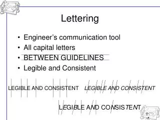
Lettering Rules • The type of lettering recommended by ANSI for mechanical drafting is single stroke gothic (vertical freehand lettering). • The minimum recommended lettering size on engineering drawings is .125 inches (1/8”). • All dimension numerals, notes and other lettered information should be the same height except for titles, drawing numbers and other captions. Titles and subtitles, for example, may be .25 inches (1/4”) high.
Lettering Rules Continued • The composition or spacing of letters in words and between words in a sentence should be such that the individual letters are uniformly spaced with approximately equal background areas. This requires the letters such as I, N or S be spaced slightly father apart from their adjacent letters than L, A, or W. • A minimum recommended space between letters in words is approximately .0625 inches (1/16”). • The space between words in a note or sentence should be about the same at the height of the letters. The horizontal space between sentences in a note or paragraph should be equal to twice the height of lettering.
Lettering Rules Continued • All notes should be lettered horizontally on the sheet. • Most industries prefer that drafters produce lettering that looks the same form one drawing to the next. Also, when drawing changes are made, the individual making the change should attempt to match the lettering on the original drawing. • Always use an AMES lettering guide to draw horizontal guidelines that are spaced equal to the height of the letters. • Use 2H, H, or F pencils for lettering. Try them all, but use the one that gives you the best results. • Many drafters prefer using a .5 mm automatic pencil for lettering.
Lettering Rules Continued • Place a clean paper under your hand when lettering to prevent smudging. • As a rule of thumb, curved letters can be placed close together and straight letters should be placed further apart. • When making curved letters, push the guidelines; that is, let the thickness of the stroke go slightly beyond the guideline. This technique will help make the curved letters appear the same height as the other letters.
Lettering Rules Continued • The tops of letters and numbers such as B, C, E, F, G, K, R, S, X, Z, 2, 3, 5, 6, 8, and 9 should be drawn smaller so the letters do not appear top heavy. • If your letters are wiggly or if you are nervous, try pressing hard to make you lines straighter. If you are pressing too hard, try to relax the pressure. Also try making each letter as rapidly as possible. This tends to eliminate wiggly letters. If your lead is too hard, wiggly letters could result; try a softer lead.