Download
1 / 57
620 likes | 850 Vues
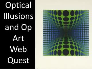
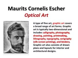
Optical Art and color interaction – Part 1. The study of optics, movement, pattern and rhythm. What is Op Art?. “Op Art” or Optical Art is art that is based on or utilizes the idea of movement and the illusion of movement. The Op Art school began in the 60’s.

E N D
Optical Artand color interaction – Part 1 The study of optics, movement, pattern and rhythm.
What is Op Art? • “Op Art” or Optical Art is art that is based on or utilizes the idea of movement and the illusion of movement. • The Op Art school began in the 60’s. • Advances in the science of optics, glass and lenses following WW2 helped create and spur the growth of the movement. • Note that Op Art is concerned with the illusion of movement, whereas the use of actual movement in a work of art is called Kinetic Art.
Bridget Riley • British Op Artist. • One of the greatest and most productive of the Op Artists. • Began working in the sixties, basing work on the study of color theory and optics.
Closure Closure is the idea that your mind will connect objects that are close in proximity. An edge will create a line where none exists in reality. -Do you see one or two rectangles in the example on the right?
Angles and Proximity • If the distance between design units is changed, especially if it is changed radically and on the angle, vibration in the eye is the result. • Sharp changes in angle will also cause this same effect.
Angles and Proximity • Sharp changes in angles, connected fault lines and waves that are in close proximity create the illusion of movement by affecting the rods and cones of the eyes.
Negative/Positive reversals • By making the negative and positive space (figure and ground) exactly the same size and shape, the viewer becomes confused and the perception of what is “real” flips back and forth – creating the illusion of movement or motion.
Shape Change • A change in the shape of your design units can create an additional illusion of space or depth where none exist.
some fun… • http://www.coleo.com/Maurice/Story/ • The Wizard of Op by Ed Emberly • Ed Emberly is one of the great children’s book illustrators of the 60’s and 70’s. Many of his works are classics. • The Wizard of Op is an experiment in Optical Art in the form of a children’s story.
Color Interaction • Color Interaction is the study of how colors interact with each other. • Color interaction is an illusion created when colors are seen in groups. • Since colors are rarely seen alone, it holds that color is then dependent on other color and we rarely (if ever) see color as it truly appears.
Value Changes • The two hues interact, they can radically impact how we see them, not only in terms of base hue, but in terms of value and intensity as well. • Which green is darker? • Top or bottom?
Value Changes • Both greens are actually the same hue. • Most people see a difference in value because they are surrounded by colors of different shade and hue.
CHALLENGE: Take the 12 grey squares and place them in numerical order from lightest to darkest.
The answers… • 3 • 7 • 4,5 and 6 are all the same shade of grey. • 1 • 2, 11 and 12 are all the same shade of grey. • 8 and 10 are the same shade of grey. • 9
Joseph Albers stated that even when a color is placed on a ground that is not technically a color, it is still influenced by its surroundings.
Color Depth • Color depth is, as discussed before, the idea that certain color seem further away, and certain colors seem closer. • The Op Artists took this one step further, finding that when they surrounded a hue with certain other hue’s, they could make the color seem to advance or recede in space as well.
“Night cafe in the Place Lamartine in Arles” Complimentary colors. Also, one of the first known paintings where an artists intentionally used color to create a mood or evoke an emotional response in the viewer.
“The Cafe Terrace on the Place du Forum, Arles, at Night” Split - compliments