Download
1 / 43
430 likes | 627 Vues
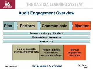
Data Presentation: How to Effectively Communicate Your Findings. Mary Purugganan, Ph.D. maryp@rice.edu Leadership & Professional Development Workshop November 20, 2004. Today’s Plan. Function & design of common graphics for data in S&E Tables Line & bar charts Scatter plots Histograms

E N D
Data Presentation:How to Effectively CommunicateYour Findings Mary Purugganan, Ph.D. maryp@rice.edu Leadership & Professional Development Workshop November 20, 2004
Today’s Plan • Function & design of common graphics for data in S&E • Tables • Line & bar charts • Scatter plots • Histograms • Frequency polygons • Photographs, micrographs • Video clips • Designing for context • Ethical issues in data presentation
Graphical Excellence “The well-designed presentation of interesting data-- a matter of substance, of statistics, and of design” (Tufte, 1983)
Tables • Function • Organize verbal and numeric data • Good for showing specific results • Not good for showing overview / trends • Not good for quick communication of ideas • Design • Place title and caption above table • Place units in column headings • Avoid rules (gridlines) in small tables • Use rules cautiously in large tables • Choose narrow and/or gray lines • Use blocks of light color instead of rules
Example: Small Table Day, R.A. (1998) How to Write and Publish a Scientific Paper. Phoenix: Oryx Press
Example: Rules in Large Table Rules should be narrow, faint, and unobtrusive J. Donnell, Georgia Tech; http://www.me.vt.edu/writing/handbook
Example: Color Bars in Large Table Color bars aid readers who may have to, for example, look up and compare values often J. Donnell, Georgia Tech; http://www.me.vt.edu/writing/handbook
Line Graphs • Function • Good for showing trends / relationships • Not good for showing precise data values • Design • Place title and caption below graph • Place units in axes labels • Avoid legends (keys) off to side in box • Label lines (best for projected work), or • Place key in caption or within graph (written documents)
Line Graphs Day, R.A. (1998) How to Write and Publish a Scientific Paper. Phoenix: Oryx Press
Line Graphs Kaufmann(2003) J of Hydrology 276:53-70
Scatterplots • Function • Good for identifying non-linear relationships • Good for identifying clusters and outliers (out-of-range points) • Design • As for line graphs
Example: Scatterplot Sanchez et al. (2004) Chem Eng J. 104:1-6
Bar Graphs • Function • Good for comparing proportions, amounts, values • Good for displaying data sets that are close together in value (would overlap in line graphs) • Not good for showing precise data values • Design • Place title and caption below graph • Place units in axes labels • Spacing between bars should be half the size of bars
Example: Bar Graph Figure 1. Ras12V37G transforms human cells. Anchorage-independent growth of NIH 3T3 (black bars) or human HEK–HT (white bars) cells expressing the described constructs, calculated from the average number of colonies observed from three plates and expressed as the percent of colonies observed in Ras12V-transformed cells. A total of 50,000 Ras12V-transformed NIH 3T3 or HEK–HT cells yielded 380 ± 50 or 289 ± 47 colonies in soft agar, respectively. Hamad, N.M.et al., Distinct requirements for Ras oncogenesis in human versus mouse cells, Genes & Development, 16(16)
Histograms • Function • Constructed from frequency tables • Good for seeing shape of the distribution • Good for screening of outliers or checking normality • Not good for seeing exact values (usually data is grouped into categories) • Design • Place title and caption below graph • Place midpoints of intervals on horizontal axis • Place frequencies on vertical axis • Bars should touch one another (unlike bar graphs) • Use only with continuous data
Example: Histograms Fig. 4. Height histograms a, b, c and d corresponding to micrographs of Fig. 3b,c,d and Fig. 2, respectively. Ali et al. (1998) Thin Solid Films 323:105-109
Frequency Polygons • Function • Constructed from frequency tables • Visually appealing way of showing counts/ frequency • Better than histogram for two sets of data because the graph appears less cluttered • Design • Place title and caption below graph • Use a point (instead of histogram bar) and connect the points with straight lines • May shade area underneath the line
Example: Frequency Polygon http://www.olemiss.edu/courses/psy214/Lectures/Lecture2/lex_2.htm
No chartjunk! • Graphical simplicity: keep “data-ink” to “non-data-ink” ratio high • Gridlines • Rarely necessary • Better when thin, gray • Fill patterns • Avoid moiré effects / vibrations • Gray shading is preferable to hatching • Avoid 3-dimensional bars Tufte, 1983
Photographs • Function • Illustration • Good for documenting physical observations • Usually qualitative but supported by quantitative data • Design • Place title and caption below photograph(s) • Crop and arrange several photographs to facilitate understanding • Insert scale bars when necessary
Shahbazian et al., Neuron (2002) Photographs C.R. Twidale (2004) Earth Sci Rev 67:159-218
Micrographs Fig. 2. GFP.S co-localizes with wild-type S at the ER. Shown is the intracellular distribution of GFP.S expressed either alone (squares a–c) or together with SHA (squares d–i) in COS-7 cells. Cells were fixed, permeabilized, and examined by fluorescence microscopy. (a, d, and g) GFP fluorescence (green); (b and e) immunostaining with a mouse antibody to PDI followed by AlexaFluor 494-conjugated goat anti-mouse IgG (red); (h) immunostaining with a mouse anti-HA antibody followed by AlexaFluor 494-conjugated goat anti-mouse IgG (red) to visualize SHA. Squares c, f, and i are the corresponding merged images so that overlapping red and green signals appear yellow. Lambert et al. (2004) Virology 330:158-67
Micrographs Fig. 3. STM micrographs of Ag (100). (a) 0.1 Å~0.1 area. (b) Edge enhanced image of (a), (c) 500 ÅÅ~500 Å and (d) 100 ÅÅ~100 Å areas, respectively. Ali et al. (1998) Thin Solid Films 323:105-109
Blots and Gels • Author must “transform” raw data • Select lanes and/or create montage • Crop image • Label lanes, bands
Clumsy labeling of lanes CHOK1 ; 1.5 mg CHOK1 ; 0.3 mg CHOK1; 0 mg xrs-6 ; 1.5 mg xrs-6 ; 0.3 mg xrs-6 ; 0 mg Cell type; DNA transfected
User-friendly labeling of lanes Purugganan et al., Nucleic Acids Research (2001) 29:1638-46.
Video clips • Function • Utilize web technology for innovative ways to share data • Show processes in real-time • May be qualitative but supported by quantitatve data • Design • No conventions yet observed/published
Video clips Shahbazian et al., (2002) Neuron 35:253-54. Supplemental movie S2 online at: http://www.neuron.org/cgi/content/full/35/2/243/DC1/
Remember your context Written documents • Theses • Manuscripts • Reports Visual presentations • Seminars/ oral presentation • Posters
Conventions for Written Documents • Number and title (caption) each graphic • Table 1. Xxxxxxx… • Figure 3. Xxxxxxx… • Identify graphics correctly • Tables are “tables” • Everything else (graph, illustration, photo, etc.) is a “figure”
Conventions for Written Documents • Refer to graphics in the text • “Table 5 shows…” • “… as shown in Figure 1.” • “… (Table 2).” • Incorporate graphics correctly • Place graphics close to text reference • Caption correctly • Above tables • Below figures
Tips for Written Documents • Design graphics for black-and-white printers and photocopies • Figure and table captions can be long and informative (follow individual discipline and journal conventions) • Remember audience when designing • Journals: learn as much as possible about audience to identify needs, areas of expertise • Thesis: design for “outside” committee member
Tips for Visual Presentations Uniqueness of posters and oral presentations • User is not a reader • Can assimilate less detail • May not have time to process confusing data • Oral communication accompanies what is printed / projected • “Free” and “guaranteed” color • Use color purposefully • Avoid overuse of decorative color • Avoid too much color (e.g., background fill) • Avoid layering two colors of similar intensity (e.g., red on blue) • Be sensitive to red/green color blindness
Visual Explanations • Tag image with explanations • Interpret (don’t just show) data (esp. on posters!)
Ethics in Data Representation • Intent to deceive = scientific fraud • Distortion: when visual representation is not consistent with numerical representation • Visual representation = perceived visual effect • e.g., readers do not compare areas in circles correctly (larger circle does not appear to have the increased area it actually does) • 3-dimensional graphs may fool the eye • Context is crucial (show enough data)
Ethics in Data Representation • Data distortion in graphing • Scale of graph (limits; log) • Placement of origin • Shape (length of axes) • Omission of data range in a continuum (implied continuum) • Cooking and trimming • Charles Babbage (1830) “Reflections on the Decline of Science in England and on Some of Its Causes” • Cooking: making multiple observations, selecting from those that agree with theory/preconceptions (Mendel?) • Trimming: smoothing irregularities to make data appear accurate and precise; excluding extreme values in a data set (lots of researcher excuses)
Ethics in Data Representation Photographic data: Particularly vulnerable to trimming • field of view selection • cropping • software (Photoshop) manipulation of contrast, brightness, etc.
Ethics in Data Representation Number one discipline to be guilty of fraud (historically): Biomedical science • Welfare of patients > Scientific integrity • M.D.s less rigorously trained in research than Ph.D.s
Resources • Tufte, Edward R. (1983) The Visual Display of Quantitative Information. Cheshire, CT: Graphics Press. • Burnett, Rebecca (2001) Technical Communication. Fort Worth: Harcourt College Publishers. • Technical Writing: Resources for Teaching (esp. Illustration section written by J. Donnell, Georgia Tech). Accessed 11/18/04. http://www.me.vt.edu/writing/handbook/ • Klotz, Irving M. (1992) Cooking and trimming by scientific giants. FASEB J 6:2271-73. • Goodstein, David. Conduct and Misconduct in Science. Accessed 11/19/04. http://www.physics.ohio-state.edu/~wilkins/onepage/conduct.html/
Small Group ExerciseLook at Visuals: The good, the bad, and the ugly;Present and discuss