Aesthetics Workshop
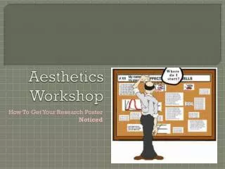
Aesthetics Workshop. How To Get Your R esearch Poster Noticed. Introduction. A research poster is a summary of your research in a visually engaging way; it is an advertisement of your work

Aesthetics Workshop
E N D
Presentation Transcript
Aesthetics Workshop How To Get Your Research Poster Noticed
Introduction A research poster is a summary of your research in a visually engaging way; it is an advertisement of your work Scientific posters are presented at conferences and enable collaboration, support, and feedback from people in your field
AnatomyOf A Research Poster • Title • Abstract • Introduction • Methods • (this is where images and graphs come in handy) • Results • Conclusions • References • Acknowledgements • Contact Information
Layout and Format Are Critical • A well composed poster communicates what you want to say better, and will be taken more seriously (Think how confusing it would be if you were reading an essay and your paragraphs were scrambled out of order) • (Also) If your poster looks good, it will incentivize others to look at it!
Organized flow good not so good
*Tech Tip*Let’s begin. • To properly format a PowerPoint to your poster’s size: • Go to the Design tab and select Page Setup • A dialogue box will open enter the height and width of the page, and the slide orientation (portrait or landscape) should automatically adjust • If the rulers are turned on ( in the View tab check the Ruler box), you will be able to see that the slide is now the size you entered
*Tech Tip*Can anyone read your body text? To get a better idea of what your poster will look like when it’s printed, use the zoom feature of PowerPoint • Take the vertical dimension of the print size and divide it by the vertical dimension of the page setup size in your PowerPoint • 42’’×32’’ poster: 42 ÷ 32 = 1.31 1.31 × 100 = 131% • Enter 131 into the Zoom Percentage box and click OK
Always be aware of your audience • Make it easy for people with any type of background here at Ames to be able to understand the basics of your project
Good Posters Have Unique Features Not Pertinent to Papers • Your poster tells a story of what you did, both descriptively and visually • Describe a few main points with words, but keep text to a minimum • If you include graphs, don’t overcomplicate them with too many specifics • LESS IS MORE! • Simplify your design format based on the poster size criteria
Formatting Do’s • High contrast between the background and text • What you see on your screen may not look the same in print • It has been proven that visual aids (charts, graphs, diagrams, images, etc.) increase the effectiveness of research posters • But be sure the visual aid is significant & informative (it should be able to stand alone without an explanation!)
Things that make a poster difficult to read: • More than twodifferent fonts…it distractspeople • The easiest fonts for most people’s eyes to read are Arial and Veranda • Shadow or glow effects are not helpful either. • Busy backgrounds make things…busy
+Visual Cues • Clear large titles • Nice flow of poster • Use concise wording and larger font • Sometimes pictures or graphs can say more than words • Just remember to keep graphs simple and easy to follow • Web images are usually poor resolution
When you think you’re done… • Read it through and make sure it’s not too long • A person should be able to read your poster in about 7-10 minutes • Stuck? Ask yourself: “If a person was only able to take one thing from looking at my poster, what would that one thing be?” you have your theme! • Ask for help if you need it! (and help others if they’re stuck)
Be your poster’s wingman • Smile! It will attract more people to your poster • Introduce yourself and your project • Start with a short summary of your project • Think of it as an abstract of your abstract • Don’t simply read your poster out loud • Review what you want to say the day before • This is your time to share all the work you’ve done during your internship, so don’t be shy! • Treat everyone as a potential collaborator, employer, or someone who just wants to learn more • Bring paper copies if you can
Resources www.ccmr.cornell.edu snras.blogspot.com/2013/08/nasa-extends-internship-for-uaf.html makeposters.com http://chem.virginia.edu/


