Greta’s Peony
60 likes | 272 Vues
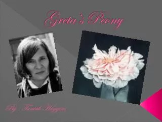
Greta’s Peony. By : Taniah Huggins. Media : . The name of this Art work is Greta's Peony. Aquatint and dry point was used to make this painting , It was created in 1976 by Beth Van Hoesen . By : Beth Van Hoesen. Description :. •Texture : Silky , Smooth ,

Greta’s Peony
E N D
Presentation Transcript
Greta’s Peony By : TaniahHuggins
Media : The name of this Art work is Greta's Peony. Aquatint and dry point was used to make this painting , It was created in 1976 by Beth Van Hoesen. By : Beth Van Hoesen
Description : • •Texture : Silky , Smooth , • •This flower looks more open than regular Peony (Looks as if its dying .) • •Its gives off a relaxing vibe , and has mild tones. • •They used the warm colors to draw your attention to the middle of the flower , from there it illuminates from the center outwards. • •The flower is held in a transparent vase , which gives the flower a stunning look. • The background is dark which is making the main attention go to the Peony.
Analysis: • Emphasis : The flower is the focal point . When you look at this Art the first thing you see is the Peony. • Balance: The Peony is in the middle ; it balances out the dark background , and the transparent vase it’s in . The flower is more bloomed than usual Peony’s which means its dying . • The Dark background brings a sad , depressed vibe ; as well as the dying flower. • Its not symmetrical but proportional .
Interpretation : • The darken background makes the Peony seem as if it’s a self portrait. • The illuminated center gives me the impression that it’s what the artist wants the main attention to go towards . • At the time of drawing this picture I believe that the artist was experiencing some kind of emotionally distress . • I think the artist wanted to give of a grief feeling, because of the sadness the
Judgment : • I believe she achieved her standards , and she made it an indivisual art work . Beth Van Hoesen seems as if she loves flowers . In my opinion this was one of her best works. It was an unique painting , and I believe it was an success. I don’t believe she had many things to improve .