Download
1 / 37
440 likes | 549 Vues
Learn about the fundamental elements of art and principles of design such as line, shape, color, texture, space, and value. Explore how artists use these tools to create visually appealing and meaningful artworks.

E N D
What is Art? Painting Sculpture Architecture Music Poetry Pottery Weaving Metalwork Art is the process or product of deliberately arranging elements in a way that appeals to the senses or emotions.
What is Design? Picture Building Sculpture Drama Design refers to the process of originating and developing a plan or a product, structure, system, or component with intention. Design implies a conscious effort to create something that is both functional and aesthetically pleasing.
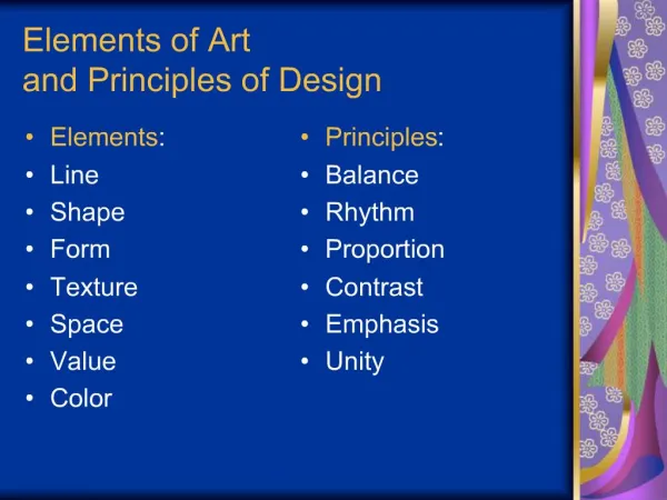
The Elements of Art (the tools to make art)
TEXTURE FORM LINE SHAPE SPACE COLOR VALUE
Artists use line to lead your eyes around a work of art. This is because the artist wants to lead you through their composition. Line creates movement, and leads your eye into, around, and out of visual images as in this painting by Yvonne Jacquette. Oil, 1988 Notice how the artist uses the line of the highway to pull your eyes into the artwork. Line has width as well as length, but usually the width of the line is smaller than the length. Artists create lines in many different ways. A line can be drawn on a paper with pencil or scratched in clay with a stick.
Some lines that we think we see in nature really do not exist. For instance, when you look at the edges of shapes, you think of lines. In the photo of the dogwood blossom, notice that there are no black lines around the flower, only black against white. However in a sketch of the same blossom, lines are used to define the shape of the flower.
Shape When lines meet, shapes are formed. Shapes are flat. Some shapes are geometric, such as squares, circles, triangles, rectangles, and ovals. Other shapes are organic or irregular. Organic shapes Geometric Shapes
Form Forms are three-dimensional—they have height, width and thickness. Shapes are flat; forms are not.
Color The colors we see are lightwaves absorbed or reflected by everything around us. In nature, a rainbow is white light that is broken apart by the moisture in the air. White light consists of all of the colors mixed together. The color of an object depends on how it absorbs and/or reflects light. If an object absorbs all of the light wavelengths, it will appear black. If it reflects all of them, it will appear white. If an object absorbs all wavelengths except red, for example, it will look red.
The primary colors are red, blue and yellow. The secondary colors are green, orange and violet (purple). A secondary color is made by mixing two primary colors.
Intermediate colors, sometimes called tertiary colors, are made by mixing a secondary a primary color together. Some examples of intermediate colors are yellow-green, blue-green, and blue-violet.
Color wheel with primary colors Color wheel with secondary and intermediate colors
Cool Colors Cool colors are made mostly of green, blue and violet (purple). This family of colors is called cool because they remind you of cool things like a cool forest or a cold lake. This painting by Claude Monet uses cool colors to suggest a quiet pond. Cool colors can even make you feel cooler because they can slightly decrease your circulation and body temperature!
Warm Colors Warm colors are made mostly of red, orange and yellow. This family of colors is called warm because they remind you of warm things like the sun or fire. Warm colors can even make you feel warmer because they can slightly increase your circulation and body.
Neutral Colors Neutral colors or earth tones are not seen on most color wheels. Black, gray, whites are neutral. Browns, beiges and tans are sometimes neutral too. Neutral colors can be made by mixing: black and white Complementary colors are mixes of all three primaries together (plus some black or white).
Value Value is the lightness or darkness of a color. You can get different values of a color by mixing its shades and tints. Shades are dark values of a color. One usually makes shades by mixing a color with different amounts of black.
Texture Texture is the way something feels when you touch it. Artists also create the illusion of texture in artworks such as paintings, drawings and prints.
Janet Fish Oranges 1973 Pastel on Sandpaper Janet Fish used pastels to create visual textures in this work. In some areas she has combined different kinds of visual textures, such as shiny-rough, and shiny smooth, and matte smooth.
Space Space is an empty place or surface in or around a work of art. Space can be two-dimensional, three-dimensional, negative and/or positive.
Jasper Johns Cups 4 Picasso 1972 Lithograph. Do you see a vase or do you see profiles of Pablo Picasso? Jasper Johns has deliberately organized this work as a visual puzzle to confuse the viewer. One minute the faces are very clear and seem to be the figure, while the space between the profiles is the ground. The next moment the vase becomes figure and the space around the vase becomes the ground.
The Principles of Design(how to use the tools to make art) balance (symmetry or asymmetry) emphasis variety/contrast pattern/repetition proportion /scale harmony/unity rhythm/movement
Balance Symmetry Where the image's illusion of balance appears to be equal on both the left and right sides. Asymmetry Where the image appears to be weighed heavier on one side yet the image still appears to have an illusion of balance.
Emphasisoccurs when elements of art are used to draw an audience's attention to a key subject in an art work. In this image, yellow has been used to create a glow around the violet flower -- emphasizing its significance. Complementary colors and high contrast pull our attention towards the key area. Clemente, FrancescoThree Dead Soldiers
Variety or Contrast occurs when elements of art vary within the artwork. An image may contain a range of sizes, colors, textures (etc). This is done to jazz up a work -- evading monotony.
Pattern, Rhythm and Movement When visual elements repeat themselves (this is called pattern), they establish rhythm. The forms can be duplicates, near duplicates, or have some sense of variety or movement.
Proportion is used to establish a relationship of scale between visual elements. Here, Emily Carr shows us a village next to a mountain, inciting us to comprehend the mountain's majesty.
Unity or Harmony is the hallmark of a good design. It's the final result in a composition when all the design elements work harmoniously together giving the viewer a satisfying sense of belonging and relationship.
Art and Design Scavenger Hunt • Using magazines, find one to three examples (to total of 20) for each Element of Art and Principle of Design. • Give each element and principle their own page in your Sketchbook. • On these pages, carefully arrange each picture and in a space beneath each one, explain how it represents the particular element or principle. • Keep your elements and principles separate from each other. • Make clear and decorative title pages for: the project, and one for the Elements of Art and another for the Principles of Design. • Clearly label each page with the corresponding concept.
This is an assignment for ART CLASS! Creativity and appearance MATTER!
The arrangement of items on the page should be interesting and creative.
The description of the Element or Principle should be clear and detailed.
The title of each page should represent the Element or Principle it represents.