Download

1 / 7
70 likes | 89 Vues
Mobile-friendliness is directly related to search engine ranking. Learn about the top mobile-friendly hacks to improve your site performance.

E N D
Use These Mobile- Friendly Hacks to Boost Your Site Ranking BETA SOCIALS
According to WARC, around 2 billion people use their smartphone devices to access the internet, and it accounts for 51 percent of the total mobile users worldwide. This shows how important it’s for businesses to optimize their websites for mobile platforms. However, a reputed digital marketing agency in Nigeria can help you optimize your site content for mobile devices. Google Webmasters says, “Having mobile-friendly content is still helpful for those looking at ways to perform better in mobile search results.” How can you make your site mobile-friendly? What are the SEO hacks that can help boost the ranking of a site? Read on for more information.
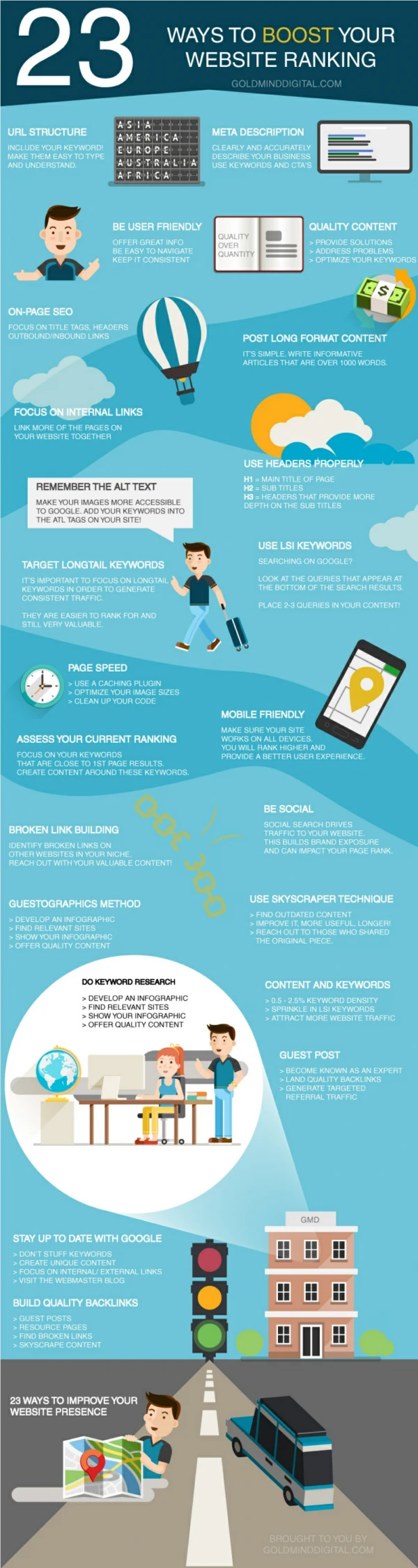
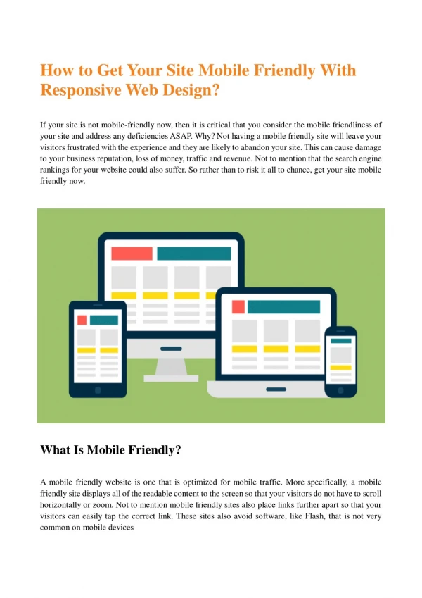
Responsive Website Design When developing a website, make sure it has a responsive design. This will give your users an optimal experience, allowing them to access the site content easily. Moreover, you are way ahead in the competition by positioning your site according to different internet devices. In addition to improved user experience, there are many other benefits of choosing a responsive website design- Flexibility Cost-effectiveness Improved ranking Ease of management Due to the demand for mobile search, most site themes are now responsive. So, be sure all your site elements are responsive to help the pages perform better in search engine search results.
Use High-Resolution Images The human brain works efficiently when dealing with visual content. Research says visuals are processed 60,000 times faster than text. High-resolution images provide ultimate user experience, thus increasing the chances to convert. At the same time, it’s important to compress high-resolution images otherwise they will affect the site speed. Remember, when it comes to search engine ranking, site speed plays a vital role. If your site takes longer to load than your competitor sites, you will definitely lose your visitors. Would you prefer visiting a site with low-quality images? Of course not. So, start using only high-resolution images from today.
Call-to-Action (CTA) Button Fast loading speed and improved user engagement aren’t the only ways to increase mobile-friendliness. Another important mobile-friendly hack is to use the high-level CTA buttons to enable your audience to get the right action. For example, if you want your audience to learn about your brand, products, and services, you can employ CTAs to the places that lead them to the required actions. This will accelerate the conversion rate, thus sales. Remember, your old CTAs may not work for your mobile audience. Apple developers say that to deliver the best mobile user experience, the CTA buttons need to be 44 by 44 pixels. This will increase the CTR, thus profits.
Reduce The Number of HTTP Requests HTTP requests can have a great impact on the mobile speed. A request occurs when a user requests the browser to load images, scripts, flashes, etc. Thus, more the components on the page, longer they will take to load, thus reducing the page speed. Thus, if you want to improve mobile site’s speed, it’s necessary to streamline all its elements, thus reducing the number of HTTP requests. Limit the number of links, remove any unwanted forms, and make content concise. To sum up, the majority of the users prefer searching through their mobile platforms. Thus, it’s important to optimize your site for mobile devices for better performance and results. A responsive website design provides an optimal user experience with added benefits such as flexibility, cost- effectiveness, and ease of management. Using visuals such as high-resolution images, videos, etc. increases the conversion rate, thus sales. Reducing the number of HTTP requests allow you to improve site speed, thus search engine ranking. Additionally, you should use the CTAs at the right positions of the site pages to make your audience take required actions. For any professional help related to optimizing your site for mobile platforms, hire a reputed digital marketing agency in Nigeria.
Address: 5th avenue I one close Block 2 Flat 8 Festac Town, Lagos, Nigeria Phone: +234806656904 Email: hello@betasocials.com Contact