Download
1 / 1
0 likes | 2 Vues
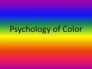
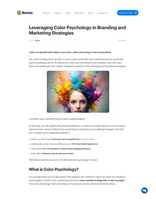
Color plays a powerful role in branding and print design. It influences emotions, perception, and buying decisions. This infographic explores how specific colorsu2014like red, blue, green, and blacku2014can shape your brandu2019s identity and message. Whether you're designing business cards, packaging, or promotional products, understanding color psychology helps you connect with your audience. At Quapri, we combine expert printing with smart design to bring your brand to life through impactful colors and creative print solutions.<br><br>

E N D
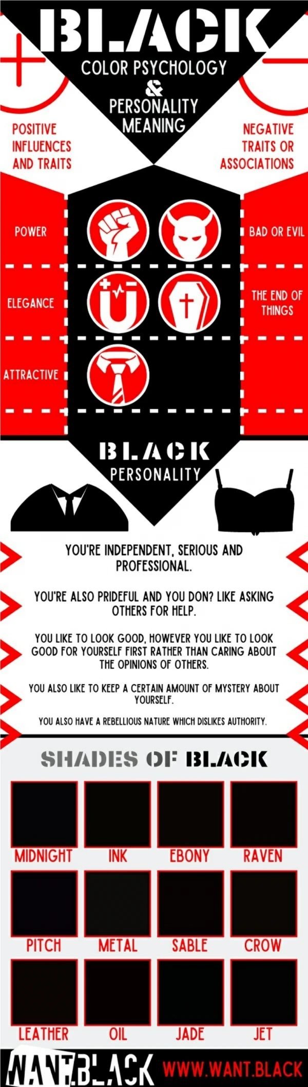
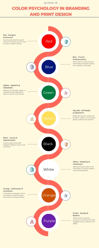
QUAPRI.IN COLOR PSYCHOLOGY IN BRANDING AND PRINT DESIGN Red – Energy & Excitement Used to grab attention, spark emotion, and drive action. Great for bold, confident brands. Red Blue – Trust & Professionalism Often used in corporate, tech, and healthcare brands. Evokes calm, stability, and loyalty. Blue GREEN – GROWTH & FRESHNESS Ideal for eco-friendly, organic, or wellness brands. Represents balance, nature, and renewal. Green YELLOW – OPTIMISM & CREATIVITY Bright and cheerful, perfect for youthful, creative, or fun brands. Sparks positivity and warmth. Yellow Black – Luxury & Sophistication Black Used by high-end brands. Suggests elegance, power, and exclusivity. White – Simplicity & Cleanliness Represents purity, peace, and minimalism. Great for modern, clean branding styles. White Orange – Enthusiasm & Innovation A friendly and energetic choice for dynamic, creative brands that want to be approachable. Orange Purple – Royalty & Wisdom Often used for premium products or educational brands. Suggests luxury, creativity, and depth. Purple