Chapter 2 Data Presentation Using Descriptive Graphs
KVANLI PAVUR KEELING. Chapter 2 Data Presentation Using Descriptive Graphs. Chapter Objectives. At the completion of this chapter, you should be able to answer: How does one construct (and when is it appropriate to use) each of the following graphs: a. Histogram

Chapter 2 Data Presentation Using Descriptive Graphs
E N D
Presentation Transcript
KVANLI PAVUR KEELING Chapter 2Data Presentation Using Descriptive Graphs
Chapter Objectives • At the completion of this chapter, you should be able to answer: How does one construct (and when is it appropriate to use) each of the following graphs: a. Histogram b. Frequency polygon c. Ogive d. Bar chart e. Pie chart f. Stem-and-leaf diagram
Chapter Objectives - Continued ∙ What is a frequency distribution, and how would you construct a frequency distribution from a set of data? ∙ What are some of the ways in which a seemingly accurate graph can be drawn in a misleading and deceptive manner?
Describing a Sample • Chapter 2: Discusses how to draw a chart or graph • Chapter 3: Discusses how to crunch a number or two, such as an average
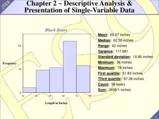
Original Data Ordered Array 41.5 39.4 40.9 35.9 37.4 39.5 40.3 39.3 41.6 36.6 41.1 35.7 43.7 37.0 41.3 40.6 38.0 42.4 35.7 41.4 39.2 36.8 39.3 43.8 38.5 43.0 36.3 35.6 36.2 38.1 34.8 38.1 35.7 36.5 39.5 37.9 34.3 36.8 33.8 35.0 37.8 38.7 37.2 32.8 38.2 37.0 39.7 38.8 35.2 36.2 32.8 33.8 34.3 34.8 35.0 35.2 35.6 35.7 35.735.7 35.9 36.2 36.2 36.3 36.5 36.6 36.8 36.8 37.0 37.0 37.2 37.4 37.8 37.9 38.0 38.1 38.1 38.2 38.5 38.7 38.8 39.2 39.3 39.3 39.4 39.5 39.5 39.7 40.3 40.6 40.9 41.1 41.3 41.4 41.5 41.6 42.4 43.0 43.7 43.8 Frequency Distribution for Continuous Data Table 2.3
Constructing a Frequency Distribution Gather the sample data Arrange the data in an ordered array Select the number of classes to be used Determine the class width Determine the class limits for each class Count the number of data values in each class (the class frequencies) Summarize the class frequencies in a frequency distribution table
Constructing the Frequency Distribution • To see what’s going on within the data, we’ll put the data into classes (groups) • Let K be the number of classes • Generally, K is between 5 and 20 and the larger the sample, the more classes you can use • Let’s try K = 6 classes
Constructing the Frequency Distribution • Looking at the ordered data, the smallest value is L = 32.8 and the largest value is H = 43.8 • Next, find • Round this to a “nice number” • Here we’ll round this to 2 • This is the class width (CW) Other Applications (H-L)/K Round to 11.6 10 46.5 50
Constructing the Frequency Distribution • The last thing: Start the first class with a “nice number” and make sure it includes L = 32.8 • We’ll start the first class at 32 • The resulting table (frequency distribution) is shown on the next slide
Class Number Class Frequency 1 32 and under 34 2 2 34 and under 36 9 3 36 and under 38 13 4 38 and under 40 14 5 40 and under 42 8 6 42 and under 44 4 50 Frequency Distribution of the Salaries The lower class limits The upper class limits Relative Frequency .04 .18 .26 .28 .16 .08 1.00 Check: Does this include H = 43.8? Yes. If not, add another class. Table 2.4
15 — 12 — 9 — 6 — 3 — — Frequency 32 34 36 38 40 42 44 Starting salary (thousands of dollars) Frequency Histogram Figure 2.1
.30 — .24 — .18 — .12 — .06 — — Relative frequency 32 34 36 38 40 42 44 Starting salary (thousands of dollars) Relative Frequency Histogram Figure 2.2
Frequency Polygon • A frequency polygon is a graph that represents the shape of the data • It can be conceptualized as a connection of the midpoints of the classes at the height specified by the frequency • A relative frequency polygon is similar to a frequency polygon, except that the height is dictated by the relative frequency
15 — 12 — 9 — 6 — 3 — — Frequency 32 34 36 38 40 42 44 Starting salary (thousands of dollars) Frequency Polygon Figure 2.1
15 — 12 — 9 — 6 — 3 — — Frequency 32 34 36 38 40 42 44 Starting salary (thousands of dollars) Frequency Polygon
Shape of the Data • Histograms and frequency polygons are useful for observing the “shape” of the sample data • The salary data appear to be “bell shaped”
Skewed Histogram • This histogram of 500 account balances is not bell-shaped and is very skewed
Ogive • An ogive (pronounced “oh’-jive) is a plot of cumulative frequencies or cumulative relative frequencies • For the salary data, this would be a plot of the salaries that are under 34 (thousand), under 36 (thousand), etc. • To construct an ogive, you need the following table
Salary Starting Salaries
Stem and Leaf Diagrams • A stem and leaf diagram is similar to a histogram and can be used to see the “shape” of the data • It is OK to use if the sample size is not too large (n < 150) • Unlike a histogram, there is no loss of information; i.e., you can reconstruct the sample from this diagram
Stem Leaf (unit = .1) 2 3 4 7 3 4 4 6 8 4 1 5 7 5 1 9 Stem-and-Leaf Diagrams Reports of the after-tax profits of 12 companies are (recorded as cents per dollar of revenue) as follows: 3.4, 4.5, 2.3, 2.7, 3.8, 5.9, 3.4, 4.7, 2.4, 4.1, 3.6, 5.1 Figure 2.7
Leaf Unit • The leaf unit sets the decimal • In this way, you can have very large or very small values in the diagram • (actual value) = (value you see) x (leaf unit) • For the smallest value, the value you see is 23 but the actual value is 2.3 • So, the leaf unit is .1
Ordered Array of Aptitude Test Scores 22 44 56 68 78 25 44 57 68 78 28 46 59 69 80 31 48 60 71 82 34 49 61 72 83 35 51 63 72 85 39 53 63 74 88 39 53 63 75 90 40 55 65 75 92 42 55 66 76 96 Table 2.5
Stem Leaf (unit = 1) 2 2 5 8 3 1 4 5 9 9 4 0 2 4 4 6 8 9 5 1 3 3 5 5 6 7 9 6 0 1 3 33 5 6 8 8 9 7 1 2 2 4 5 5 6 8 8 8 0 2 3 5 8 9 0 2 6 Stem-and-Leaf Diagram for Aptitude Test Scores
Rotate the stem and leaf diagram and you see the shape of the data
Stem Leaf (unit = 1) 2 2 2 5 8 3 1 4 3 5 9 9 4 0 2 4 4 4 6 8 9 5 1 3 3 5 5 5 6 7 9 6 0 1 3 3 3 6 5 6 8 8 9 7 1 2 2 4 7 5 5 6 8 8 8 0 2 3 8 5 8 9 0 2 9 6 Stem-and-Leaf Diagram for Aptitude Test Scores Using repeated stems Figure 2.9
Example 2.1 – Histograms in Action • Allied Manufacturing makes a machined part whose inside diameter must be between 10.1 and 10.3 mm • These are called specification (spec) limits • Any part whose inside diameter is outside these limits is called nonconforming and is considered unacceptable
The Sample • The sample consists of 100 measurements (inside diameters) • There is a link to this data set (DATA2-1.xls) in the online textbook (Example 2.1) • Use the Excel macros to construct a histogram and stem-and-leaf diagram • What would you tell the management of Allied? • First, enter the 100 sample values in column A
Stem-and-Leaf Diagram for Allied Manufacturing 117 17 values exceed 10.3 mm
Advice to Allied • The measurements are too large • None of the measurements were even close to 10.1 mm • 17% of the measurements were larger than 10.3 mm • Adjustments need to be made to the manufacturing process to produce parts with smaller inside diameters
The Previous Graphs • The previous graphs (histogram, frequency polygon, ogive, stem-and-leaf diagram) are used for quantitative data (interval data or ratio data) • The next two graphs are used when you’re trying to summarize qualitative data (nominal data or ordinal data) • These two graphs are the bar chart and pie chart
Example • A group of 400 undergraduate students contained: • CategoryFrequency Freshmen (FR) 160 Sophomores (SO) 60 Juniors (JR) 100 Seniors (SR) 80 400
Pie Chart or Bar Chart? • For many applications (such as the one used here), you can use either graph to summarize the sample • For applications where you are dividing something (such as your tax dollar) into its pieces, a pie chart generally works better • For example, the following pie chart summarizes where your tax money goes
Deceptive Graphs • What is wrong with this bar chart?