By Jasmine Howell
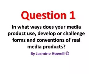
Question 1. In what ways does your media product use, develop or challenge forms and conventions of real media products?. By Jasmine Howell . FRONT COVER . Masthead- The central image is placed over the masthead. Facial expressions-

By Jasmine Howell
E N D
Presentation Transcript
Question 1 In what ways does your media product use, develop or challenge forms and conventions of real media products? By Jasmine Howell
Masthead- The central image is placed over the masthead. Facial expressions- They don’t seem to be doing much; looking away, very casual clothing, simple body posture with their hands in their pocket Cover Line- Canted angle, un-conventional because it’s highly decorative Central Image The central image goes right out to the edge, and I have followed this convention Cover Line- This is the main cover line which refers to the main article in the magazine. Background- Un- conventional because its not done in the studio like most music magazines Footer- Banner at the bottom of the page
Eyebrows- some music magazines do not have this, so I decided to include this in my magazine Masthead- I haven’t placed the central image over the masthead because as my music magazine is new, I wanted the title to stand out to my new audience. I have also added a tag line, which NME do not have, so I have challenged this convention. Ears- I have included ears in my magazine which many music magazines do, so I have kept this convention along with all the rest Barcode- I have made a barcode to add into my magazine and in NME they have their barcode somewhere else, so I have tackled this convention Footer- I have continued this convention and included a banner
This NME layout is very much similar to my own music magazine. I have included this to show that NME are un-conventinal sometimes because they have different elements they maintain for an example they have maintained a footer, and some they change, for an example the barcode is at the front and on the other NME magazine the barcode is placed somewhere else.
Heading- I have used the same masthead for my title and included it into my contents page This is something different I have created by using my own hand to make a rock sign. This is breaking the convention because it hasn’t been done before Images- These are my images I have included in my contents page; I haven’t used these pictures before throughout making my magazine Subscription: I have included a subscription, only some magazines have this on their contents page and I have decided to include one on my one Editorial comment: Most music magazines do not include an editorial comment but I have included mine; suggests that I am challenging this convention
Heading- Their heading does not include the words ‘Contents Page’ in their contents page Images- In this NME contents page layout they have many images when my own music magazine only has a substantial amount of pictures Text- The text mostly has quotes from the article inside the music magazine, I did not challenge this convention Advertisement- Shows that my magazine included a subscription and NME has used an advertisement This is very different because it’s going down which is un-conventional and different, I did not challenge this convention
Overall: Contents Page • Overall my contents page is very different because its it has a number of conventions I’ve challenged and maintained and I believe my contents page looks appealing and very easy to read for my aimed audience, because from the questionnaire I did awhile back, it shows my audience likes magazines with more images and less text with bug writing, so I kept that in mind whilst producing my music magazine.
Header- The heading in this double page spread helps you to know what article you are reading Headline/Title- I have maintained this convention because on the vast majority of magazines have these and if I challenged this convention I would of have to find another way to show the heading Standfirst- This standfirst tells you briefly what the article is about Drop Cap- Kerrang’s Drop Cap is very small compare to my one, so in a way I have challenged this convention Pull Quote- This is very conventional for music magazines. I have maintained this convention because I believe it stands out from the rest of the article and grabs the readers attention Image- I have maintained this convention because it will draw the attention of my readers closer as I know they prefer more image to text
Central Image- I have maintained this convention by having a central image, as I have chosen a simple double page spread I thought having a central image would make it look more attractive Headline/ Title-This title is very unconventional because it starts off on the side and makes it way up the page Standfirst- I have maintained this convention as it also tells you a little fact Pull Quote- I have maintained this convention because I think having a pull quote it makes your whole article stand out Footer- I have included a footer in mine because vital information that is included in the footer wouldn’t have a place to go so I included a footer Drop Cap- I have maintained this convention, however I have made my Drop Cap bigger and making it touch the central image which is unconventional Gutter- I have maintained a gutter because it separates the text better
This is the Double Page Spread layout I have tried to make mine look like. I chose a more simple spread because the rest of my pages are colourful and I wanted to go for a calmer approach on my double page spread. By looking at this picture, I have challenged and maintained many conventions.
Overall, my music magazine has maintained many conventions and also challenged some. I took a risk by challenging some conventions because as my magazine is aimed at a younger audience I wanted to change it. Also the name of my magazine is suggesting its own ‘rule’ so I made sure I challenged these conventions because of that.