Pareto Principle
680 likes | 2.27k Vues
Pareto Principle. “The Vital Few and Trivial Many Rule” “Predictable Imbalance” “80:20 Rule”. Named after Vilfredo Pareto -an Italian economist. He observed in 1906 that 20% of the Italian population owned 80% of Italy's wealth

Pareto Principle
E N D
Presentation Transcript
Pareto Principle “The Vital Few and Trivial Many Rule” “Predictable Imbalance” “80:20 Rule”
Named after Vilfredo Pareto -an Italian economist He observed in 1906 that 20% of the Italian population owned 80% of Italy's wealth He then noticed that 20% of the pea pods in his garden accounted for 80% of his pea crop each year
The Pareto Principle • A small number of causes is responsible for a large percentage of the effect- -usually a 20-percent to 80-percent ratio. • This basic principle translates well into quality problems - most quality problems result from a small number of causes. • You can apply this ratio to almost anything, from the science of management to the physical world
Addressing the most troublesome 20% of the problem will solve 80% of it. Within your process, 20% of the individuals will cause 80% of your headaches. Of all the solutions you identify, about 20% are likely to remain viable after adequate analysis. 80% of the work is usually done by 20% of the people.
80% of the quality can be gotten in 20% of the time -- perfection takes 5 times longer 20% of the defects cause 80% of the problems. Project Managers know that 20% of the work (the first 10% and the last 10%) consume 80% of the time and resources.
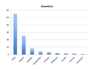
A Pareto chart is a useful tool for graphically depicting these and other relationships It is a simple Histogram style graph that ranks problems in order of magnitude to determine the priorities for improvement activities The goal is to target the largest potential improvement area then move on to the next, then next, and in so doing address the area of most benefit first The chart can help show you where allocating time, human, and financial resources will yield the best results.
While the rule is not an absolute, one should use it as a guide and reference point to ask whether or not you are truly focusing on: 20% - The Vital Few or 80% - The Trivial Many True progress results from a consistent focus on the 20% most critical objectives. the
The simplicity of the Pareto concept makes it prone to be underestimated and overlooked as a key tool for quality improvement. Generally, individuals tend to think they know the important problem areas requiring attention…… if they really know, why do problem areas still exist?
Although the idea is quite simple, to gain a working knowledge of the Pareto Principle and its application, it is necessary to understand the following basic elements:
Pareto Analysis Creating an tabular array of representative sample data that ranks the parts to the whole with the objective to use the facts to find the highest concentration of quality improvement potential in the fewest number of projects or remedies Thus achieving the highest return for the investment.
Pareto Diagram The Category Contribution, the causes of whatever is being investigated, are listed across the bottom, and a percentage is assigned for each (Relative Frequency) to total 100%. A vertical bar chart is constructed, from left to right, in order of magnitude, using the percentages for each category.
Pareto Diagram is a combined bar chart and line diagram based on cumulative percentages. 80% improvement in quality or performance can reasonably be expected by eliminating 20% of the causes of unacceptable quality or performance
Relative Frequency [(Category Contribution) / (Total of all Categories)] x 100 expressed in bar chart form.
Cumulative Frequency [(Relative Frequency of Category Contribution) + (Previous Cumulative Frequency)] expressed as a line graph
Break Point The percentage point on the line graph for Cumulative Frequency at which there is a significant decrease in the slope of the plotted line
Vital Few Category Contributions that appear to the left of the Break Point account for the bulk of the effect
Trivial Many Category Contributions that appear to the right of the Break Point, which account for the least of the effect.
Pareto Diagram Analysis • Pareto analysis provides the mechanism to control and direct effort by fact, not by emotion. • It helps to clearly establish top priorities and to identify both profitable and unprofitable targets. • In addition to selecting and defining key quality improvement programs:
Prioritize problems, goals, and objectives • Identify root causes • Select key customer relations and service programs • Select key employee relations improvement programs • Select and define key performance improvement programs • Address the Vital Few and the Trivial Many causes of nonconformance • Maximize research and product development time • Verify operating procedures and manufacturing processes • Product or services sales and distribution • Allocate physical, financial and human resources
For a General Manager The value of the Pareto Principle is that it focuses efforts on the 20 percent that matters. Of the things you do during your day, only 20 percent really matter. Those 20 percent produce 80 percent of your results. Identify and focus on those things.
To Create a Pareto Chart: • Select the items (problems, issues, actions, defects, etc.) to be compared. • Select a standard for measurement. • Gather necessary data • Arrange the items on the horizontal axis in a descending order according to the measurements you selected. • Draw a bar graph where the height is the measurement you selected.