Download
1 / 12
120 likes | 339 Vues
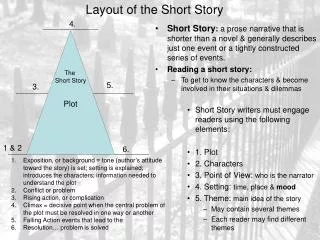
Telling a Story with Pictures: Choosing What to Show. Dr. Harry Witchel Brighton and Sussex Medical School. Story Boards. A story board is a way of roughly drawing out on a piece of paper what is going on in the movie

E N D
Telling a Story with Pictures:Choosing What to Show Dr. Harry Witchel Brighton and Sussex Medical School
Story Boards • A story board is a way of roughly drawing out on a piece of paper what is going on in the movie • In this course, story boards can be drawn by hand, the lines can be sloppy, and you can use symbols and stick figures to represent the objects on screen • In a story board, there are frames (you can draw 6-8 frames on a page of A4). • In each frame you show what the viewer sees • You can illustrate actions occurring by using arrows • You can put what the characters say in a text box below the picture
Shot Selection • In a movie, you need to explain the context of what is happening, and you need to focus the viewer on what is important • You do this by carefully selecting a series of “shots” and then defining regions of interest • These rules are essential in didactic movies, but they are also important in Hollywood movies
Shot selection • Extreme wide shot • Very far away: character is invisible or barely visible • Gives Location • Long shot • Size: Far away, character takes up ¼ of total height of frame • Relationship in space between characters/objects and environment • Character doing something TO the environment • Character “owns” environment • Full shot • Size: full body(s) with space above and below character, character takes up ½ of total height of frame • Relationship in space (and emotions) between characters/objects
Shot selection • Medium shot • Size: half to ¾ of body fills up frame, or there are 2 heads • Relationship in space (and emotions) between characters/objects • Environment is not relevant (or is already explained) • Demonstrates process occurring • Most common shot, useful for most of story • Close up • Size: Head & shoulders – most of body is cut out of shot • Register of emotion • Intimate • Extreme close up • Size: part of a body – mouth, eyes, hand • Provides information OR • Can be intimate
Regions of Interest (ROIs) • In didactic movies, it is essential that the user knows where to look • If not, they will have no idea what is going on • There should not be too many things happening at once • Usually only one new action can be followed • You can include one other familiar action as the “clock” • If you put more than one action in a slide, the user will be unable to follow much (if any) of it • You can make a series of stopped action shots where the user advances the action (but then why not use photos rather than a movie) • You can break up the sequence so that only one action occurs (ie show the same series of events three times, but have the focus on only one action/aspect during each run through)
Regions of Interest (ROIs) • Speed • Starting and stopping • Circling, arrows • Contrast and focus • Mix circling with contrast lowered outside circle • Zoom • User interactivity
Contrasting Colours • Contrasting colours are essential for visibility, especially with lettering • For two colours to really contrast, one must be dark and the other must be light • Contrasting hue (eg red on green) is much less visible than differences in brightness • Examples of good combinations: • Black lettering on white (& make the lettering bold) • Usually a good combination will work both ways (eg White lettering on black) • Yellow on dark blue (eg blue gradient), and vice versa • Beware of mid-tones, especially Red! • If you must use red, put it against a white • For complex backgrounds (photos with dark & light), pick 1: • Use lettering with outlines (black letters with white outlines) • Add a partially transparent square of dark colour where your lettering will be • Make the entire background less contrasty and lighten/darken it
White Is a Good Colour for Contrasts • White contrasts with most other colours • White on pillar box red works well • White works well against most mid-tones • White does not work against • Any background that has white in it • Light yellows
Reduced contrast and brightness of photo Writing with outline Writing w/o outline Writing w/o outline Writing w/o outline
Please do NOT make mistakes with colour contrasts and lettering – this is an essential part of the course learning material Red White Contrasts are best with differing brightnesses. Red on green (colour/hue opposites) is disappointing because both are mid-tones
Lowering the Contrast in Flash • In Flash you can quickly lower the contrast of the background by overlaying a white object with partial transparency over the unimportant objects • Partial transparency is achieved by changing the alpha • Only use white if that this the colour of the background. Use the colour of the background to make objects less contrasty • You can make objects grey • You can tint objects with white