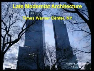
MODERNIST ARCHITECTURE
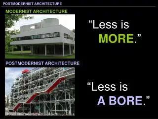
MODERNIST ARCHITECTURE. “Less is M ORE .”. POSTMODERNIST ARCHITECTURE. “Less is A BORE .”.

MODERNIST ARCHITECTURE
E N D
Presentation Transcript
MODERNIST ARCHITECTURE “Less isMORE.” POSTMODERNIST ARCHITECTURE “Less isA BORE.”
Swiss architect Charles-Eduoard Jenneret, best known as Le Corbusier, promoted the International Style that the Bauhaus school helped to make popular. His designs for buildings include geometric shapes, maximum use of space, and a lack of ornamentation. Le Corbusier referred to his style as Purism because it relied on pure geometric shapes. Villa Savoye is a country house he designed supports his belief that a home should not need load-bearing walls – the steel beams support the structure, giving it much more space. Le Corbusier,Villa Savoye, 1929.MODERNIST ARCHITECTURE(International Style)
Le Corbusier,Villa Savoye, 1929. MODERNISM (International Style)
Le Corbusier,Villa Savoye, 1929. MODERNISM (International Style)
Le Corbusier,Chapel of Nôtre Dame du Haut, 1955. MODERNIST ARCHITECTURE
AT & T Building Phillip Johnson Phillip Johnson helped Mies van der Rohe design the Seagram Building in the 1950s, but in the ’70s he did the opposite with the AT&T Building (now called the Sony Building) Phillip Johnson in 1978 with model of AT&T building
Instead of a building made of sleek glass and metal, this building is predominantly masonry (only 30% of the outside is glass) and revives a classical architectural vocabulary… Johnson & his associates divided the building into three parts, reminiscent of the three elevations of a Greek temple – base, column and pediment. Phillip Johnson,the AT&T Building (New York), 1984. POSTMODERN
The top slopes down like a pediment, including a space in the middle known as an orbiculum (similar to the look of 18th century dressers) Thin strips of masonry that make up the center resembles the fluting of columns Phillip Johnson,the AT&T Building (New York), 1984. POSTMODERN
The entrance includes a massive round arch, similar to a triumphal arch or a Romanesque portal. (Please note the modern-day looking ‘coffers’ and ‘rose window’) Phillip Johnson,the AT&T Building (New York), 1984. POSTMODERN
Michael Graves, Portland Public Services Building, 1982. POSTMODERN
Michael Graves, Portland Public Services Building, 1982. POSTMODERN
Michael Graves, Team Disney – The Eisner Building, 1991. POSTMODERN
The Pompidou Centre is a multipurpose structure. It contains a public library, France’s National Museum of Modern Art, a theatre and numerous halls. It was named after the French President Georges Pompidou. Note that the building appears to look “inside out”. All of the pipes and supports are exposed, but color is used with a purpose: for example, green indicates water, blue indicates air conditioning while the elevators and escalators are red. It demonstrates MODERNIST architecture with its steel support beams and functionality, but it’s mixture of influences and lack of decoration and make it POSTMODERNIST.
Richard Rodgers and Renzo Piano, The Pompidou Centre, 1977. POSTMODERN
Frank Gehry, Guggenheim Museum, Bilbao, 1997. DECONSTRUCTIVISM
Frank Gehry used titanium on the outside to imply fish scales since fishing is a part of bilbao’s economy. (Note the long ship-like form of the building, too.) This type of work is often considered deconstructivist since it’s goal is to eliminate continuous lines and normal shapes.