Download
1 / 11
110 likes | 472 Vues
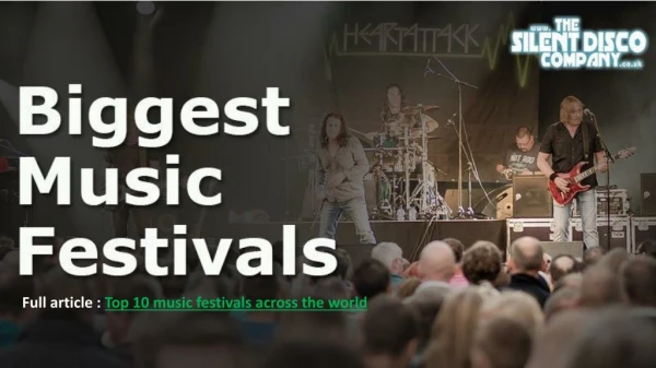
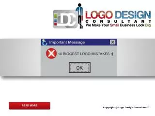
Top 10 Biggest Logo Design Mistakes

E N D
READ MORE Copyright © Logo Design Consultant™
Bing Logo Bing has used freely drawn fonts, that can even be designed by teens! Copyright © Logo Design Consultant™, a custom logo design company.
Xe Services LLC Logo Xe Services LLC Logo seems to be very deceptive and furtive. Copyright © Logo Design Consultant™, a graphic design logo design company.
Buffalo Sabres Logo Buffalo Sabres Logo seems to be too generic and abstract lacking the conceptual design. Copyright © Logo Design Consultant™, an affordable logo design company.
Check Point Software Technologies Logo Checkpoint software logo is presenting an unprofessional look with no checkpoint that can be identified. Copyright © Logo Design Consultant™, a corporate logo design company.
Cover the Earth Logo The logo appears to be sloppy and designed in a very unprofessional way making no sense. Copyright © Logo Design Consultant™, a design logos company.
Kraft Foods Logo The logo is reminiscent of a daycare company rather than a food company and also there is no sense in the color scheme the logo. Copyright © Logo Design Consultant™, your best option to design a logo.
Lending Tree Logo The logo doesn't reflect the nature of the business and it’s too trendy. Copyright © Logo Design Consultant™, a design logo company.
London 2012 Summer Olympics Logo This logo is totally absurd as the jagged edges in the logo don’t allow “2012” to appear properly while 5 Olympic logo rings appear very dim in the intense color. Copyright © Logo Design Consultant™, the best choice for designing a logo.
MobileMe Logo Banners cluttered with the cloud are too confusing and don’t make any sense! Copyright © Logo Design Consultant™, the best graphic design logos company.
Wisconsin Department of Tourism Logo The typography is at it’s best to be labeled the worst while the man doing the up stands is too corny and doesn’t attract the visitors a bit. Copyright © Logo Design Consultant™, the best designers of logos of companies.