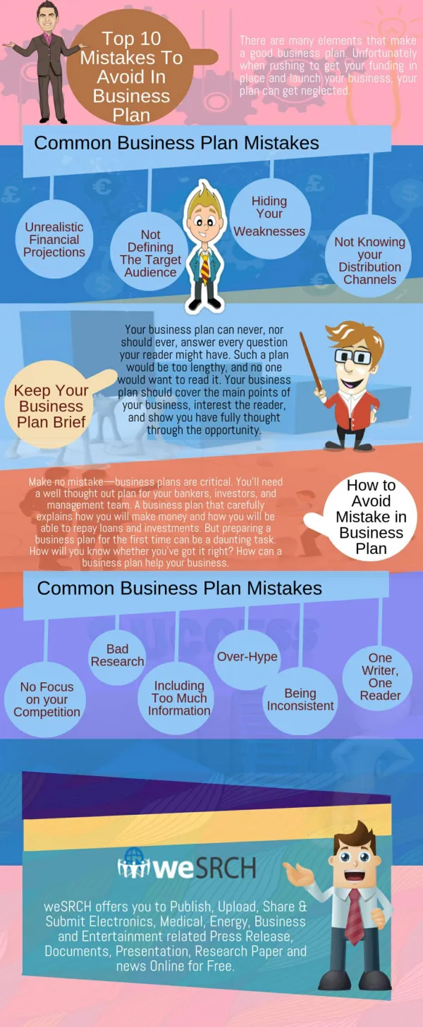
10 Mistakes to Avoid In Logo Design
60 likes | 339 Vues
Iris web design is a custom website design and web development company in Ontario, Canada. Our services include web design and development, logo design, banner design, content writing service and more.

10 Mistakes to Avoid In Logo Design
E N D
Presentation Transcript
There are some common mistakes made by designers not familiar with logo design as well as by talented amateurs attempting to do it yourself with logos. These common mistakes can undo all the hard work done in selecting the message and color choices and ideally, these top 10 mistakes will be useful for both designers and businesspersons choosing a logo. • Using pixel-based software to design a logo is possibly the fatal mistake in terms of logo design that can be made. A good logo is used consistently throughout the marketing and branding campaign. That means on t-shirts, business cards, newspaper ads, mailers and many other applications. A logo stands for the company. However, a pixel based logo such as one made in the popular Photoshop will only be scalable to a certain size. Once a pixel-based logo is enlarged, it begins to lose definition and becomes blurry. Designing a logo in vector-based software is essential if the logo is to be used anywhere at all but on the web as a banner header.
Swooshing or swishing is a term meant to imply speed and was used to give a visual high tech effect; in fact, the effect was abused to death in the 1990s. With perhaps the exception of Nike, the swoosh is not actually a design element that really makes a statement, and will usually be unsatisfactory in the end. • Using presets for font spacing is a definite mistake when it comes to logo design. Letters that look well spaced on one monitor can be design horror stories when printed. Kerning and spacing should be done manually in order to have a professional logo, which can be used in any venue necessary. Clients should not actually have to concern themselves with that, but designers should be aware that ignoring manual spacing could ruin the logo when it goes to print. In addition, a melange of fonts can ruin the effect of a business logo. One or two fonts can and should convey a message effectively and more is probably overkill.
Complex logos are not essential and in fact, they can be huge mistakes. A logo that will be translated to many sizes on many items may end up being as small as a postage stamp and for another use, as large as a billboard. If there are too many visual elements included, then the complex logo loses its effectiveness, and the artwork becomes squiggles or a visual nightmare with different parts competing for attention. Keep it simple, is a very good rule to follow in logo design. Advising the client to keep it simple will increase the effectiveness of their logo. • Distinctiveness is essential in logo design. Marketing material with every truism ever written included in the text is hardly effective, in fact, it should be avoided and the same applies to logo design. Some elements are so overused that they are visual truisms. From the designer perspective, it portrays a failure of imagination, and though a client may find them attractive, they will not be distinctive. Avoid the overused design elements in order to make the logo memorable, unique and original.
Avoid complexity which has been stated before but it can have unexpected and undesired results. Using design elements to convey a message about a brand is common in fact, it is part of the job of the logo but if there are too many design elements piled up in one logo. It can be confusing at best and end up not resembling anything at all. In some cases, not checking the logo from all angles can be catastrophic. Case in point is the famous OGC logo, which was professionally designed, well done and followed all the rules however, when turned sideways took on an unexpectedly sexual connotation. Never forget that people will be looking at a logo upside down and sidewise too. • Acronyms that no one will know are ineffective on a logo. Business names are not normally created with logo designs in mind. Eventually long business names will become shortened as in the case of IBM and FedEx. However if a business does not yet have a presence then an acronym that no one knows is ineffective. Visual accents are also essential and every designer knows that to accent the wrong word in a name by lining up or emphasizing elements may mean that only unimportant words are memorable.
Taking someone else's work is one of the worst offenses in design. A logo that is obviously influenced are taken from another site will not be memorable, professional or useable for long. The original designers will make sure of that. Furthermore, if it is a well-known logo, brand confusion will assure the client receives no value from a stolen or borrowed logo since it is associated with another brand already. • Using pre-made art in a logo is a tremendous mistake. Artwork that has been premade such as clip art is not unique, hardly memorable and overused. In a word, it does not do the job a logo must do. • The final mistake in logo design to avoid is to believe that any set of rules is immutable. No one has a complete list of what will make a logo work or what will make it fail. Things a person is told to avoid can be used with success in some circumstances. In other words, though logos should be designed with common sense and the client's satisfaction in mind, there is no way to say that x or y or z design element will not ever work, it just might.