Download
1 / 24
240 likes | 329 Vues
Learn about percentiles, quartiles, interquartile range, and five-number summary in box and whisker plots. Discover how outliers impact data visualization and interpretation. Includes examples and questions to test your knowledge.

E N D
Box and Whisker Plots C. D. Toliver AP Statistics
Percentile • The percentile of a distribution of a set of data is a value such that p% of the data fall at or below the data value and (100-p%) of the data fall at or above it. • Example 1– suppose you scored 2000 on your SAT and your score report said you fell in the 89th percentile. Then 89% of the test takers scored a 2000 or less and 11% of the test takers scored 2000 or more • Example 2 – The top 15% of the graduating class at WOS has a GPA of 3.9 or higher. That means they are at least in the 85th percentile. 85 % of the students have a GPA of 3.9 or less.
Quartiles • Special percentiles (100% divided into fourths). So we consider data in the • 25th percentile, quartile 1 (Q1) • Median or 50th percentile, quartile 2 (Q2) • 75th percentile, quartile 3 (Q3)
How to Compute Quartiles • Order the data from smallest to largest. • Find the median. This is the second quartile, Q2. • The first quartile Q1 is the median of the lower half of the data; that is, it is the median of the data falling below Q2, but not including Q2 • The third quartile Q3 is the median of the upper half of the data; that is, it is the median of the data falling above Q2 but not including Q2
Example 1-Consider the data set:{10, 20, 30 40, 50, 60, 70} • The median, Q2 is 40 • Q1 is the median of the values below 40, These values are 10, 20, and 30. The median, or Q1 is 20. • Q3 is the median of the values above 40, These values are 50, 60 and 70 so the median or Q3 is 60.
Interquartile Range • The interquartile range is the difference between Q3 and Q1 or Q3 –Q1 For our data set Q1 is 20, Q3 is 60, so the interquartile range is 60-20 = 40
Five-Number Summary • Lowest Value or minimum • Q1 • Median • Q3 • Highest value or maximum
Five-Number Summary • Example - For the data set {10,20,30,40,50,60,70}: • The five number summary is • Lowest number, 10 • Q1, 20 • Median, 40 • Q3, 60 • Highest number, 70
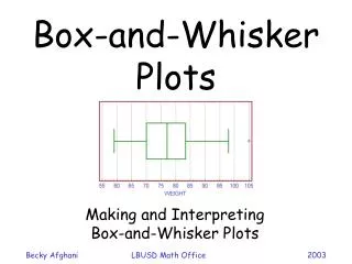
Box and Whisker Plot • A box and whisker plot is a graphical display of the five number summary • Draw a scale to include the lowest and highest data values • Draw a box from Q1 to Q3 • Include a solid line through the box at the median • Draw solid lines, called whiskers from Q1 to the lowest value and from Q3 to the highest value.
Questions • Is the median always in the middle of the box of your box and whiskers plot? • How do outliers affect a box and whiskers plot? • How can you use a box and whiskers plot to tell if your data is skewed right or skewed left? • What would be a better way to display the data if you want to see the actual outliers?
Example 2 • Compute the five-number summary and draw a box and whiskers plot for the test scores on a recent AP Statistics test • {76, 59, 76, 78, 100,66,63,70,89,87,81,48,78} • What scores if any might be considered outliers? • How do they affect the shape of the graph? • How would the graph change if you removed the outliers?
Example 3 • Compute the five-number summary and draw a box and whiskers plot for the test scores on a recent AP Statistics test in another class. • {87,78,91,70,70,66,87,78,80,86,97,98,97,94} • What scores if any might be considered outliers? • How do they affect the shape of the graph? • How would the graph change if you removed the outliers? • Compare the two sets of data? What can you conclude about the test results for the two classes?