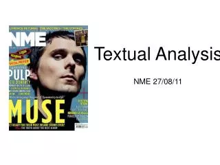
TEXTUAL ANALYSIS
Discover Metal Hammer, the UK's leading monthly hardcore rock magazine with a readership of over 137,000 fans. Featuring traditional and nu-metal bands, punk, hardcore, and gothic rock, Metal Hammer connects listeners with both established legends and emerging artists. The magazine's striking design combines dark and vibrant colors, captivating readers from the cover to the last page. With insights into the metal music scene and recommendations on what to listen to and buy, Metal Hammer fuels the passion of its predominantly male audience, averaging 22 years of age.

TEXTUAL ANALYSIS
E N D
Presentation Transcript
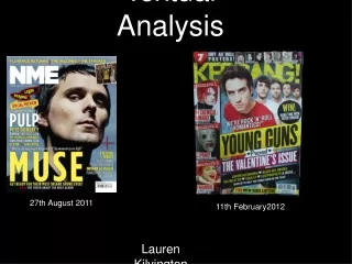
TEXTUAL ANALYSIS • METAL HAMMER & KERRANG! • Georgia Wilson
METAL HAMMER Publisher; Future Publishing Editor; Alexander Milas Circulation; 52,272 Readership; 137,427 Mission statement Metal Hammer is the UK's market-leading monthly hardcore rock magazine. It is also the only music magazine that covers traditional and nu-metal bands, punk, hardcore and gothic rock. Metal Hammer's aim is to satisfy fans of established, traditional metal bands as well as to break new artists and to keep readers informed of everything happening in the world of metal. Reader profile85% maleAverage Age 22Average Income £30,722The vanguard of the rock and metal movementFirst to know about new music, and advise their friends on what to buySpend at least three hours reading each issueSpend on average £112 each per month on music, tickets and merchandise - equating to £138m per year Future publishing Other magazines: Guitar Techniques. Guitar World (US). Guitarist. Guitarist (Australia). Metal Hammer. Revolver (US). Rhythm. Total Guitar. Classic Rock. Classic Rock Prog. Computer. Music. Future Music. Guitar Aficionado (US). Guitar Legends (US).
COLOUR Front cover; The front cover is two dark colours and two lighter colours that stands out, black, red, silver and white, this is quite common for the genre of the magazine, which will appeal to the audience, as metal and hardcore music in some eyes are associated with darkness, death and the devil. Black and red are usually associated with negativity and darkness but they are colours that go, they look neat and colours such as red could symbolise passion for the music. The white makes the text stand out and the white text is sometimes covered by something such as the main image over the title and the red banner over the main cover line, this could suggest that as white may suggest purity, that purity is behind the magazine, in the past and this is now. Finally there is a shiny silver colour, as it is the 25th anniversary special, the silver suggests a sense of value and importance which appeals to the audience as it is an important issue. Contents page; The colour scheme is constant throughout the magazine which is neat and professional looking, the colours are not over powering and they’re not boring either. There are a few more colourful pictures in the contents page which lightens the mood that the other colours bring. The use of these colourful pictures are to make the contents page more interesting and makes the reader want to read on. Double page spread; Again, the double page spread is red, white and black. The black and white could symbolise Cliff Burton’s past, the main focus of the text. The red is mainly to add colour to the page so it won’t look boring and plain.
LAYOUT AND DESIGN House Style The house style is neat, contrasting colours such as white, red and black. There are use of lines throughout the magazine that make the magazine look more defined. Metal Hammer will always have a big picture that covers the title. There is a red banner logo, which I really like, used on most pages to symbolise importance. All pictures are centred in the middle of the page as the audience eyes will focus on the model. Front cover; Image The front cover is quite crowded but the text fits round the image with out taking the focus away from it. Font All fonts are easy to read. The fonts contrast between each other the heavier and bolder writing could symbolise the heaviness of the music, they are also the main attractions of the magazine, which are eye catching and stand out, automatically appealing to the audience. The lighter fonts such as ‘CLIFF BURTON’ is typical text that you would find metal albums or band logos. The text looks almost rough and worn out, which could symbolise the remembrance of Cliff Burton and the old age of Metal Hammer. Rule of thirds The front cover image is not using the rule of thirds as then the text would be thrown off. There is so much to look at on the cover that the audience eye would look over the whole magazine and not just a section of it.
Contents page; LAYOUT AND DESIGN Font I really like the style and font used of the contents, the layout is simple and neat and explains everything the reader needs to know. The red numbers are clear and easy to see. House styleThe images are in the middle of the page and fit around the text. There is the metal hammer logo that is seen throughout the magazine. The colour scheme is still noticeable and there are lines uses as a type of border. Image The images and text fits together well as the images are visual guides of the text. There aren’t many photos on the contents page due to all the writing, I think that the list of all who works in the magazine shoudn’t be on the contents page. Rule of thirds The contents is using the rule of thirds because it doesn’t fit with the house style, all images are in the middle and even within the images, they aren’t in the rule of thirds.
LAYOUT AND DESIGN Image The image and text fit together really well as the text shapes round the photo and looks apart of the photo. The image is in black and white and fits the colour scheme. There is a smaller image of a skull which fits the genre of the magazine. It could be disturbing because of Cliff Burton’s death but it match the text. House style There are lines around the edges for a border that are continuous throughout the magazine. There are the banners, that are contain information, they draw the readers eyes to them and make them want to read on. Rule of thirds There is a rule of third over the two pages as the main focuses of the double page spread are the title and his face in the image, the readers eyes will go to these points first before reading on. Font The font is typical metal font, used on albums and band logos. It also looks faded which could symbolised the death of Cliff Burton.
IMAGES AND ELEMENTS WITHIN Front cover; Overall image The main image represents the target reader as it is someone they would connect with, the long hair, the ring and the jacket are all typical elements of someone that would want or wear or buy. He is someone they would all recognise as he was a bass guitarist for Metallica, who became a music legend and died in an accident, the readers would want to know about him and what the band thought of him. Being a music legend the reader would want to aspire to be like him and would make it a selling point. The image reflects the content as it is a tribute to him, it also establishes the colour scheme. Pose The pose shows Cliff Burton to be calm, cool and collected which would make the readers respect him. He is holding his fist out as a sign of respect which connects him with the reader. The pose is staged but the model seems to be calm making the pose feel natural and calm. His facial expressions show that he is manly. Style The style is really down played, it’s not big and bright which fits with the genre and the audience, you wouldn’t usually see members of the target audience in colourful clothing and being loud. The image is in black and white which fits the colour scheme and the audience. Hair Being a male model they may not have done a lot to his hair. His hair is tucked behind his ears to show his face, so he is recognisable and to show the expression on his face. His hair would connect with the target audience as they are stereotyped to having long and messy hair. Make-up Again, being male he is most likely not wearing make-up which shows he is a typical male and shows the stereotype of a strong male figure. Even if he was wearing make-up the photo is in black and white and wouldn’t be seen.
IMAGES AND ELEMENTS WITHIN Contents page; The contents page show small images of bands and people on stage. I don’t feel like the image is big enough for the audience to find a connection with the people in it. The images are in colour to make the contents page less dull and more interesting. The image reflect the contents as they are all images that are within the magazine and images from the next issue. Pose The images relate to the genre as they are all typical rock poses, on stage playing bass and guitar, singing, symbol of rock hand signs and intimidating facial expressions this appeals to the audience as it is what they expect to see. Style The style of the photos are all different, there is one in black and white and the others in colour, they are all different to show that the magazine has a lot of different things in it. Hair Most of the models hair is long and messy, these are the usual hair styles of people associated with metal music. There is a photo of a man with short hair which shows that the magazine isn’t based around the stereotype of metal. Make-up It isn’t clear if the models have make-up on but judging by the front cover they wouldn’t as they are stereotyped to be typical hardcore men. If they were to be wearing make-up they would be wearing dark make-up such as eye-liner, which seems to be the only suitable make-up, following the stereotype.
IMAGES AND ELEMENTS WITHIN Double page spread; The image is of Cliff Burton, the music legend that died this would appeal to the audience as they would want to know more about him. They target audience could connect with him through what he is wearing and his hairstyle as they would most likely look the same or aspire to look the same as him. Pose He is sitting down, cross legged which suggests youth and would appeal to a younger audience. It is also him as before he died and he was young. Cliff looks quite vulnerable and laid back which could show his inner feeling and could relate to an audience that feels the same. Style The image is in black and white which suggests a theme of age and could represent the emotions of the photo. It’s a really laid back style which could make the audience feel calm and relaxed. Hair Cliff has long, messy hair, which establishes the stereotype of metal. Being male they wouldn’t have put as much effort in as if there was a female it is stereotypical to have their hair styled.