Guide to Clinical Outcome Reports
50 likes | 219 Vues
Guide to Clinical Outcome Reports. Care Pathways and Packages Programme. Introduction. From the data gathered through the Care Pathways and Packages approach the Trust is now able to report on clinical outcomes ie the impact our care packages are having on our patients.

Guide to Clinical Outcome Reports
E N D
Presentation Transcript
Guide to Clinical Outcome Reports Care Pathways and Packages Programme
Introduction • From the data gathered through the Care Pathways and Packages approach the Trust is now able to report on clinical outcomes ie the impact our care packages are having on our patients. • The organisational and team level data is available via the Q&P dashboard whilst individual patient-level data is available either by drilling down on these reports, or direct from the MHCT screen in the patient’s Rio record. • The data can be subjected to sophisticated statistical analysis but clinical teams should find the following graphs have some immediate utility in determining progress for individual patients and caseloads from entering a cluster to change of cluster / discharge • Screenshots of each graph have been annotated to explain how they should be interpreted.
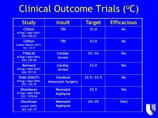
Graph 1: Overall outcomes for a caseload(Change in total score for HoNOS element of MHCT) Lines representing average score change (by cluster) for all patients changing cluster / being discharged in the reporting period Max possible improvement (i.e. reduction in MHCT ratings) from start of an episode of care to end Dots represent each patient and their change in HoNOS total (NB hover mouse to see if more than 1 patient made same change Axis containing each cluster Effect size for each cluster i.e. how significant the change is (large effect size and improvement = green, large effect size and deterioration = red, small-moderate effect sizes = yellow) Max possible deterioration(i.e. increase in MHCT ratings) from start of an episode of care to end Summary: the higher up on the graph a line or dot is the better and green effect sizes are best whilst red effect sizes are worst
Graph 2-4: Factor outcomes for a caseload(Change in scores for each subset of MHCT scales) Lines representing average factor score change (by cluster) for all patients changing cluster / being discharged in the reporting period Max possible factor improvement (i.e. reduction in relevant MHCT ratings) from start of an episode of care to end Dots represent each patient and their change in factor score (NB hover mouse to see if more than 1 patient made same change Axis containing each cluster Effect size for each cluster i.e. how significant the change is (large effect size and improvement = green, large effect size and deterioration = red, small-moderate effect sizes = yellow) Max possible factor deterioration(i.e. increase in relevant MHCT ratings) from start of an episode of care to end Summary: the higher up on the graph a line or dot is the better and green effect sizes are best whilst red effect sizes are worst Summary: Factors are ‘themes’ made up of related MHCT scales. Personal wellbeing= scales 4+5+10+12 (max score 16) Emotional wellbeing = scales 2+7+8 (max score 12) Social wellbeing= scales 3+9+11+12 (max score 16) Severe disturbance = scales 1+6 (max score 8)
Graph 5: Individual patient timeline(Changes in total HoNOS and factor scores over time) Use this scale when reviewing the trends in total HoNOS score Use this area to help understand why a set of MHCT ratings were recorded Click on a plus symbol to see what type of significant events were recorded in Rio at a particular point in time Use this axis when reviewing the trends in factor totals Use this axis to understand when a set of MHCT ratings were recorded Each line represents sets of MHCT or SWEMWEBS ratings recorded at each cluster review Use this area to review the changes in cluster that the patient has made. NB factor changes can also help explain which area of a patients life has improved / deteriorated Summary: This is a simple PSI timeline for use in CPA reviews to demonstrate and/or help understand recovery and relapse from clinician and patient perspectives. The lower each line is the better. Be aware that each factor has a different maximum possible score (see previous slide)