Graphs
Learn the importance of using graphs in data presentation, including how to create and interpret various types of charts such as bar charts, pie charts, line charts, and scatter charts.

Graphs
E N D
Presentation Transcript
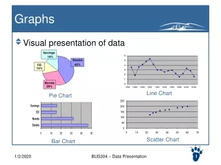
Graphs • Visual presentation of data Line Chart Pie Chart Scatter Chart Bar Chart BUS304 – Data Presentation
A good graph should • Accurately conveys the information • Grabs the reader’s attention (visually enjoyable) • Complements or demonstrates arguments presented in the text • Is simple and uncluttered • Clearly shows trends or differences in the data • Is visually accurate (i.e. one chart value is 15 and another is 30, then 30 should be twice the size of 15) BUS304 – Data Presentation
Why use graphs? • Graphs • Are quick and direct • Highlight the most important facts • Facilitate understanding of the data • Can convince readers • Can be easily remembered. Most of the time, creating graphs is more of an art. Both visually correct data can create different BUS304 – Data Presentation
The data are very dispersed The data are very numerous Not always good to use graphs BUS304 – Data Presentation
There are too few data The data show little variations Not always good to use graphs Sometimes, you may need to try different graphs, and may determine not to use graph in the end. BUS304 – Data Presentation
Bar Charts • Horizontal bars or vertical bars (also called “columns” in Excel) • Used to represent categorical data • Each bar (column) represents one category • The width (height) of the bar represents the number in the category • Horizontal bar chart provides more space for category names • Vertical bar shows a clearer trend when representing yearly data BUS304 – Data Presentation
Create a basic bar chart • Open file “data2.xls” • Create two bar charts using the data in Data Sheets “Column Chart” and “Bar Chart” BUS304 – Data Presentation
Other Bar Charts • Side by side bars / stacked bars / 100% stacked bars • when more than one piece of info in one category Create these three charts using data from worksheet Side-by-side. Write down, for each chart, the primary information the chart conveys. Legend is important in those charts BUS304 – Data Presentation
March 2005 New Car Sales Create a bar chart to represent the sales of Mar 2005 for different brands. Then discuss with another student (group of 2) to create a new graph characterizing the information on the 3rd column. (You can draw the graph, if you are not sure how excel can convey the information. BUS304 – Data Presentation
Pie Chart • A way of summarizing a set of categorical data • Convenient to present the proportion of each category • It is generally more difficult to convey the actual amount • Works especially when there are not too many categories and the proportions are significantly different from categories. BUS304 – Data Presentation
Exercise • Use the data in “Bar Chart” to create a bar chart. Compare it with the bar chart. Discuss the different information it conveys BUS304 – Data Presentation
Mis-use of a pie chart • A pie chart focuses the readers attention on the “proportion”. • Unlike bars, which can be created with multiple series (side-by-side bars), pie chart is focused on one series. • Wrong: why? BUS304 – Data Presentation
Discuss: • Student leaders at Boise State University wanted to draw attention to the funding inequities among the four public universities in Idaho. They collect the following information: The student leader created a par chart as shown on the right to represent the data he collected. Please comment on his chart. BUS304 – Data Presentation
Line Chart • Especially useful in statistics and science. To reflect the trend. • Can draw multiple lines in one graph for comparison. Note: when using Excel to generate a line chart, the X-axis is still regarded as categorical names. It does not have numerical value Exercise: Sheet 4 and 5 BUS304 – Data Presentation
Line Chart with Secondary Axis • Go to Line Chart 3. The data contains both the Sales and Profit over the years. • Create two line chart, one for sales data, one for profit data. • Question: how do we combine these two lines in one chart? BUS304 – Data Presentation
Scatter Chart • Mostly used in science and statistics to reflect the sample location. • X-axis and y-axis both have numerical values • Shows data correlations (positive, negative, etc.) BUS304 – Data Presentation
Observe data correlation from scatter chart • Find the data from worksheet 6. • Draw scatter chart using • Sq. Feet as x-axis, Price as y-axis • Age as x-axis, Price as y-axis • No. of bedrooms as x-axis, Price as y-axis • No. of bathrooms as x-axis, Price as y-axis • No. of garages as x-axis, Price as y-axis BUS304 – Data Presentation
4 Basic types of charts: Bar chart Pie chart Line chart Scatter chart Know how to create a chart from Excel Know how to read the chart (find a value given a certain condition) Know the characteristics, and be able to pick the best chart to convey info. Summary BUS304 – Data Presentation
From Raw Data … Raw Survey Data • What is your favorite type of cuisine? • Chinese • French • Indian • Italian • Other BUS304 – Data Presentation BUS304 – Data Presentation 23
Frequency Table Tells us information on the aggregate level i.e. How many data fall in one specific category Such information is most statisticians care about Can be used to transfer to graphs BUS304 – Data Presentation BUS304 – Data Presentation 24
Relative Frequency Relative Frequency: The percentage of times You can use either a bar chart or a pie chart to represent a relative frequency table. Feb 1, 2006 BUS304 – Data Presentation BUS304 – Data Presentation 25
Exercise • Create frequency and relative frequency tables for both the male and female surveyees. Compare their different preferences. BUS304 – Data Presentation
For Interval / Ratio Data • 16 business executives responded to the question on how many international trips they made in 2006. Create a frequency and relative frequency to characterize the responses. BUS304 – Data Presentation
When data spread to a wide range Grouped Data Raw Data Frequency Table We divide the data into ranges and count how many fall into the range Finish the table and create a bar chart to display the grouped data Hint: you may need to sort the raw data in ascending (or descending) order Feb 1, 2006 BUS304 – Data Presentation BUS304 – Data Presentation 28
Histogram Also called “frequency histogram” A bar chart converted from the frequency table: displays the data distribution: X-axis shows the data range Y-axis shows the number of data fall in to the group Generally don’t have gap between bars – why? Histogram is only for displaying “continuous interval/ratio data” 0~9 10~19 20~29 30~39 40~49 50~59 More Exercise: Adjust the bar chart you have from last page to a histogram Feb 1, 2006 BUS304 – Data Presentation BUS304 – Data Presentation 29
Steps to create a histogram Figure out how to group the data Find the minimal data (rounded down) Find the maximal data (rounded up) Find the rough range = max – min What does the range mean? Determine how many groups you want to display? (Not too many, but not too few) Define the Interval (How wide is each group) Interval = (range of Data) / (no. of groups) Generate the ranges and create frequency table Convert the frequency table to a bar chart (with no gap!) Feb 1, 2006 BUS304 – Data Presentation BUS304 – Data Presentation 30
Extra Notes The actual shape of the histogram depends on the number of groups Exercise: try to create a histogram using the income data (data3, sheet2) with 6 groups, 10 groups and 15 groups. Read: How many people have an annual income higher than $60000? How many are lower than $30000? Think: What if I only have 2 groups? What if I have 30 groups? Finding the right number of groups to best present the data distribution may take you several trials. Feb 1, 2006 BUS304 – Data Presentation BUS304 – Data Presentation 31