Download
1 / 24
240 likes | 508 Vues
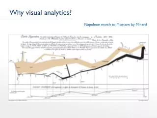
iPLANT Visual Analytics Workshop November 5-6, 2009. Visual Analytics Bernice Rogowitz Greg Abram. ;lk. Insight: Represent Magnitude as a Distance. Visual Representation of Data Rene Descartes (1596 – 1650). Values of X 0.5 2.4 5.7 4.2 3.4. Values of Y 40 33 2 18 32.

E N D
iPLANT Visual Analytics Workshop November 5-6, 2009 Visual Analytics Bernice Rogowitz Greg Abram ;lk
Insight: Represent Magnitude as a Distance Visual Representation of DataRene Descartes (1596 – 1650) Values of X 0.5 2.4 5.7 4.2 3.4 Values of Y 40 33 2 18 32
Visualization: Mapping Data onto Visual Dimensions • Many visual dimensions • Lines, glyphs, • Color, grayscale • Depth, texture • Motion, 3D Monte Carlo Risk Analysis Data
Four Visualizations of the Same Data Monte Carlo Risk Analysis Data Which is “correct” ? -- depends on the data, the task and thedomain.
Data Value (Z) The Rainbow Color Map
Why Perception Matters In the standard, default “Rainbow” color map, equal steps in the magnitude of the data are not perceived as equal steps Rogowitz and Treinish, IEEE Spectrum 1998 “The End of the Rainbow”
Color Perception Experiments test the degree to which different trajectories in 3-D color space convey magnitude information
Year pop dji auto housing prime economy Interactive Visual Exploration Using Color “Brushing” to help reveal linkages helps users explore features in high-dimensional data Diamond
Dynamic linking (“brushing” between different data representations) Parallel Coordinates Parametric Snake Plot 67 197.892 0.329 24.165 2241.8 57.6 67.8 67.5 198.911 0.334 24.662 2287.7 56.5 71.3 68 199.92 0.341 25.818 2327.3 59.4 77.3 68.5 200.898 0.349 27.661 2385.3 60.7 83.6 69 201.881 0.357 28.784 2416.5 62.6 85.8 69.5 202.877 0.368 29.037 2433.2 63.9 86.4 70 204.008 0.379 30.449 2408.6 62.1 85.4 70.5 205.295 0.389 31.573 2435.8 61.7 87.7 71 206.668 0.399 32.893 2478.6 61.5 93.4 71 71.5 206.668 207.881 0.399 0.406 34.431 32.893 2491.1 2478.6 62 61.5 98.5 93.4 72 209.061 0.412 35.762 2545.6 65.6 105.7 71.5 207.881 0.406 34.431 2491.1 62 98.5 72.5 210.075 0.418 38.033 2622.1 67.6 112.3 72 209.061 0.412 35.762 2545.6 65.6 105.7 73 211.12 0.427 41.542 2734 71.8 126.3 72.5 210.075 0.418 38.033 2622.1 67.6 112.3 Animated 3-D Scatterplot Fractal Foam 73.5 212.092 0.442 42.542 2738.3 74.4 125 73 211.12 0.427 41.542 2734 71.8 126.3 74 213.074 0.468 43.211 2747.4 73 120.2 73.5 212.092 0.442 42.542 2738.3 74.4 125 74.5 214.042 0.493 46.062 2719.3 73.6 130.2 74 213.074 0.468 43.211 2747.4 73 120.2 75 215.065 0.523 46.505 2642.7 66.3 124.8 74.5 214.042 0.493 46.062 2719.3 73.6 130.2 75.5 216.195 0.54 49.618 2714.9 65.7 140 75 215.065 0.523 46.505 2642.7 66.3 124.8 76 217.249 0.558 52.886 2804.4 69.9 156.4 75.5 216.195 0.54 49.618 2714.9 65.7 140 76.5 218.233 0.57 54.991 2828.6 72.5 162.4 76 217.249 0.558 52.886 2804.4 69.9 156.4 77 219.344 0.587 56.999 2896 75.5 177 76.5 218.233 0.57 54.991 2828.6 72.5 162.4 77.5 220.458 0.608 60.342 3001.8 78.9 186.5 77 219.344 0.587 56.999 2896 75.5 177 78 221.629 0.627 61.24 3020.5 78.8 188.9 78.5 222.805 0.655 67.136 3142.6 83.3 210 77.5 220.458 0.608 60.342 3001.8 78.9 186.5 79 224.053 0.685 71.174 3181.7 85.1 215.6 78 221.629 0.627 61.24 3020.5 78.8 188.9 79.5 225.295 0.73 73.667 3207.4 85.6 223.9 80 226.656 0.78 79.407 3233.4 85.9 225 80.5 227.94 0.826 79.311 3159.1 81.2 218.7 81 229.054 0.872 84.943 3261.1 85.2 241.1 81.5 230.168 0.915 86.806 3264.6 87.1 246.9 82 231.29 0.944 85.994 3170.4 82.4 245.1 82.5 232.378 0.975 88.977 3154.5 82 252.8 83 233.462 0.979 91.607 3186.6 80.8 266.7 83.5 234.49 0.998 98.885 3306.4 85.3 295.2 84 235.525 1.021 105.133 3451.7 91 322.7 87 86.5 85 86 87.5 85.5 84.5 240.862 236.548 237.608 243.03 241.943 238.68 239.794 1.041 1.139 1.057 1.115 1.077 1.095 1.099 119.593 118.477 114.419 110.393 129.921 106.781 119.247 3577.5 3858.9 3781.2 3712.4 3721.1 3520.6 3635.8 100.8 94.1 94.8 93.9 96.5 96.1 93.1 387.2 337.7 381.8 441.3 361.4 403.3 426.4
GTA CAC CCAG AT AA CAC CGA GAAA CAC CCATGA CGA AA CACCAC CAAC ATGAGACCC CGA CAC AACAACACC AAACCCATGATG ATGAA CAC CCAA C CCCAA GTA CGA CCA CAA CGA GTA Many different types of data…. time series numerical categorical field image sequence 3-D geometry text GIS graph
Example: Finite Element Heart Excitation Model • 3D computational model for investigating heart disease. • 150,000 nodes. • Multiple simulation parameters at each node, 60 time steps. Gresh, Rogowitz, Winslow, et al, 2000 Winslow, et al, 2000 Collaboration with Johns Hopkins University
Interactive Data Exploration, linking numerical parameters and 3-D geometric representation LARGE PEAK AT ZERO
Interactive Data Exploration, linking numerical parameters and 3-D geometric representation COLOR ONLY DATA ABOVE THE PEAK
Interactive Data Exploration, linking numerical parameters and 3-D geometric representation SHOW ONLY COLORED POINTS
Interactive Data Exploration, linking numerical parameters and 3-D geometric representation COLOR PEAKS DIFFERENTLY
Visualization for Visual Analysis • Judgments (Tasks) • Magnitude of a variable or set of variable • Correlations, trends over timeTrends over time • Interaction effects • Patterns • Connections and relationships • Outliers • User Actions • View a static representation • Browse (pan, zoom, select, rotate) • Filter • Explore relationships within a data set; across different data sets • Identify semantic regions of interest, and explore the behavior of that subset, across representations – “brushing” • View over time • Transform variables, create new variables • Tag and annotate • Integrated analysis and visualization of analysis
Visualization and Visual Analysis Framework Communication Analytical Judgments User Interactions Operations, Functions, Tools (visualization, mathematical libraries, analytical methods) Infrastructure Image Array Tables Video Text 3D Sequence • “Workflow” is a path through this hierarchy • Different workflows for different users (personas) • Flexible re-use and re-parameterization of functions for different use cases • Extensibility (standard APIs, pre-established hooks, metadata)
Bernice’s Web page – Visualization in Plant Genetics • Please let me know if there are other sites or examples I should include • http://sites.google.com/site/bernicerogowitz/plant-genetics-visualization