Download
1 / 22
220 likes | 283 Vues
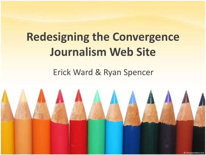
Redesigning the Convergence Journalism Web Site. Erick Ward & Ryan Spencer. Background. Current Convergence site designed three years ago. Background. Reasons we chose this capstone project: We wanted more experience in web design

E N D
Redesigning the Convergence Journalism Web Site Erick Ward & Ryan Spencer
Background • Current Convergence site designed three years ago
Background • Reasons we chose this capstone project: • We wanted more experience in web design • It presented an opportunity to leave a lasting impact on the Convergence program
Research • Meetings with Convergence faculty • Updating the current site by using Dreamweaver—is there a better way? • Current site is not template driven and the coding is complex—focus on using clean, simple coding • New site should feature a search function, something the current site does not have.
Research • Meetings with Convergence faculty • Logo: Karen and Lynda disliked it, Mike had no gripe with it • Give a place to feature good examples of student work—On the Verge • Mike: current site optimized for 800x600, we should aim for 1024x728 • Resources need to be updated and added to • A more public face for the Convergence blog?
Research • Student use survey • Administered online through SurveyMonkey • 61 completed the survey • Results weren’t surprising, but did provide good information on what students used most on the site and what they most wanted to see on the front page.
Goals • We set four primary goals for our redesign • Make the site easy to update and manage for the faculty • Make the site easy to navigate and use for students • Provide a prominent place to showcase examples of student work • Give the site a more modern, visually appealing design
Choosing a CMS • We examined several possibilities for the CMS for the redesigned site • Dreamweaver • Pro: Faculty familiarity • Con: Requires program & access • Drupal • Pro: Powerful CMS • Con: High learning curve • Newsy proprietary • Pro: Proven with multimedia • Con: Too costly
Choosing a CMS • We examined several possibilities for the CMS for the redesigned site • On the Verge proprietary • Pro: Would have been nice to keep a consistent CMS between OTV & the site • Con: Meghan and Kelly seemed frustrated with it, lack of support • WordPress • Pro: Easy to learn and use, yet very feature rich • Con: Lack of experience in Theme design
Designing the Site Our first draft of the homepage was done in Dreamweaver with the intention of importing it into WordPress. We ran into difficulties successfully importing the design, so we began to explore alternatives.
Designing the Site We spoke with Karen to pitch the possibility of using a pre-made theme that maintained a similar look and feel to the page we designed in Dreamweaver We decided this would be an acceptable alternative. We found Arthemia to be a nice recreation of our original design
Designing the Site Redesigned Convergence Site
Post-production research Karen gave us the opportunity to conduct site usability testing in her J4802 lecture class We made handouts that informed students of our project, then asked them to find answers to four questions by navigating the site Handout also asked for feedback, suggestions, and other comments
Post-production research • The vast majority of students were able to find the answers in the site with no problems • Some confusion about what industry resources encompassed • Also some thought For Students/Staff could be more clear
Post-production research • Positive feedback • I like how everything was pretty easy to find. • The simplicity of the home page is an asset. • I like that student work is on the site. • I like how the class schedules and grading seem more organized and clear cut.
Post-production research • Constructive criticism • Needs link to main journalism site • Needs more multimedia, photos of students working with equipment • I don’t particularly like ‘telling compelling stories, no matter how’ • I feel the logo banner is too large
Next Steps Convert links from IP address to convergence.journalism.missouri.edu Add dates next to week numbers in course schedules and sidebar Reviewing and updating course schedules at the beginning of each semester Updating and adding links to senior e-portfolios
Future Possibilities Using WordPress to change purpose and execution of student blogs Adding a Convergence Introduction video Adding more multimedia (such as video how-tos for equipment) Adding an alumni profiles page (similar to the main Journalism site’s alumni database)