Download
1 / 3
30 likes | 137 Vues
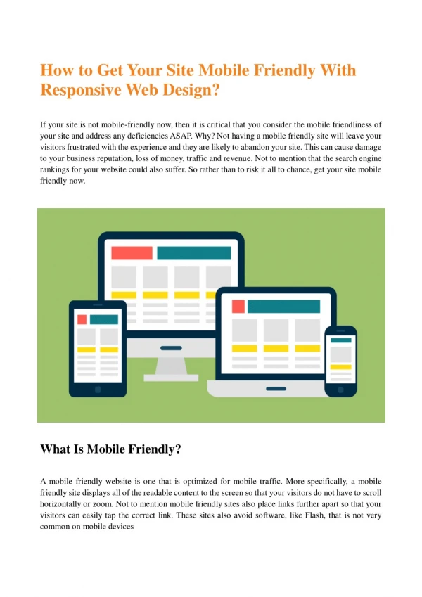
With the growing importance of mobile devices it's necessary as website owners, designers and developers to think smarter and broader about how we can or will engage visitors with our sites.

E N D
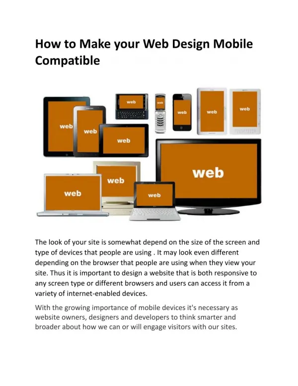
How to Make your Web Design Mobile Compatible The look of your site is somewhat depend on the size of the screen and type of devices that people are using . It may look even different depending on the browser that people are using when they view your site. Thus it is important to design a website that is both responsive to any screen type or different browsers and users can access it from a variety of internet-enabled devices. With the growing importance of mobile devices it's necessary as website owners, designers and developers to think smarter and broader about how we can or will engage visitors with our sites.
First, it is important that all website is viewable on every browser and device. A non-optimized website can negatively impact a consumer’s likeliness and overall perception of the brand. A mobile compatible website is a HTML based that doesn’t contain flash. If your site is not optimized for mobile devices then it is likely that visitors leave your site pretty quickly. You need a clear policy and strategy for making your website accessible to as many internet connected devices as possible. If your site does not look properly in certain browsers, it is generally due to compatibility issues. Being a part of Web Development Company, we make sure that your site work properly and that its appearance is error-free and functional on any platform used to view it. Our designers can help you to develop a separate mobile site or site that is mobile friendly depending on your budget and business needs. Having a different URL of your mobile version may not get as good a ranking in search results as your original URL. If you are planning a new design (or redesign) a site that works well on all devices. Then this can be achieved through either adaptive design or responsive design. Adaptive Design Adaptive works to detect the screen size and load the appropriate layout for it – generally an adaptive site designed for six common screen widths: 320, 480, 760, 960, 1200, and 1600.it is generally the more expensive choice of the two but make sure that the design doesn’t become constrained by the content. Responsive Design Majority of companies now use responsive design as it has been made easier for less experienced designers.it uses a technology called Cascading Style Sheets (CSS) to make website to auto adjust itself to the device being used it’s usually better to use responsive for new projects.
Regardless, of what you choose, it is important to develop a website that people can easily view on their screen. As we know the amount of traffic coming from mobile devices has increased tremendously in the past few years. If your website is viewable on any screen types you will definably get good value for your investment. Want to learn more about Responsive Web Design? Check out, responsive web design!