Download
1 / 2
20 likes | 41 Vues
The simplest way is to pick a WordPress theme that’s responsive. There are a lot of themes on WordPress that are free and responsive.

E N D
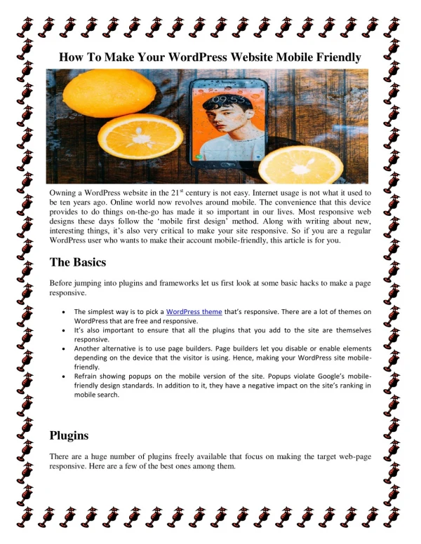
How To Make Your WordPress Website Mobile Friendly Owning a WordPress website in the 21st century is not easy. Internet usage is not what it used to be ten years ago. Online world now revolves around mobile. The convenience that this device provides to do things on-the-go has made it so important in our lives. Most responsive web designs these days follow the ‘mobile first design’ method. Along with writing about new, interesting things, it’s also very critical to make your site responsive. So if you are a regular WordPress user who wants to make their account mobile-friendly, this article is for you. The Basics Before jumping into plugins and frameworks let us first look at some basic hacks to make a page responsive. The simplest way is to pick a WordPress theme that’s responsive. There are a lot of themes on WordPress that are free and responsive. It’s also important to ensure that all the plugins that you add to the site are themselves responsive. Another alternative is to use page builders. Page builders let you disable or enable elements depending on the device that the visitor is using. Hence, making your WordPress site mobile- friendly. Refrain showing popups on the mobile version of the site. Popups violate Google’s mobile- friendly design standards. In addition to it, they have a negative impact on the site’s ranking in mobile search. Plugins There are a huge number of plugins freely available that focus on making the target web-page responsive. Here are a few of the best ones among them.
Accelerated Mobile Pages (AMP) There’s no point in having a responsive page if it fails to load fast. AMP is a lightweight framework for WordPress that makes mobile pages load faster. AMP is an open-source library that helps you in create web pages that are smooth, and load almost instantaneously. What’s more, AMP is compatible across browsers and is supported by many different platforms. This is a great option for sites that have tons of content. AMP also helps in ranking your content better on search engines.